Unlock a world of possibilities! Login now and discover the exclusive benefits awaiting you.
- Qlik Community
- :
- All Forums
- :
- QlikView App Dev
- :
- Qlikview Bar Chart - No Dimensions - Grouping of P...
- Subscribe to RSS Feed
- Mark Topic as New
- Mark Topic as Read
- Float this Topic for Current User
- Bookmark
- Subscribe
- Mute
- Printer Friendly Page
- Mark as New
- Bookmark
- Subscribe
- Mute
- Subscribe to RSS Feed
- Permalink
- Report Inappropriate Content
Qlikview Bar Chart - No Dimensions - Grouping of Percentages & Actuals
Hi,
I have created a chart that has no dimensions & multiple expressions. The expressions are pairs that express the actual & the percentage of a bar. The actual figures are all just Text on Axis & no bar is displayed for it. The percentages all display bars & values on data points.
This arrangement works quite well within Qlikview, the chart on the left hand side is the best I could achieve. However I this entailed ordering all the actual fields first, and then the percentages - which makes the export to excel not easy to interpret. Also the export is a whole line of figures - is there any way to pivot this, so it reflects the order of the chart? When I sort by pair, so actual & percentage for each heading, I get the chart on the right hand side. As you can see the actuals are not spaced correctly and the last two are cut off the size of the chart. Also the percentage headings appear as repetitions in the chart. I also cannot see on either version of how to correctly justify the headings so they are truncated on the right hand side, not left.
Is this behaviour because the actuals and percentages are not related? I would rather keep them as seperate figures, and not as concatenated text, so they can be directly exported to Excel un-concatenated.
I cant help but think there is a better way of doing this - I have tried using a reference table for the headings in the script load, and this works OK for other figures, but is quite an investment of time to setup, is there a quicker way? I want to create quite a number of similar chart layouts that can export to excel.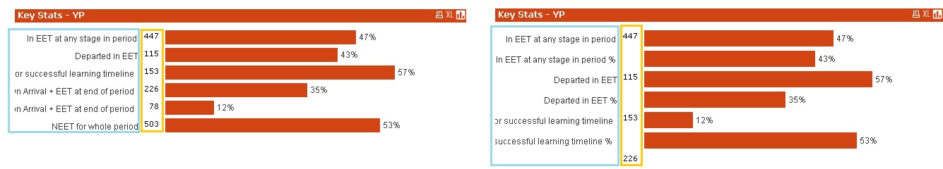
Thanks