Unlock a world of possibilities! Login now and discover the exclusive benefits awaiting you.
- Qlik Community
- :
- All Forums
- :
- QlikView App Dev
- :
- Re: Qlikview Visualizations
- Subscribe to RSS Feed
- Mark Topic as New
- Mark Topic as Read
- Float this Topic for Current User
- Bookmark
- Subscribe
- Mute
- Printer Friendly Page
- Mark as New
- Bookmark
- Subscribe
- Mute
- Subscribe to RSS Feed
- Permalink
- Report Inappropriate Content
Qlikview Visualizations
Hello QlikView Community,
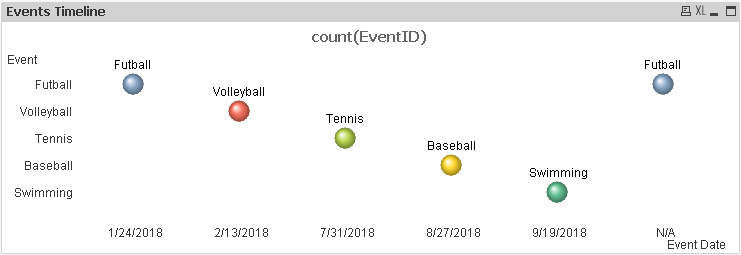
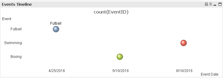
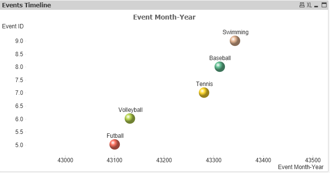
I am looking at using a scatter plot in QlikView to visualize timeline of events. See attached sample data, sample qvw, and screenshot of what I have gotten so far. I would like to show Month-Year of Event in the X axis, and Event in the Y axis, with the Event name in the bubbles as well. I would like to only show sorted Month-Year of Events in the X axis and omit dates without events. There are events with 'N/A' as Event Date which I would like to display as well on the right side.
Thank you
Sokol
- Mark as New
- Bookmark
- Subscribe
- Mute
- Subscribe to RSS Feed
- Permalink
- Report Inappropriate Content
Hi Spetushi,
May be like this ?
KC
- Mark as New
- Bookmark
- Subscribe
- Mute
- Subscribe to RSS Feed
- Permalink
- Report Inappropriate Content
Thank you for taking a shot KC.
This helps, but will need to align the Y axis with the corresponding event bubble. I will look at it in more detail this evening.
Sokol
- Mark as New
- Bookmark
- Subscribe
- Mute
- Subscribe to RSS Feed
- Permalink
- Report Inappropriate Content
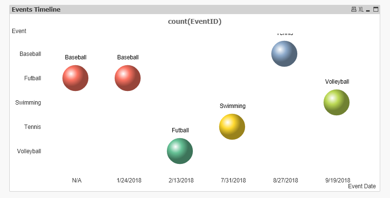
I was able to account for the misalignment of the bubbles with the Y axis events by changing the sorting logic:

See attached new version. In the Sort settings, I used Expression to sort for the Event Date: =If([Event Date]='N/A',99999,[Event Date])
For the Event dimension, I removed the sort on Text and only using State. Not sure why some of the bubbles are missing the label.

