Unlock a world of possibilities! Login now and discover the exclusive benefits awaiting you.
- Qlik Community
- :
- All Forums
- :
- QlikView App Dev
- :
- Scale on Linear Gauge Chart in Straight Table
- Subscribe to RSS Feed
- Mark Topic as New
- Mark Topic as Read
- Float this Topic for Current User
- Bookmark
- Subscribe
- Mute
- Printer Friendly Page
- Mark as New
- Bookmark
- Subscribe
- Mute
- Subscribe to RSS Feed
- Permalink
- Report Inappropriate Content
Scale on Linear Gauge Chart in Straight Table
I would like to replicate below as a column in a straight table :
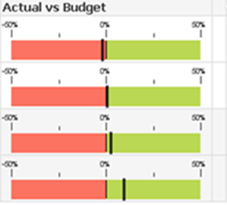
I managed to get the linear gauge chart in the straight table, but I cannot get it to display a scale.
Plus I would like to set the bounds so that anything below a certain value is red, and anything above a certain value is green, representing a target area. Seems like it should be simple but anytime I set the lower bound of the green segment > than the value of the expression it disappears.
Any help would be appreciated.
Accepted Solutions
- Mark as New
- Bookmark
- Subscribe
- Mute
- Subscribe to RSS Feed
- Permalink
- Report Inappropriate Content
Hi David,
1. Chart properties > Presentation > "Wrap Cell text", check and set to 4 lines
2. Chart properties > Expressions > Gauge settings, change "Show labels on every" to 1
Grtz. Fred
- Mark as New
- Bookmark
- Subscribe
- Mute
- Subscribe to RSS Feed
- Permalink
- Report Inappropriate Content
Hi,
you will Try in the expression tab -->> Gauge chart setting -->> logarithmic scale
- Mark as New
- Bookmark
- Subscribe
- Mute
- Subscribe to RSS Feed
- Permalink
- Report Inappropriate Content
Thanks for the reply krishnama but that did not make the scale appear.
- Mark as New
- Bookmark
- Subscribe
- Mute
- Subscribe to RSS Feed
- Permalink
- Report Inappropriate Content
Hi David,
1. Chart properties > Presentation > "Wrap Cell text", check and set to 4 lines
2. Chart properties > Expressions > Gauge settings, change "Show labels on every" to 1
Grtz. Fred
- Mark as New
- Bookmark
- Subscribe
- Mute
- Subscribe to RSS Feed
- Permalink
- Report Inappropriate Content
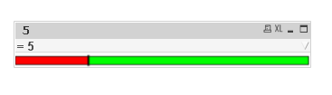
Fred - Thank you very much. This definitely worked.