Unlock a world of possibilities! Login now and discover the exclusive benefits awaiting you.
- Qlik Community
- :
- All Forums
- :
- QlikView App Dev
- :
- Re: Scatter Chart
- Subscribe to RSS Feed
- Mark Topic as New
- Mark Topic as Read
- Float this Topic for Current User
- Bookmark
- Subscribe
- Mute
- Printer Friendly Page
- Mark as New
- Bookmark
- Subscribe
- Mute
- Subscribe to RSS Feed
- Permalink
- Report Inappropriate Content
Scatter Chart
Hi,
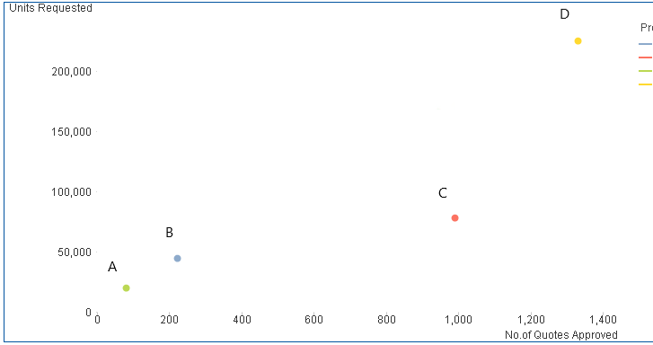
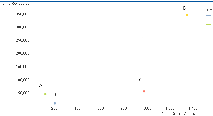
I have two scatter charts, one showing the data for 2017 and the other one for 2018.
Dimension: Product Group (Values: A,B,C,D)
Expressions : 1. No of Quotes Approved 2. Units Requested
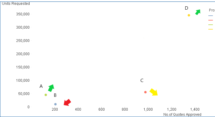
If 2018 is compared with 2017, Product A and D are growing , Product B is declining and for Product C one of the value is going up while the other is going down.
| Header 1 | Header 2 | Header 3 |
|---|---|---|
| Product | 2017 | 2018 |
| A | 81 (no. of quotes), 19000 (units requested) | 124, 45000 |
| B | 220, 44000 | 200, 10000 |
| C | 950, 78000 | 990, 55000 |
| D | 1330, 225300 | 1350, 344000 |
I want my chart to show the data for 2017 and display colored arrows depending on whether the product is growing or declining in 2018.
Is there any way to achieve this result? Also, I am open to suggestions for other chart types displaying the information in a similar fashion (something that gives you the information at a glance). Thank you!
2017
2018
Outcome desired
Accepted Solutions
- Mark as New
- Bookmark
- Subscribe
- Mute
- Subscribe to RSS Feed
- Permalink
- Report Inappropriate Content
- Mark as New
- Bookmark
- Subscribe
- Mute
- Subscribe to RSS Feed
- Permalink
- Report Inappropriate Content
- Mark as New
- Bookmark
- Subscribe
- Mute
- Subscribe to RSS Feed
- Permalink
- Report Inappropriate Content
Hi,
maybe one solution might be:
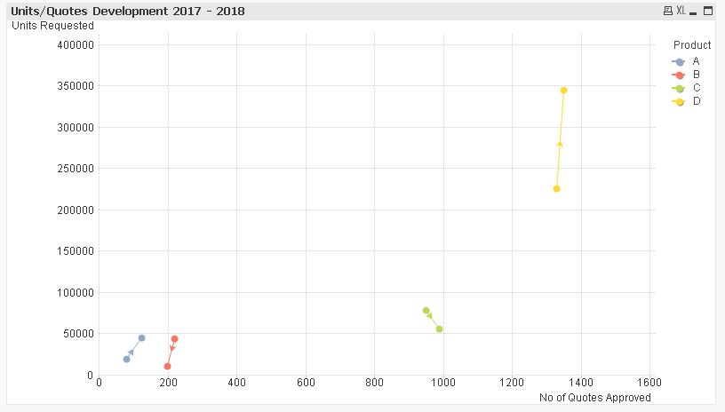
hope this helps
regards
Marco
- Mark as New
- Bookmark
- Subscribe
- Mute
- Subscribe to RSS Feed
- Permalink
- Report Inappropriate Content
Thank you Marco! 