Unlock a world of possibilities! Login now and discover the exclusive benefits awaiting you.
- Qlik Community
- :
- All Forums
- :
- QlikView App Dev
- :
- Re: Scatter diagram
- Subscribe to RSS Feed
- Mark Topic as New
- Mark Topic as Read
- Float this Topic for Current User
- Bookmark
- Subscribe
- Mute
- Printer Friendly Page
- Mark as New
- Bookmark
- Subscribe
- Mute
- Subscribe to RSS Feed
- Permalink
- Report Inappropriate Content
Scatter diagram
Hi,
I'm trying to do a scatter diagram in QlikView and I'm not doing great so far.
What I'm trying to do is to create a QV from an existing excel document, and in this excel document there is a diagram like this:
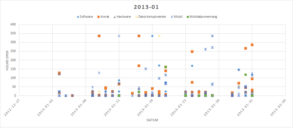
The chart displays one dot per case. I have only managed to create charts with one dot per category (software, hardware etc) so far.
Each case has the following properties:
- Response time
- Category
- Date
Any one who could help me?
Accepted Solutions
- Mark as New
- Bookmark
- Subscribe
- Mute
- Subscribe to RSS Feed
- Permalink
- Report Inappropriate Content
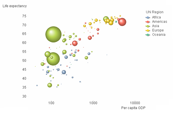
Then use "WorkflowInstance" as first dimension and "WorkFlowType" as second dimension.
If the following graph I have used "Country" as first dimension and "UN Region" as second. Note the colors.
HIC
- Mark as New
- Bookmark
- Subscribe
- Mute
- Subscribe to RSS Feed
- Permalink
- Report Inappropriate Content
you might want to have a look here:
http://community.qlik.com/blogs/qlikviewdesignblog/2013/03/18/scatter-chart
- Mark as New
- Bookmark
- Subscribe
- Mute
- Subscribe to RSS Feed
- Permalink
- Report Inappropriate Content
Hi,
I've seen this before, and it sure do help a bit. However, when I followed this guide the closest thing i could achieve was this:
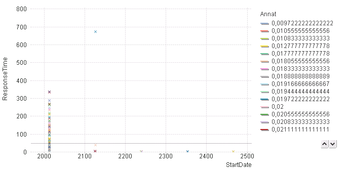
I cannot make it anywhere close to the original:
- For some reason the StartDate is suddenly all wrong. The startdate is formated as 'YYYY-MM-DD'
- I can make a diagram for the category 'Annat', but not for all categories at once. When i do this, I get only one dot per category.
- Mark as New
- Bookmark
- Subscribe
- Mute
- Subscribe to RSS Feed
- Permalink
- Report Inappropriate Content
It looks as if the start date isn't interpreted correctly. But it is impossible to tell without looking at the data. Post some data, please.
HIC
- Mark as New
- Bookmark
- Subscribe
- Mute
- Subscribe to RSS Feed
- Permalink
- Report Inappropriate Content
Hi,
I managed to correct the StartDate interpretation. It was automatically set to calculate the sum of the startdate, which naturally looked wiered for me.
I have now managed to create a scatterchart doing what i want, except that i cannot make it group by category type (hardware, software etc) like the picture in the first post.
The data is attached.
- Mark as New
- Bookmark
- Subscribe
- Mute
- Subscribe to RSS Feed
- Permalink
- Report Inappropriate Content
Make the following changes:
Set Dimension to "WorkFlowType"
Set Expression 1 to Avg(StartDate)
Set Expression 2 to Sum(ResponseTime)
HIC
- Mark as New
- Bookmark
- Subscribe
- Mute
- Subscribe to RSS Feed
- Permalink
- Report Inappropriate Content
Thanks for your help. The problem is, when I do what you suggest I end up with only one dot per category. What i want is to make every WorkflowInstance to be displayed as a dot on the chart (with the dot color depending on what category the instance is associated with.
- Mark as New
- Bookmark
- Subscribe
- Mute
- Subscribe to RSS Feed
- Permalink
- Report Inappropriate Content
Then use "WorkflowInstance" as first dimension and "WorkFlowType" as second dimension.
If the following graph I have used "Country" as first dimension and "UN Region" as second. Note the colors.
HIC
- Mark as New
- Bookmark
- Subscribe
- Mute
- Subscribe to RSS Feed
- Permalink
- Report Inappropriate Content
Thanks! This did the trick!
Richard