Unlock a world of possibilities! Login now and discover the exclusive benefits awaiting you.
- Qlik Community
- :
- All Forums
- :
- QlikView App Dev
- :
- Single bar at the end of the bar chart
- Subscribe to RSS Feed
- Mark Topic as New
- Mark Topic as Read
- Float this Topic for Current User
- Bookmark
- Subscribe
- Mute
- Printer Friendly Page
- Mark as New
- Bookmark
- Subscribe
- Mute
- Subscribe to RSS Feed
- Permalink
- Report Inappropriate Content
Single bar at the end of the bar chart
Hello everyone,
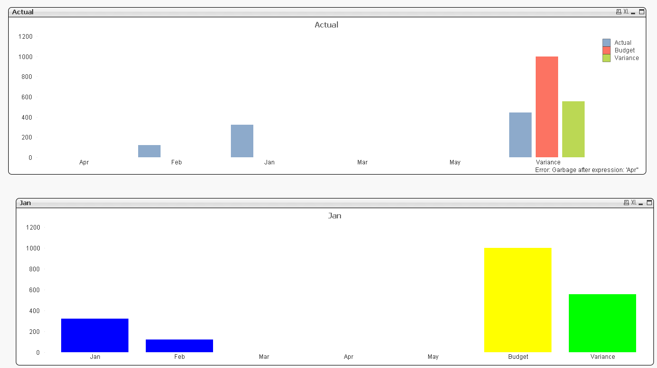
I have a field (Budget) in which the data for all months is the same and another field (Actual) which has different data for different months. So is it possible to plot a bar graph which shows just one bar (instead of displaying one bar for each month) at the end for this field, Budget and to display Actual values for all months as shown in the attached picture?
Second question: Is it possible to have a single bar at the end in the same graph which sums up all actual values and subtracts that by the Budget and displays the subtracted value in the bar so that I get to see the total amount remaining in the budget, as shown in the picture?
Or is there a better way of displaying this info in a graph?
Any help on this?
Thank you.
Accepted Solutions
- Mark as New
- Bookmark
- Subscribe
- Mute
- Subscribe to RSS Feed
- Permalink
- Report Inappropriate Content
Yeah get on, there is always a way!
Just use this in the enable expression dialogue, changing the month where you need to
=wildmatch(GetFieldSelections(Month),'*Mar*')
See attached
- Mark as New
- Bookmark
- Subscribe
- Mute
- Subscribe to RSS Feed
- Permalink
- Report Inappropriate Content
- Mark as New
- Bookmark
- Subscribe
- Mute
- Subscribe to RSS Feed
- Permalink
- Report Inappropriate Content
Please see the attached for a couple of ways of doing this.
The top one is dynamic, the bottom one you need a formula for each month, I prefer the bottom one for sure
- Mark as New
- Bookmark
- Subscribe
- Mute
- Subscribe to RSS Feed
- Permalink
- Report Inappropriate Content
Hi Deepak,
Thank you for sharing about waterfall chart. I tried this method, but some how i am not able to create one. I will definitely try this later and understand how it works.
- Mark as New
- Bookmark
- Subscribe
- Mute
- Subscribe to RSS Feed
- Permalink
- Report Inappropriate Content
Hi Adam,
Thank you for your suggestion. I tried the second method and yes, even i agree that this is a good option. But, as there is no dimension in the graph, i will not be able to see the graph with respect to few months when i make selections in the month list box right? Is there a way where I can implement even this?
Thank you.
- Mark as New
- Bookmark
- Subscribe
- Mute
- Subscribe to RSS Feed
- Permalink
- Report Inappropriate Content
Yeah get on, there is always a way!
Just use this in the enable expression dialogue, changing the month where you need to
=wildmatch(GetFieldSelections(Month),'*Mar*')
See attached
- Mark as New
- Bookmark
- Subscribe
- Mute
- Subscribe to RSS Feed
- Permalink
- Report Inappropriate Content
Thank you very much!
That worked perfectly! 