Unlock a world of possibilities! Login now and discover the exclusive benefits awaiting you.
- Qlik Community
- :
- All Forums
- :
- QlikView App Dev
- :
- Re: Slopegraphs - too Tufte ?
- Subscribe to RSS Feed
- Mark Topic as New
- Mark Topic as Read
- Float this Topic for Current User
- Bookmark
- Subscribe
- Mute
- Printer Friendly Page
- Mark as New
- Bookmark
- Subscribe
- Mute
- Subscribe to RSS Feed
- Permalink
- Report Inappropriate Content
Slopegraphs - too Tufte ?
Hi all,
After reading a post at Edward Tufte's blog I've had a quick go at creating a 'slopegraph' in Qlikview but am stuck on a label placement issue.
The problem is after using the script to, rather clumsily, create a resident table with new data points positioned to show a series of 'stacked'
lines, each tracing a trend in UN Life Expectancy data per country, I ran out of space for the expression that holds the labels as data point values.
In order to have enough space on the left of the plot area I've added two dummy years to the data on the x-axis and hidden them with a text block, which is a bit of an ugly hack by anyones standards.
There must be a better way - I'd appreciate any ideas of how to add that space because the slopegraph thing does show up 'lines of unusual slope' quite well.
Using those dummy years removes the only interaction that still works which is the click and drag selection - if I could fix that they may be useful, even if just for a demo.
See attached example qlikview that points at the UN HDR data site for loading a table of Life Expectancy data (one possible test example mentioned on the Tufte blog) and an image of the chart (the 3 dots in the bottom left hide the extra years)
Thanks,
HD.
Accepted Solutions
- Mark as New
- Bookmark
- Subscribe
- Mute
- Subscribe to RSS Feed
- Permalink
- Report Inappropriate Content
Hi,
here's another approach using QlikView Extensions:
http://www.qlikblog.at/3093/slopegraph-for-qlikview-d3slopegraph-qlikview-extension/
Regards
Stefan
- Mark as New
- Bookmark
- Subscribe
- Mute
- Subscribe to RSS Feed
- Permalink
- Report Inappropriate Content
Hi,
here's another approach using QlikView Extensions:
http://www.qlikblog.at/3093/slopegraph-for-qlikview-d3slopegraph-qlikview-extension/
Regards
Stefan
- Mark as New
- Bookmark
- Subscribe
- Mute
- Subscribe to RSS Feed
- Permalink
- Report Inappropriate Content
Hi Stefan,
That's what I like about this Qlikcommunity, you post a question.......................and you get an answer.
This extension looks very useful, I'll give it a try and post some feedback,
Thanks,
HD
- Mark as New
- Bookmark
- Subscribe
- Mute
- Subscribe to RSS Feed
- Permalink
- Report Inappropriate Content
Hi Stefan,
it seems to me you've solved the problem with the lables I posted some days ago here, http://community.qlik.com/thread/102561
Thanks a lot
- Mark as New
- Bookmark
- Subscribe
- Mute
- Subscribe to RSS Feed
- Permalink
- Report Inappropriate Content
Stefan,
I've been working with that extension object and it is very effective, thanks for creating it.
For my own purposes I was looking for something with slightly simpler parameters where the user would choose an x and y dimension only with a single expression and the object would set the titles to the minimum and maximum values in the y dimension. I also wanted to see a mini-chart in the trend area of the pop-up window..so I fiddled with the D3 code to get a layout like the attached..
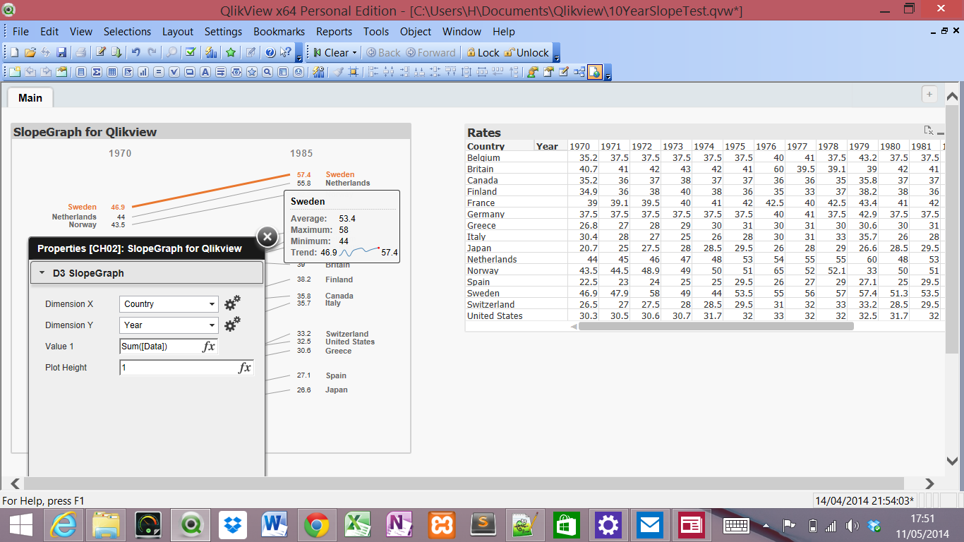
I used Ben Christensons simple D3 sparkline example for the mini chart - is it better as a double Tufte chart type combination ?, maybe some kind of win/loss mini chart would also be good,
Regards,
HD
- Mark as New
- Bookmark
- Subscribe
- Mute
- Subscribe to RSS Feed
- Permalink
- Report Inappropriate Content
Great!!! Do you want to share your code as Pull-Request on QlikDev/D3SlopeGraph · GitHub ??
Regards
Stefan
- Mark as New
- Bookmark
- Subscribe
- Mute
- Subscribe to RSS Feed
- Permalink
- Report Inappropriate Content
Ok, I've not used Git before - only some Gists for storing code samples - but I've had a go and created a pull request today.
Let me know if it's not right - should I have created another branch first..like 'D3SlopeGraph\Tooltip_changes'...before making changes and commits and creating the pull request ?,
Regards,
HD