Unlock a world of possibilities! Login now and discover the exclusive benefits awaiting you.
- Qlik Community
- :
- All Forums
- :
- QlikView App Dev
- :
- Straight Table Percent of Target
- Subscribe to RSS Feed
- Mark Topic as New
- Mark Topic as Read
- Float this Topic for Current User
- Bookmark
- Subscribe
- Mute
- Printer Friendly Page
- Mark as New
- Bookmark
- Subscribe
- Mute
- Subscribe to RSS Feed
- Permalink
- Report Inappropriate Content
Straight Table Percent of Target
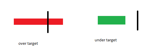
I have a straight table that shows my Dimension, YTD % and YTD Target. I know I've seen dashboards that visually displays the % relative to the target within a straight table, but I can't figure out how to do this. I can do it in a simple bar chart outside of a straight table and I know this is simple, so what easy solution am I not thinking of?
There are different targets based on the dimension.
Here is an example of what I am looking for:
Thank you!
- Mark as New
- Bookmark
- Subscribe
- Mute
- Subscribe to RSS Feed
- Permalink
- Report Inappropriate Content
Hi Cassandra,
I believe you're looking for a Linear Gauge within a straight table. Here is a thread with some examples: Straight Table chart with linear gauge chart
The example "Data Visualization" QVW that comes with QlikView, has an example of this minichart on the Sparklines sheet as well.