Unlock a world of possibilities! Login now and discover the exclusive benefits awaiting you.
- Qlik Community
- :
- All Forums
- :
- QlikView App Dev
- :
- Re: Target distribution line on bar chart
- Subscribe to RSS Feed
- Mark Topic as New
- Mark Topic as Read
- Float this Topic for Current User
- Bookmark
- Subscribe
- Mute
- Printer Friendly Page
- Mark as New
- Bookmark
- Subscribe
- Mute
- Subscribe to RSS Feed
- Permalink
- Report Inappropriate Content
Target distribution line on bar chart
I have a bar chart that I use to show the distribution of monthly sales between new business and existing business. I would like to be able to project a line on top of the chart that shows where we would like the distribution to be. For instance, if June's sales were $400 to new business and $600 to existing business and we want salespeople to target a 50/50 distribution, the line chart would pass through the month at the $500 point.
Here's an Excel rendition of what I'd like the chart to look like:
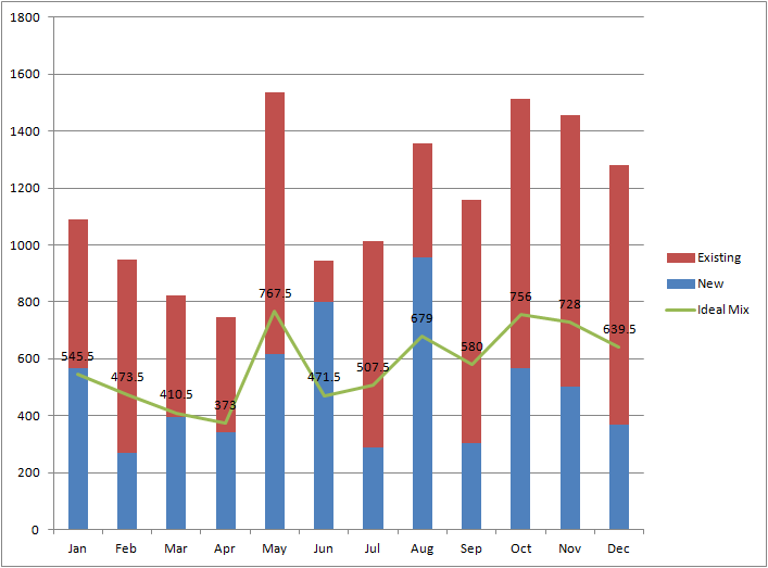
Can a create a similar target distribution line in QlikView? I've attached a QVW containing the same sample data.
Thanks. -- Ben
Accepted Solutions
- Mark as New
- Bookmark
- Subscribe
- Mute
- Subscribe to RSS Feed
- Permalink
- Report Inappropriate Content
Ben, see attached
- Mark as New
- Bookmark
- Subscribe
- Mute
- Subscribe to RSS Feed
- Permalink
- Report Inappropriate Content
Ben, see attached
- Mark as New
- Bookmark
- Subscribe
- Mute
- Subscribe to RSS Feed
- Permalink
- Report Inappropriate Content
See attached qvw
talk is cheap, supply exceeds demand
- Mark as New
- Bookmark
- Subscribe
- Mute
- Subscribe to RSS Feed
- Permalink
- Report Inappropriate Content
Perfect. Michael / Gysbert, thank you for getting back to me so quickly. -- Ben