Unlock a world of possibilities! Login now and discover the exclusive benefits awaiting you.
- Qlik Community
- :
- All Forums
- :
- QlikView App Dev
- :
- Traffic lights
- Subscribe to RSS Feed
- Mark Topic as New
- Mark Topic as Read
- Float this Topic for Current User
- Bookmark
- Subscribe
- Mute
- Printer Friendly Page
- Mark as New
- Bookmark
- Subscribe
- Mute
- Subscribe to RSS Feed
- Permalink
- Report Inappropriate Content
Traffic lights
Hi,
I have a bar chart with on the x-axis employeeID and on the y-axis is the sales
Now I want to make a traffic light which is green if EACH employee meets the target of 60 000 000 sales and red if they don't meet the target.
But how do I do this?
Can I use my bar chart for it or should I make a new gauge chart with exact the same data?
And we're can i say when it should be green or red?
Thanks in advance!
- « Previous Replies
-
- 1
- 2
- Next Replies »
Accepted Solutions
- Mark as New
- Bookmark
- Subscribe
- Mute
- Subscribe to RSS Feed
- Permalink
- Report Inappropriate Content
in the traffic light use this
=If(sum({$<EmployeeID={1}>}Subtotal)<100000, 'qmem://<bundled>/BuiltIn/led_r.png',
If(sum({$<EmployeeID={2}>}Subtotal)<100000, 'qmem://<bundled>/BuiltIn/led_r.png',
If(sum({$<EmployeeID={3}>}Subtotal)<100000, 'qmem://<bundled>/BuiltIn/led_r.png',
If(sum({$<EmployeeID={4}>}Subtotal)<100000, 'qmem://<bundled>/BuiltIn/led_r.png',
If(sum({$<EmployeeID={5}>}Subtotal)<100000, 'qmem://<bundled>/BuiltIn/led_r.png',
If(sum({$<EmployeeID={6}>}Subtotal)<100000, 'qmem://<bundled>/BuiltIn/led_r.png',
If(sum({$<EmployeeID={7}>}Subtotal)<100000, 'qmem://<bundled>/BuiltIn/led_r.png',
If(sum({$<EmployeeID={8}>}Subtotal)<100000, 'qmem://<bundled>/BuiltIn/led_r.png',
If(sum({$<EmployeeID={9}>}Subtotal)<100000, 'qmem://<bundled>/BuiltIn/led_r.png',
'qmem://<bundled>/BuiltIn/led_g.png')))))))))
the example of the chart was this..
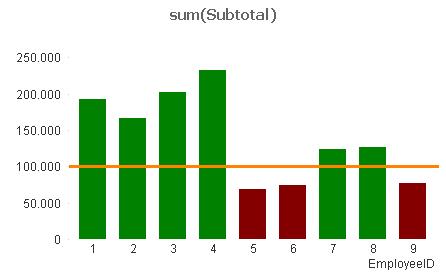
My personal view is that the chart does what you need in its own right..
But should you need to apply the traffic lights the formula should set you on your way.
- Mark as New
- Bookmark
- Subscribe
- Mute
- Subscribe to RSS Feed
- Permalink
- Report Inappropriate Content
Hello,
You can play around with the legend on the bar chart to do it or its always suggested if you use a Guage chart with LED's.
Anyways you need to write something like if(sum(Sales) = '60000000', Green(), Red()). This should be your expression and the Dimension should be your Employee.
Hope this helps.
Thanks
- Mark as New
- Bookmark
- Subscribe
- Mute
- Subscribe to RSS Feed
- Permalink
- Report Inappropriate Content
If you mean; green if every induvidual employee reaches the 60,000,000 target and red if even 1 falls short then look at a single LED gauge chart and an expression using an agg() function across the EmployeeID dimension.
If you want a traffic light for each seperate employee you can use a straight table chart with EmployeeID as the dimension and a micro-chart as the expression with a simple if() controling the LED component.
You could also add an indicator to the Axis of the bar chart ('Text on Axis') you may be able to get a red / green LED to display by using the built in QV icons.
Alternatively I'd look to put a reference line in your Bar Chart at a y-value of 60,000,000 you can also colour the bar itself red or green accordingly with a simple background color if() function. This would be my preferred option for ease of use.
Hope that helps,
Matt - Visual Analytics Ltd
- Mark as New
- Bookmark
- Subscribe
- Mute
- Subscribe to RSS Feed
- Permalink
- Report Inappropriate Content
Hi
If I get you right I think you want this.... not sure it will look good but try it and see what you think...
in the expression tab of your object properties. click the expand button next to your expression for sales.
then on the background color tool..
then put the following if statement into the definition box on the right..
if(Sales>='60000000',Green(),Red())
I hope this helps..
- Mark as New
- Bookmark
- Subscribe
- Mute
- Subscribe to RSS Feed
- Permalink
- Report Inappropriate Content
as a thought it may be worth also applying a ref line in your graph to help the user understand the reason for the colour coding.
just a thought.

- Mark as New
- Bookmark
- Subscribe
- Mute
- Subscribe to RSS Feed
- Permalink
- Report Inappropriate Content
On my y-axis is sum(Subtotal), which I call sales.
I've made a new text object with code:
=If(sum(Subtotal)>'60000000', 'qmem://<bundled>/BuiltIn/led_g.png', 'qmem://<bundled>/BuiltIn/led_r.png')
but it is always green, i think it's because it doesn't look at the seperate employeeID's, how can i let him check every sum(Subtotal) of every employeeID? And only if every employeeID meets the target of 60000000 it should be green.
Thanks in advance!
- Mark as New
- Bookmark
- Subscribe
- Mute
- Subscribe to RSS Feed
- Permalink
- Report Inappropriate Content
Could you upload an example of your graph so that I can look at this please. ??
I am finding it difficult to picture it in my head. .
Thanks
- Mark as New
- Bookmark
- Subscribe
- Mute
- Subscribe to RSS Feed
- Permalink
- Report Inappropriate Content
Here is a small example
- Mark as New
- Bookmark
- Subscribe
- Mute
- Subscribe to RSS Feed
- Permalink
- Report Inappropriate Content
Hi, it would be good if you use a table instit of a chart in that you can show an additional column and show that traffic lights attached is an example for you reference
- Mark as New
- Bookmark
- Subscribe
- Mute
- Subscribe to RSS Feed
- Permalink
- Report Inappropriate Content
Hi
I have applied two different ways of visualizing this info..
Please see the attached example.
I hope one of these covers your needs
Note: the traffic light way can get messy if you have a huge list of Employees as it could require a lot of future maintenance.
- « Previous Replies
-
- 1
- 2
- Next Replies »