Unlock a world of possibilities! Login now and discover the exclusive benefits awaiting you.
- Qlik Community
- :
- All Forums
- :
- QlikView App Dev
- :
- Trendline defined by expression in combo chart
- Subscribe to RSS Feed
- Mark Topic as New
- Mark Topic as Read
- Float this Topic for Current User
- Bookmark
- Subscribe
- Mute
- Printer Friendly Page
- Mark as New
- Bookmark
- Subscribe
- Mute
- Subscribe to RSS Feed
- Permalink
- Report Inappropriate Content
Trendline defined by expression in combo chart
Hello,
I have bar chart expressing volume of cars saled in specific categories. I want to create something like a trendline showing the change of sales between the two years.
So I will have bars with values and trendline over it with percentual expression of change between those two years.
I think, that the best solution for me is to create two expressions within the combo chart with the second expression showed as line.
But my "trend line" in combo chart is showed like a flat line on the "bottom"... I made another chart, using the expression showed as a line, set background to transparent ant put it over the first chart. - It is OK, easy to adjust etc... but it is horrible solution, actually it is not a real solution.
Please can anybody help me with this? 
What I want to get within one chart is like this one:
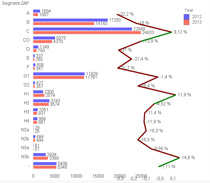
BAR CHART:
Dim.: Year, Segment,
Exp.: Count(VIN)
LINE CHART:
Dim.: Segment
Exp.:
2012 = Count({<[Year]={'2012'}>} [VIN]) (not showed)
2013 = Count({<[Year]={'2013'}>} [VIN]) (not showed)
Variance = [2013]-[2012] (not showed)
Va12 = Variance/[2012] (showed) - Number set to number, showed in %
Do you have any suggestions how to format, or create "my trendline" ??
Thank you!!
P.S.: do not paste QV files - I dont have licensed version of QV yet, so I am unable to open your apps. Thx
- Mark as New
- Bookmark
- Subscribe
- Mute
- Subscribe to RSS Feed
- Permalink
- Report Inappropriate Content
It sounds like you might want a combo chart with the expression of the line being changed to a line look. A trendline would only be a straight line throughout the entire chart (the value is only calculated once and not per dimension)
- Mark as New
- Bookmark
- Subscribe
- Mute
- Subscribe to RSS Feed
- Permalink
- Report Inappropriate Content
Hi,
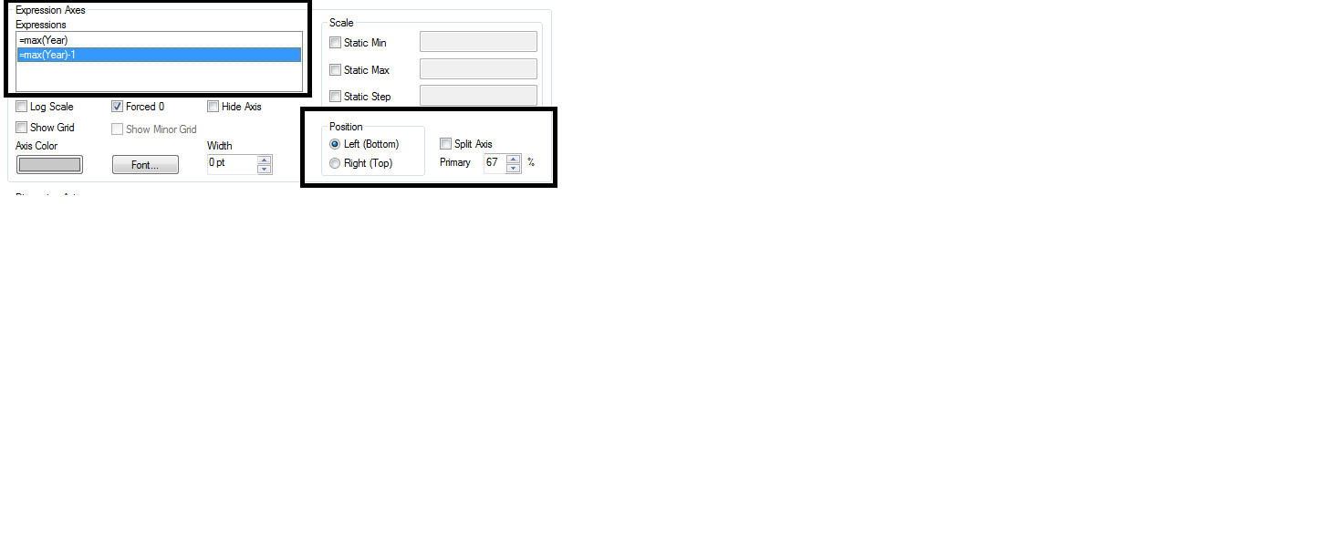
Try with this /see in the picture below/ . Change the position of the expression and the application will look like better. Also for the trend line, you can use grid and symbols functions to improve the design.
Regards,
Venelin
- Mark as New
- Bookmark
- Subscribe
- Mute
- Subscribe to RSS Feed
- Permalink
- Report Inappropriate Content
OK, so it is not a trendline I am looking for... it is a line expressing percentage change of volumes between 2013 and 2012.
- Mark as New
- Bookmark
- Subscribe
- Mute
- Subscribe to RSS Feed
- Permalink
- Report Inappropriate Content
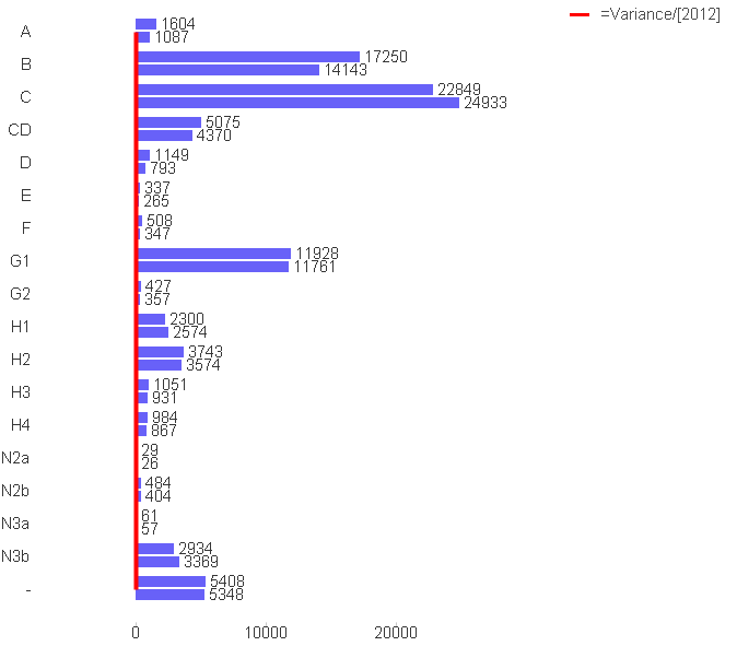
With no effect Venelin,
I changet the positon of an expression to Right (Top) and also tried to split axes, changed the "primary" valu to 1% and to 99% and the only result was, that the the "bars and lines part" of a chart was displayed smaller compared to the chart area.
I still have this result:
- Mark as New
- Bookmark
- Subscribe
- Mute
- Subscribe to RSS Feed
- Permalink
- Report Inappropriate Content
Ok.
My opinion is In this situation is to make two separate charts with different dimension. In first chart you can put your first dimension – ‘year’ with the expressions. In the next chart you can insert second dimension with the same expressions. Other solution is to insert cycle dimension but I don’t advice you in this situation because the first dimension - year is time dimension and the second dimension – ‘segment’ is maybe item category dimension. So they are not related directly and I think is better to input in the application near by in small different charts. Use similar colours in the charts and I think it will be good design.