Unlock a world of possibilities! Login now and discover the exclusive benefits awaiting you.
- Qlik Community
- :
- All Forums
- :
- QlikView App Dev
- :
- Two limitations on graph
- Subscribe to RSS Feed
- Mark Topic as New
- Mark Topic as Read
- Float this Topic for Current User
- Bookmark
- Subscribe
- Mute
- Printer Friendly Page
- Mark as New
- Bookmark
- Subscribe
- Mute
- Subscribe to RSS Feed
- Permalink
- Report Inappropriate Content
Two limitations on graph
Hi,
To show are customers, who receive the worst on time performance from transport companies we work with, I'm working with the following graph:
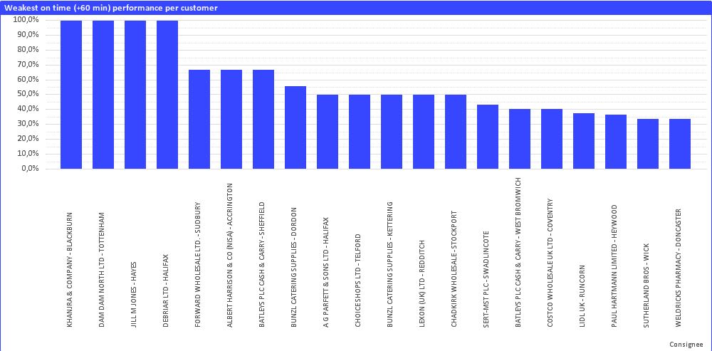
On the horizontal axis, I have the following calculated dimension:
Consignee&' - '&ConsigneeCity
I am using the following expression:
Count( {< [On time + 60 min = {0} >} DISTINCT [PO Number] ) / Count( DISTINCT [PO Number] )
In my script, I already have formulas that show if the truck is on time (On time + 60 min = 1) or late (On time + 60 min = 0), so I could implement this in my set analysis.
My problem is as follows; in my dimension limits, I already put that the graph only shows the 20 largest values (so only the 20 customers with the weakest performance). However, I also want the graph to only show the customer who received at least 5 orders ( = 5 PO Numbers). The problem is, I'm combining excel files from 10 different transport companies, and one customer can be served by multiple transporters, so I don't think I can integrate this in my script. I tried to adjust my expression to the following:
= if (sum( Aggr ( Count ( [PO Number] ), Consignee, ConsigneeCity)) >= 5,
Count ( { < [On time + 60 min] = {0} > } DISTINCT [PO Number] ) / Count ( DISTINCT [PO Number] ), 0 )
But this doesn't work. Can anybody help? Thanks!
(Other short question; at the moment the labels on my horizontal axis are aligned left. How do I align them right, so that they start at the bar?)