Unlock a world of possibilities! Login now and discover the exclusive benefits awaiting you.
- Qlik Community
- :
- All Forums
- :
- QlikView App Dev
- :
- Re: Unrelated Pivot Dimension with Linked Data
- Subscribe to RSS Feed
- Mark Topic as New
- Mark Topic as Read
- Float this Topic for Current User
- Bookmark
- Subscribe
- Mute
- Printer Friendly Page
- Mark as New
- Bookmark
- Subscribe
- Mute
- Subscribe to RSS Feed
- Permalink
- Report Inappropriate Content
Unrelated Pivot Dimension with Linked Data
Hiya Guys,
I have a complex one so forgive me if this isn't clear - if absolutely necessary I'll create an example but I just don't have time at the moment.
I have data in a table which represents a Risk Matrix:
| SEVERITY | LIKELIHOOD | AREA | COLOUR | WEIGHT |
Severity 1 | Unlikely - Rarer than once every 15 years | Critical area | 255 | 75 |
| Severity 1 | Rare - Once between every 15 years and 5 years | Critical area | 255 | 150 |
| Severity 1 | Likely - Once between every 5 years and 2 years | Critical area | 255 | 225 |
| Severity 1 | Highly - Once between every 2 years and once a year | Critical area | 255 | 300 |
| Severity 1 | As good as certain - Multiple every year | Critical area | 255 | 375 |
| Severity 2 | Unlikely - Rarer than once every 15 years | Serious area | 65535 | 25 |
| Severity 2 | Rare - Once between every 15 years and 5 years | Serious area | 65535 | 50 |
| Severity 2 | Likely - Once between every 5 years and 2 years | Critical area | 255 | 75 |
| Severity 2 | Highly - Once between every 2 years and once a year | Critical area | 255 | 100 |
| Severity 2 | As good as certain - Multiple every year | Critical area | 255 | 125 |
| Severity 3 | Unlikely - Rarer than once every 15 years | Less serious area | 65280 | 10 |
| Severity 3 | Rare - Once between every 15 years and 5 years | Serious area | 65535 | 20 |
| Severity 3 | Likely - Once between every 5 years and 2 years | Serious area | 65535 | 30 |
| Severity 3 | Highly - Once between every 2 years and once a year | Serious area | 65535 | 40 |
| Severity 3 | As good as certain - Multiple every year | Serious area | 65535 | 50 |
| Severity 4 | Unlikely - Rarer than once every 15 years | Less serious area | 65280 | 5 |
| Severity 4 | Rare - Once between every 15 years and 5 years | Less serious area | 65280 | 10 |
| Severity 4 | Likely - Once between every 5 years and 2 years | Less serious area | 65280 | 15 |
| Severity 4 | Highly - Once between every 2 years and once a year | Serious area | 65535 | 20 |
| Severity 4 | As good as certain - Multiple every year | Serious area | 65535 | 25 |
| Severity 5 | Unlikely - Rarer than once every 15 years | Less serious area | 65280 | 1 |
| Severity 5 | Rare - Once between every 15 years and 5 years | Less serious area | 65280 | 2 |
| Severity 5 | Likely - Once between every 5 years and 2 years | Less serious area | 65280 | 3 |
| Severity 5 | Highly - Once between every 2 years and once a year | Less serious area | 65280 | 4 |
| Severity 5 | As good as certain - Multiple every year | Less serious area | 65280 | 5 |
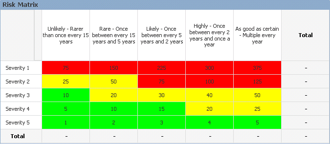
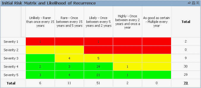
By creating a Pivot Chart from this data I can create a 5x5 table, containing (for arguement's sake) "WEIGHT" data with each Cell the appropriate COLOUR:
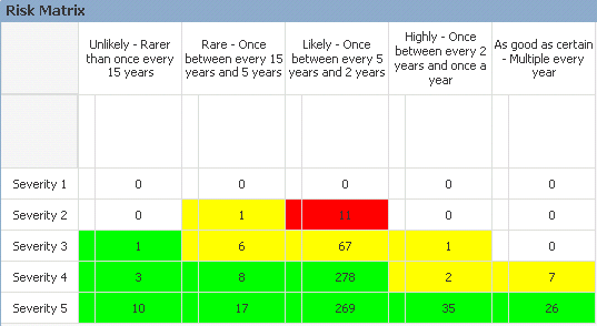
My issue is that, to create this Matrix, I cannot link the data (above) to my base data (ie: holding Dates and Events) - as if a Selection is made which does not include one of the 5 SEVERITIES or 5 LIKELIHOODS then I cannot create the full Matrix. I can obviously select the "Show all Values" and deselect "Supress When Value is Null" Chart options - but then I get extra "blank" rows and columns - plus I then no longer have access to all Cell COLOURS, eg:
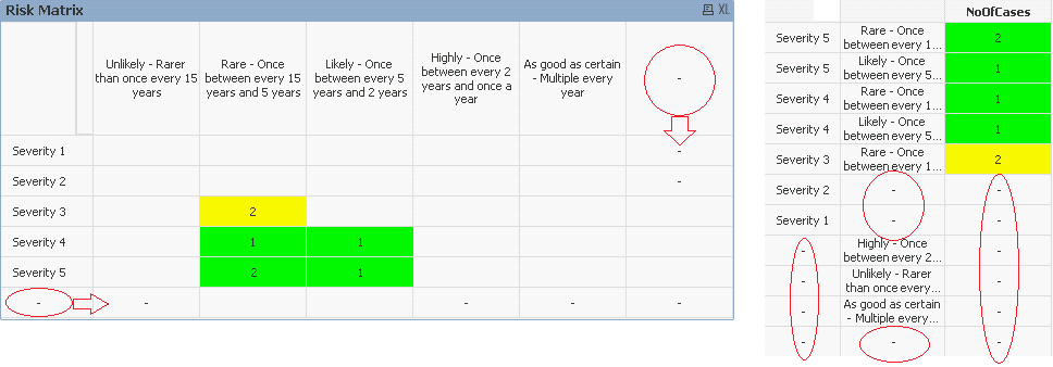
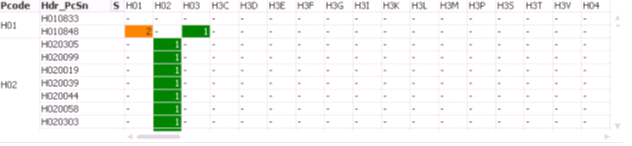
Of course this means that (if I make the data above a "data island") when I attempt to COUNT the number of Events for each Cell - ALL data is returned, regardless of the current Selection.
I am currently toying with the idea of a hybrid of the two implementations where I use a "data island" version of the table for the 'background' (with COLOURS) and then a transparent 'foreground' Pivot Chart using a linked table for the currently Selected data... however, I would like to show Totals (without having the "blank" rows and columns shown above - which, by viewing the table data highlighted above, I can understand why these are present).
Am I missing some fundamental data concept?!
How can I create an unrelated Pivot Chart which displays linked data? (or how can I remove the "blank" rows and colums from my Pivot Chart?).
Any help will be greatly appreciated!
Cheers,
Steve.
Accepted Solutions
- Mark as New
- Bookmark
- Subscribe
- Mute
- Subscribe to RSS Feed
- Permalink
- Report Inappropriate Content
The solution I have come to is to create a copy of the Matrix table as a "Data Island" - which ensures I can display all rows and columns (with colours - regardless of current Selections):
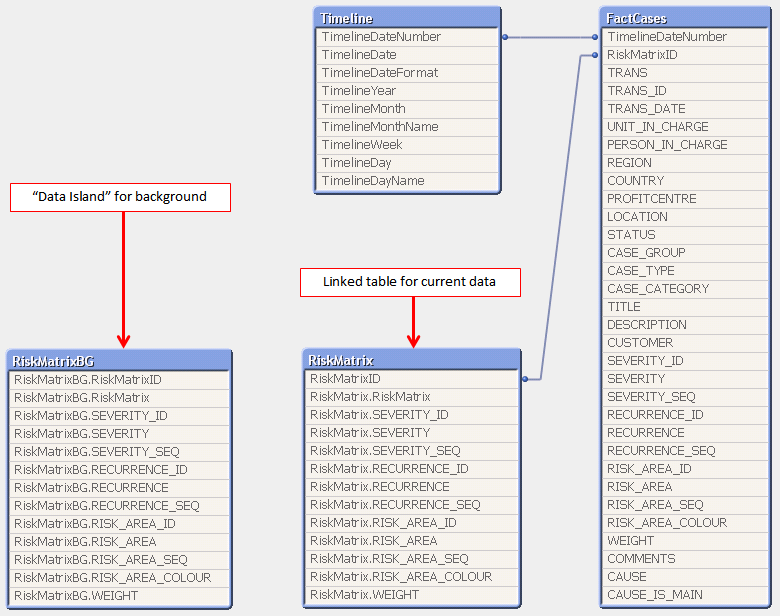
I have then created two Pivot Charts - one static (using the "Data Island" as a background), and another to display the current data. To display the Totals I have created individual Text Objects which reference a function (variable) to calculate the number of Events per row and per column (making use of Set Analysis):
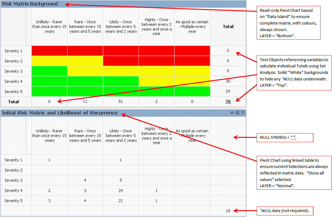
With the "data" matrix having a transparent Cell background - transposing one over the other provides the desired result:
This is a little bit of a "hack" - but at least I have come to a solution 🙂 Hopefully this post will help someone in the future.
Cheers,
Steve.
- Mark as New
- Bookmark
- Subscribe
- Mute
- Subscribe to RSS Feed
- Permalink
- Report Inappropriate Content
If you're using QV11 you can likely use alternate states. Create a new alternate state and assign that to your pivot chart. That way selections in the default state won't influence the pivot chart.
talk is cheap, supply exceeds demand
- Mark as New
- Bookmark
- Subscribe
- Mute
- Subscribe to RSS Feed
- Permalink
- Report Inappropriate Content
Hiya Gysbert,
Thank you for your response - however if I use an Alternate State (which, from my understanding, would be equivelant to the "Data Island" implementation, above) my Pivot Chart would no longer be able to display a COUNT of all Cases related to the current Selections?
Any other ideas? 🙂
Cheers,
Steve.
- Mark as New
- Bookmark
- Subscribe
- Mute
- Subscribe to RSS Feed
- Permalink
- Report Inappropriate Content
See attached example. It uses two expressions using different states. One is 'hidden' by making the text transparant. It's no ideal, but I'm out of ideas for the moment. With a macro you could even set the column width of the second expression to zero.
talk is cheap, supply exceeds demand
- Mark as New
- Bookmark
- Subscribe
- Mute
- Subscribe to RSS Feed
- Permalink
- Report Inappropriate Content
Hiya Gysbert,
Very creative solution! 🙂 I've had a play but unfortunatelty it's not a complete fix:
As you can see - I still don't have access to the COLOUR for the Cells which aren't populated (and the extra heading for the Expressions/extra Cell borders is causing presentation issues).
I believe I may have found a "hack" by transposing the current linked data over an unrelated template (background) Pivot Chart with the Cell COLOURS. If this work then I will post the result here - but if you have any further ideas please let me know!
I appreciate your efforts and it was interesting playing with Alternate States 🙂
Cheers,
Steve.
- Mark as New
- Bookmark
- Subscribe
- Mute
- Subscribe to RSS Feed
- Permalink
- Report Inappropriate Content
The solution I have come to is to create a copy of the Matrix table as a "Data Island" - which ensures I can display all rows and columns (with colours - regardless of current Selections):
I have then created two Pivot Charts - one static (using the "Data Island" as a background), and another to display the current data. To display the Totals I have created individual Text Objects which reference a function (variable) to calculate the number of Events per row and per column (making use of Set Analysis):
With the "data" matrix having a transparent Cell background - transposing one over the other provides the desired result:
This is a little bit of a "hack" - but at least I have come to a solution 🙂 Hopefully this post will help someone in the future.
Cheers,
Steve.
- Mark as New
- Bookmark
- Subscribe
- Mute
- Subscribe to RSS Feed
- Permalink
- Report Inappropriate Content
PLEASE HELP!!! ITS A BIT URGENT, THANKS! IN ADVANCE
My issue is the same to remove the null values without affecting the table structure.The solution lies in the attacment which u have provided above
Gysbert Wassenaar wrote:
See attached example. It uses two expressions using different states. One is 'hidden' by making the text transparant. It's no ideal, but I'm out of ideas for the moment. With a macro you could even set the column width of the second expression to zero.
Can u plz let me know the step by step procedure of creating the below table which u showed in the "comm75252.qvw" bcoz my problem is the same .Plz see the above image