Unlock a world of possibilities! Login now and discover the exclusive benefits awaiting you.
- Qlik Community
- :
- All Forums
- :
- QlikView App Dev
- :
- Visualizing two KPIs in the same "chart"
- Subscribe to RSS Feed
- Mark Topic as New
- Mark Topic as Read
- Float this Topic for Current User
- Bookmark
- Subscribe
- Mute
- Printer Friendly Page
- Mark as New
- Bookmark
- Subscribe
- Mute
- Subscribe to RSS Feed
- Permalink
- Report Inappropriate Content
Visualizing two KPIs in the same "chart"
Hi community.
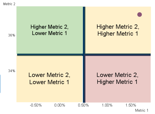
I have a dashboard i'm creating where I am trying to display two KPIs in the same chart. We have two important KPIs in our business: lets call them metric 1 and metric 2. When metric 1 is down YoY and metric two is up YoY, that's considered a good thing. Vice versa is bad. If both are up or both are down, it's not good but it's not necessarily bad. Ideally I'd like to display both the direction an magnitude of the dual KPI.
Here's one way I've imagined displaying this info. I put reference lines at last years numbers, and then in chart text boces with backgrounds for the quadrants. The purple dot indicates this years KPIs. I don't think this one really pops out, and I dont like that no matter how much larger or smaller each of the metrics is, it's always in the same relative place.
I was thinking maybe doing something similar with an arrow. I think that would pop out more and really be able to show magnitude.
Any other suggestions out there? If you already have thought about this before I'd love to pick your brain!
Thanks.