Unlock a world of possibilities! Login now and discover the exclusive benefits awaiting you.
- Qlik Community
- :
- All Forums
- :
- QlikView App Dev
- :
- Re: What type of Chart should I use to compare two...
- Subscribe to RSS Feed
- Mark Topic as New
- Mark Topic as Read
- Float this Topic for Current User
- Bookmark
- Subscribe
- Mute
- Printer Friendly Page
- Mark as New
- Bookmark
- Subscribe
- Mute
- Subscribe to RSS Feed
- Permalink
- Report Inappropriate Content
What type of Chart should I use to compare two values with a variance?
I have two values, current year sales and previous year sales. I also have created a variance for current year versus previous year. What would be the best way to graphically display this? Right now I just have text boxes with the values and I'd like to be able to graph it. Any suggestions?
- Mark as New
- Bookmark
- Subscribe
- Mute
- Subscribe to RSS Feed
- Permalink
- Report Inappropriate Content
My suggestion is Straight / Pivot table.
- Mark as New
- Bookmark
- Subscribe
- Mute
- Subscribe to RSS Feed
- Permalink
- Report Inappropriate Content
I would like a graphical representation.
- Mark as New
- Bookmark
- Subscribe
- Mute
- Subscribe to RSS Feed
- Permalink
- Report Inappropriate Content
Hi,
Try Gauge Chart, with style as

Or if you want to show variance as will as current year and last year use

The benefit of Chart is if required you can add extra Text (available in Presentation tab)
Hope this is helpful
- Mark as New
- Bookmark
- Subscribe
- Mute
- Subscribe to RSS Feed
- Permalink
- Report Inappropriate Content
Use Text Boxes and Mini Charts. Probably the link below would help you
- Mark as New
- Bookmark
- Subscribe
- Mute
- Subscribe to RSS Feed
- Permalink
- Report Inappropriate Content
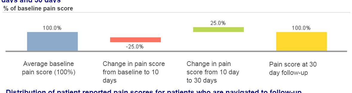
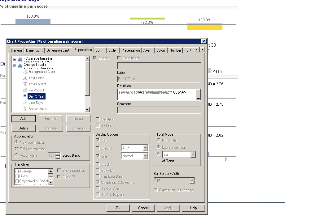
I'd keep it simple and use a bar chart with current and previous next to it, and then throw in the variance with an off set. Or even a combo chart with current and previous as a bar and the variance as a line between current/previous to see the trend.
Although using a bullet chart would work great for this as well:
There is an extension for the bullet chart on Qlik Branch you can check out, but it's an extension object. It can be found here: Qlik Branch
The other that might work better is another extension object called the double bar chart. I'd just list the current and previous in the bar and you can visually see the variance. That extension object can be found here:
- Mark as New
- Bookmark
- Subscribe
- Mute
- Subscribe to RSS Feed
- Permalink
- Report Inappropriate Content
How do I add the variance as an offset?
- Mark as New
- Bookmark
- Subscribe
- Mute
- Subscribe to RSS Feed
- Permalink
- Report Inappropriate Content
- Mark as New
- Bookmark
- Subscribe
- Mute
- Subscribe to RSS Feed
- Permalink
- Report Inappropriate Content
That doesn't really make any visual difference to me. It could be because the variance isn't that large.
- Mark as New
- Bookmark
- Subscribe
- Mute
- Subscribe to RSS Feed
- Permalink
- Report Inappropriate Content
Your offset is based on the formula you use to off set it. For this example you can see the off set better. You'll want to start yours to start at the top of your current or previous.