Unlock a world of possibilities! Login now and discover the exclusive benefits awaiting you.
- Qlik Community
- :
- All Forums
- :
- QlikView App Dev
- :
- change visualization of chart, whan a condition is...
- Subscribe to RSS Feed
- Mark Topic as New
- Mark Topic as Read
- Float this Topic for Current User
- Bookmark
- Subscribe
- Mute
- Printer Friendly Page
- Mark as New
- Bookmark
- Subscribe
- Mute
- Subscribe to RSS Feed
- Permalink
- Report Inappropriate Content
change visualization of chart, whan a condition is selected
Good Morning,
I need to have a different visualization when a condition in my list box is selected.
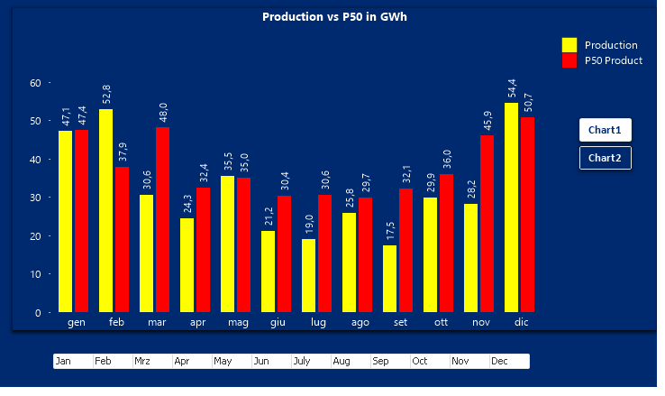
I have this chart:
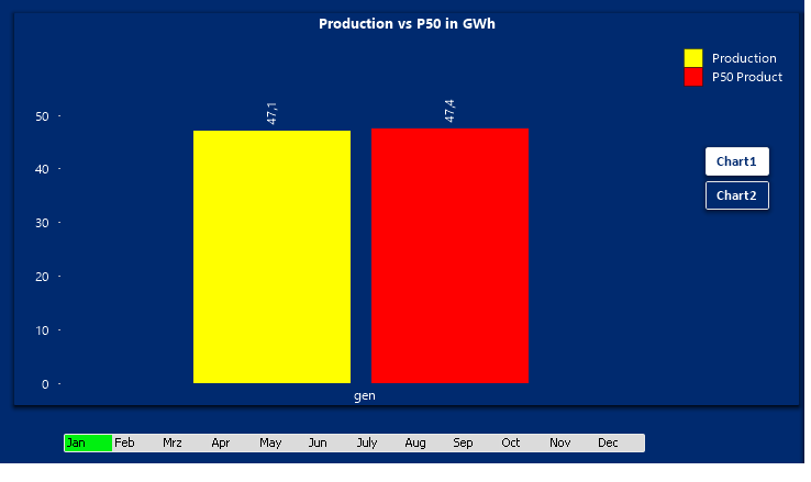
when I select the Jan month the result is this :
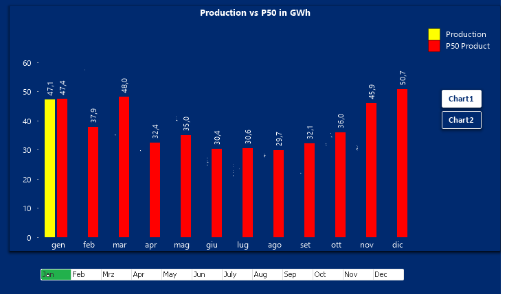
but I want that the chart is show in different way.
I would like that when I select a month the chart show me always the P50 Product value for every month but only the Production Value for the month that is selected.
someting like this (I used paint to do this is not in qlikview  )
)
Thanks for help .
Pasquale
Accepted Solutions
- Mark as New
- Bookmark
- Subscribe
- Mute
- Subscribe to RSS Feed
- Permalink
- Report Inappropriate Content
In the second expression (red bars), add set analysis to remove the selection for the month. The first expression will still follow your selections, but the second one won't. For example
=Sum({<Month = >} P50Product)
- Mark as New
- Bookmark
- Subscribe
- Mute
- Subscribe to RSS Feed
- Permalink
- Report Inappropriate Content
And your expressions in the chart look like....?
You should be able to use set analysis for what you want to achieve, something like this for the P50 expression:
Sum({<MonthField= >} P50Field)
i.e.clear the calendar fields the user may select in in the set expression.
- Mark as New
- Bookmark
- Subscribe
- Mute
- Subscribe to RSS Feed
- Permalink
- Report Inappropriate Content
In the second expression (red bars), add set analysis to remove the selection for the month. The first expression will still follow your selections, but the second one won't. For example
=Sum({<Month = >} P50Product)
- Mark as New
- Bookmark
- Subscribe
- Mute
- Subscribe to RSS Feed
- Permalink
- Report Inappropriate Content
Sorry Stefan. I see that you're picking up older & unanswered discussions, but unfortunately they end up at the top of the disucssion overview as soon as you start typing in the post editor...
- Mark as New
- Bookmark
- Subscribe
- Mute
- Subscribe to RSS Feed
- Permalink
- Report Inappropriate Content
Hi Peter, it is work. 
And if for example I would like to have all yellow bar until my selected months?
For example if I select Febrary I will have the yellow bar for the january and febrary and always all red bar..
Regards and really thanks
- Mark as New
- Bookmark
- Subscribe
- Mute
- Subscribe to RSS Feed
- Permalink
- Report Inappropriate Content
Good Morning, I can open agin the discussion and ask how I can do if I would like the visualization for the yellow bar, until my selected month?
For example if I select Febrary I will have the yellow bar for the january and febrary and always all red bar.
Regards
Pasquale
- Mark as New
- Bookmark
- Subscribe
- Mute
- Subscribe to RSS Feed
- Permalink
- Report Inappropriate Content
That's easy to do, but it may require some explaining.
Normally, expression colors in charts are set in the Colors tab of the chart. However, any expression you enter there will be evaluated for the whiole chart, and not bar-by-bar. The technique however starts here: set the default color for your expression in this tab.
Now go to the expressions tab, select the expression you want to change and open the expression properties tree. Enter your color expression in the Background color field. If you enter something like:
= IF (condition-for-special-color, SpecialColor)
then the chart will evaluate the background color for each dimension value and decide there and then whether to overrule the default color.
In your case, you could use an expression like this (or something similar):
=IF (Only({<Month = {'<=$(=Max(Month))'}>} Month), red())
The expression uses Only() 'only' ot figure out what the maximum selected value for Month is.
Best,
Peter
- Mark as New
- Bookmark
- Subscribe
- Mute
- Subscribe to RSS Feed
- Permalink
- Report Inappropriate Content
Good Morning Peter and really thanks for the replay.
Maybe I dind' t explane well what I need.
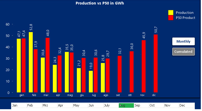
the image should will be the results if august is selected for example.
Maybe in the solution that you give me the chart showed all yellow bar until my select and the other red.
Regards
Pasquale
- Mark as New
- Bookmark
- Subscribe
- Mute
- Subscribe to RSS Feed
- Permalink
- Report Inappropriate Content
Oh. But this is simple set analysis. You want the yellow expression to stop displaying bars at the month you selected? You should be able to find a solution yourself.
Try this for the yellow expression:
=Sum({<Month = {'<=$(=Max(Month))'}>} Production)