Unlock a world of possibilities! Login now and discover the exclusive benefits awaiting you.
- Qlik Community
- :
- All Forums
- :
- QlikView App Dev
- :
- Re: line chart
- Subscribe to RSS Feed
- Mark Topic as New
- Mark Topic as Read
- Float this Topic for Current User
- Bookmark
- Subscribe
- Mute
- Printer Friendly Page
- Mark as New
- Bookmark
- Subscribe
- Mute
- Subscribe to RSS Feed
- Permalink
- Report Inappropriate Content
line chart
hi
i want to draw 3 line chart in my graph
dimensions:TIME
KPIs are 3:
Count({$<STATUS={'clos'}>}NUM_INCIDENT)
Count({$<STATUS={'BLOQUE'}>}NUM_INCIDENT)
Count({$<STATUS={'RESOLU'}>}NUM_INCIDENT)
but the problem i've got an incorrect line chart: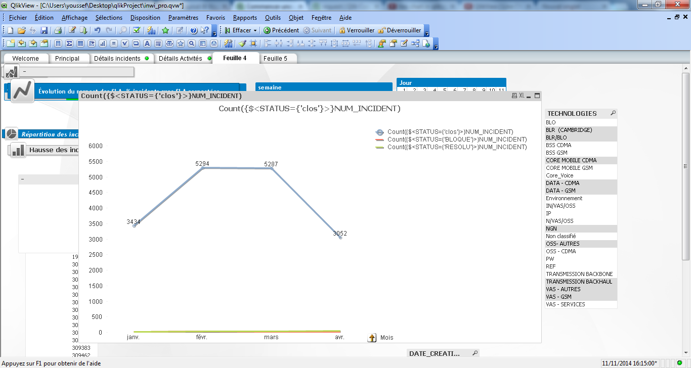
- Mark as New
- Bookmark
- Subscribe
- Mute
- Subscribe to RSS Feed
- Permalink
- Report Inappropriate Content
Try removing the sets and making STATUS a second demension
- Mark as New
- Bookmark
- Subscribe
- Mute
- Subscribe to RSS Feed
- Permalink
- Report Inappropriate Content
try and change your line chart to a straight table first to see what are your actual values for BLOQUE and RESOLU,
It maybe that the respective values are small to show on against your axis which is incremenatl by 500points
- Mark as New
- Bookmark
- Subscribe
- Mute
- Subscribe to RSS Feed
- Permalink
- Report Inappropriate Content
yes it works in a straignt table
- Mark as New
- Bookmark
- Subscribe
- Mute
- Subscribe to RSS Feed
- Permalink
- Report Inappropriate Content
Your graph is correct. Problem with the graph is that, the count of (clos) Num_Incident are very much high than BLOQUE and RESOLU ,NUM_INCIDENTS.
- Mark as New
- Bookmark
- Subscribe
- Mute
- Subscribe to RSS Feed
- Permalink
- Report Inappropriate Content
well then, its up to you to scale the other figures, put them in trellis or separate charts for each lines.