Unlock a world of possibilities! Login now and discover the exclusive benefits awaiting you.
- Qlik Community
- :
- All Forums
- :
- QlikView App Dev
- :
- Combo Charts
- Subscribe to RSS Feed
- Mark Topic as New
- Mark Topic as Read
- Float this Topic for Current User
- Bookmark
- Subscribe
- Mute
- Printer Friendly Page
- Mark as New
- Bookmark
- Subscribe
- Mute
- Subscribe to RSS Feed
- Permalink
- Report Inappropriate Content
Combo Charts
Hi all,
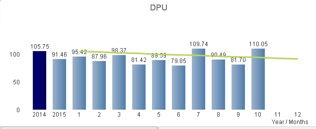
The bars show the defects per unit for each month, and the line shows the goal of how many defects per unit there should be for each month. I only want the line to show if there is a bar, so for November and December, since there is no data yet, I do not want the goal to show. When mid November comes and data is pulled and added as a bar in this chart, I'd then like the goal line to show. Is there anyway to put an if statement around the goal line to only show when there is a bar, or something like that?
Thanks,
Channing
- Tags:
- qlikview_scripting
Accepted Solutions
- Mark as New
- Bookmark
- Subscribe
- Mute
- Subscribe to RSS Feed
- Permalink
- Report Inappropriate Content
Maybe try this for your Defects Per Unit Goal expression:
if(defects per month > 0, defects per month goal, 0)
Also make sure 'Suppress Zero-Values' is selected.
Hope this helps!
- Mark as New
- Bookmark
- Subscribe
- Mute
- Subscribe to RSS Feed
- Permalink
- Report Inappropriate Content
Maybe try this for your Defects Per Unit Goal expression:
if(defects per month > 0, defects per month goal, 0)
Also make sure 'Suppress Zero-Values' is selected.
Hope this helps!
- Mark as New
- Bookmark
- Subscribe
- Mute
- Subscribe to RSS Feed
- Permalink
- Report Inappropriate Content
Assuming bar chart as first and line as second expression in the chart.
If (sum(column(1))=0,'', 'Your second expression')
Attach sample dashboard if above solution doesn't work.
- Mark as New
- Bookmark
- Subscribe
- Mute
- Subscribe to RSS Feed
- Permalink
- Report Inappropriate Content
Channing,
Glad I could help with your issue. I do have one question for you. How did you make both the year and the month numbers (I am assuming they are the months of the current year) dimensions in the chart that is listed in the image above?
Thanks!
- Mark as New
- Bookmark
- Subscribe
- Mute
- Subscribe to RSS Feed
- Permalink
- Report Inappropriate Content
Hello!
So my data is structured as a star schema with a fact table linking all of the dimensions, as shown below.
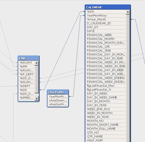
The Calendar has basically any fields you could think of that relate to a date, as shown below.
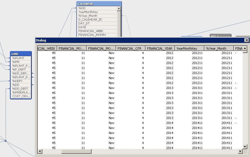
The calendar table has a YearMonthKey which is the year and month combined as shown above.
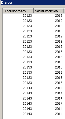
Then, linked to the calendar is a ChartTable which is shown below, which links to the calendar using the YearMonthKey. The xAxisDimension field is full of years and also months. If you keep scrolling down, you will see the YearMonthKey being, for example, 20123, and the xAxisDimension being 3.
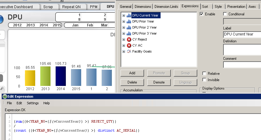
When making a chart, my dimension is the xAxisDimension field. I made variables vCurrentYear which is 2015, vPriorYear for 2014, vPrior2Year which is 2013, and vPrior3Year which is 2012. As you see below, I make an expression for each variable. Below shows the current year expression, and for each of the DPU Prior Year and below I just change the variables.
Please let me know if you have any other questions or if you need more explanation!
Channing
- Mark as New
- Bookmark
- Subscribe
- Mute
- Subscribe to RSS Feed
- Permalink
- Report Inappropriate Content
Channing,
Thanks for the explanation. That is a really cool solution!