Unlock a world of possibilities! Login now and discover the exclusive benefits awaiting you.
- Qlik Community
- :
- All Forums
- :
- QlikView App Dev
- :
- Re: Conditional based display of Traffic Lights in...
- Subscribe to RSS Feed
- Mark Topic as New
- Mark Topic as Read
- Float this Topic for Current User
- Bookmark
- Subscribe
- Mute
- Printer Friendly Page
- Mark as New
- Bookmark
- Subscribe
- Mute
- Subscribe to RSS Feed
- Permalink
- Report Inappropriate Content
Conditional based display of Traffic Lights in data
I have this task in hand since quite sometime now and it still remains only half solved. Coordinated with some experienced Qlikview developers in my team as well but they haven't been able to crack this completely either over the last 2 days. I had posted this issue earlier over here as well but it remained unresolved as i didn't attach the Table files or qvw.
I am attaching the Table File that goes in QV & the qvw as well with the full explanation of the issue in hand.
The problem is as follows,
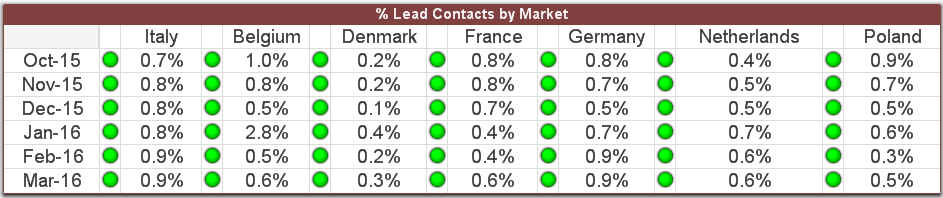
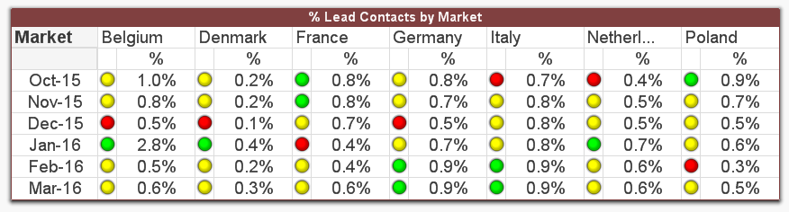
In the above chart every Market has a calculated field for 6 months.
Taking Belgium Market as an example(It needs to be done similarly for all Markets)
What needs to be done is mentioned below step by step taking Belgium Market as an example:
1)Find the Average(Maximum 3 Nos) & Average of (Minimum 2 nos.) at individual Market level and use these as a Benchmark
2)In case of Belgium it will be Average of (2.8%,0.8%,0.6%) = 1.53% as these are the maximum 3 nos. in Belgium & Average of (0.5%,0.5%) = 0.5% as these are the minimum 2 nos. here.
3)Any of the nos. >=1.53% should be shown in green , Any nos. <=0.5% shown be shown in red , Any nos. between 1.53% & 0.5% should be shown in yellow.
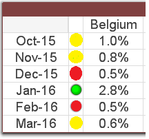
Result should look like this for Belgium for instance:
Following is half the solution i have in hand.It is not exactly a complete solution as explained further :
Average of Minimum 2 Nos. for Belgium:-
=Sum({<Market={'Belgium'}>}if(aggr(rank(-Numbers),Market,Month)<=2,Numbers))/2
Average of Maximum 3 Nos. for Belgium:-
=Sum({<Market={'Belgium'}>}if(aggr(rank(Numbers),Market,Month)<=3,Numbers))/3
In this case the above solution works perfectly BUT ONLY IF "Numbers" is a simple numeric column in the data. In my case however all 6 values for every Market are calculated and not straight forward numbers !
- Tags:
- qlikview_scripting
Accepted Solutions
- Mark as New
- Bookmark
- Subscribe
- Mute
- Subscribe to RSS Feed
- Permalink
- Report Inappropriate Content
- Mark as New
- Bookmark
- Subscribe
- Mute
- Subscribe to RSS Feed
- Permalink
- Report Inappropriate Content
Check the attached
- Mark as New
- Bookmark
- Subscribe
- Mute
- Subscribe to RSS Feed
- Permalink
- Report Inappropriate Content
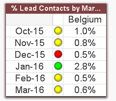
Or this in the pivot table:
=If(Sum([Unique Leads 1 Month])/Sum([Active Contacts]) >=
Avg(TOTAL <Market> Aggr(If(Rank(Sum([Unique Leads 1 Month])/Sum([Active Contacts])) <= 3,
Sum([Unique Leads 1 Month])/Sum([Active Contacts])), Market, Month)),
'qmem://<bundled>/BuiltIn/led_g.png',
If(Sum([Unique Leads 1 Month])/Sum([Active Contacts]) <=
Avg(TOTAL <Market> Aggr(If(Rank(-Sum([Unique Leads 1 Month])/Sum([Active Contacts])) <= 2,
Sum([Unique Leads 1 Month])/Sum([Active Contacts])), Market, Month)),
'qmem://<bundled>/BuiltIn/led_r.png',
'qmem://<bundled>/BuiltIn/led_y.png'))
- Mark as New
- Bookmark
- Subscribe
- Mute
- Subscribe to RSS Feed
- Permalink
- Report Inappropriate Content
Remarkable ! Thanks a ton!
- Mark as New
- Bookmark
- Subscribe
- Mute
- Subscribe to RSS Feed
- Permalink
- Report Inappropriate Content
Not a problem at all  .
.
The pivot table option is not better, instead of repeating your expression for each market?
- Mark as New
- Bookmark
- Subscribe
- Mute
- Subscribe to RSS Feed
- Permalink
- Report Inappropriate Content
Yes indeed! i used the pivot table option method to display the indicators ! Thanks
- Mark as New
- Bookmark
- Subscribe
- Mute
- Subscribe to RSS Feed
- Permalink
- Report Inappropriate Content
Oh okay, you marked the other one as the correct, so I wondered if that was the option you went ahead with.
Its good to know the pivot table option is what you ended up using