Unlock a world of possibilities! Login now and discover the exclusive benefits awaiting you.
- Qlik Community
- :
- All Forums
- :
- QlikView App Dev
- :
- Re: How to Use monochrome color in blcok chart
- Subscribe to RSS Feed
- Mark Topic as New
- Mark Topic as Read
- Float this Topic for Current User
- Bookmark
- Subscribe
- Mute
- Printer Friendly Page
- Mark as New
- Bookmark
- Subscribe
- Mute
- Subscribe to RSS Feed
- Permalink
- Report Inappropriate Content
How to Use monochrome color in blcok chart
I have plot block chart and I want to use Grey color in block chart on the basis of minimum count to maximum count.
I have data and containing order no. i want to show light grey for minimum order count and Dark to maximum order count . Light to Dark on the basis of order count.
I used expression in block chart for calculating % in block chart
=Count({<Table={'ORFT_comment_tbl'}>}Order_Number)
Color code are below
Set vwg1= rgb(220, 216, 214);
Set vwg2=rgb(197, 190, 186);
Set vwg3=rgb(173, 165, 158);
Set vwg4=rgb(150, 139, 131);
Set vwg5=rgb(124, 113, 105);
Set vwg6=rgb(97, 88, 82);
I want to show monochrome color code ( War Grey ) like
=if(Order_Number<10,$(vwg1),
if(Order_Number<15,$(vwg12),
if(Order_Number<20,$(vwg3),
if(Order_Number<30,$(vwg4),
if(Order_Number<50,$(vwg5),
$(vwg6))))))
Table Query is as below
ORFT_comment_tbl:
CrossTable(Status,Value,10)
LOAD Order_Number,
MAN_Contry_Code,
Comment,
If(MAN_Contry_Code='KO','Kolumbia',ApplyMap('CountryMap',Upper(MAN_Contry_Code),'Not Defined')) as Country,
ApplyMap('RegionMap',Upper(MAN_Contry_Code),'Not Defined') as Region,
ApplyMap('Operatingcountrymap',Upper(MAN_Contry_Code),'ALL') as [Operating country],
ApplyMap('Region_originalmap',Upper(MAN_Contry_Code),'Not Defined') as Region_original,
USERID,
'ORFT_comment_tbl'as Table,
Date(DATE_Auto,'DD-MM-YYYY') as %DATE_KEY,
//TIME_Auto,
// Region,
Credit_block,
Incomplete_BOM,
Legal_block,
Order_placed_inside_DLT,
Order_placed_without_matching_forecast,
Other,
TL_ULO_not_respected,
ATP_fails,
Wrong_missing_Incoterms,
Wrong_missing_payment_terms,
Wrong_missing_price,
Wrong_missing_route,
Wrong_missing_vendor_info_record
FROM
[\\FRIAPFIL04.EAME.SYNGENTA.ORG\Poland$\SCM\ORFT_comment_tbl.xls]
(biff, embedded labels, table is ORFT_comment_tbl$);
ORFT_comment_tbl_1:
NoConcatenate
LOAD *
Resident ORFT_comment_tbl
Where Len(Trim(Value)) > 0;
DROP Table ORFT_comment_tbl;
Concatenate(ORFT_comment_tbl_1)
ProcesIssue_comment_tbl:
LOAD
Order_Delivery_number as Order_Number,
Country_Code,
Who as [Team Responsible],
Issue_type,
Comment,
ApplyMap('SupportMap',Upper(Order_Delivery_number),'Not Defined') as Plants_Name,
If(Country_Code='KO','Kolumbia',ApplyMap('CountryMap',Upper(Country_Code),'Not Defined')) as Country,
ApplyMap('RegionMap',Upper(Country_Code),'Not Defined') as Region,
ApplyMap('Operatingcountrymap',Upper(Country_Code),'ALL') as [Operating country],
ApplyMap('Region_originalmap',Upper(Country_Code),'Not Defined') as Region_original,
USERID,
Date(DATE_Auto,'DD-MM-YYYY') as %DATE_KEY,
'ProcesIssue_comment_tbl' as Table
// TIME_Auto,
// Region,
FROM
[\\FRIAPFIL04.EAME.SYNGENTA.ORG\Poland$\SCM\ProcesIssue_comment_tbl.xls]
(biff, embedded labels, table is ProcesIssue_comment_tbl$);
Can you please suggest how can use monochrome color ( like Heat map color light to Dark Color ) for block chart, appreciate for your quick response.
Can you please help us to guide or suggest as how to use monochrome color in block chart
- Tags:
- qlikview_scripting
- « Previous Replies
-
- 1
- 2
- Next Replies »
Accepted Solutions
- Mark as New
- Bookmark
- Subscribe
- Mute
- Subscribe to RSS Feed
- Permalink
- Report Inappropriate Content
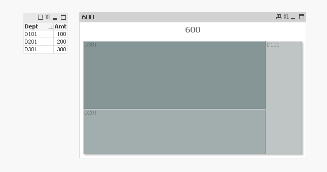
Thanks Jerry..It's working and I am getting monochrome color.
In the screen shot showing Darken and light color only because there is not much difference in percentage (like 12 % and 5.6% also showing same light color).
If there is difference maximum differance in percentage then getting Dark and light color ( like Dark Grey color for 58% and light grey color for 12 %)
Is it possible to show color variation between minimum difference of percentage (like 12 % and 5.6% also showing same light color).
Thank you for solution.
- Mark as New
- Bookmark
- Subscribe
- Mute
- Subscribe to RSS Feed
- Permalink
- Report Inappropriate Content
Check out the Colormix1 formula, https://help.qlik.com/en-US/sense/April2018/Subsystems/Hub/Content/ChartFunctions/ColorFunctions/col....
I used the Colormix1 formula: =ColorMix1(Sum(Amt)/Sum(Total Amt),RGB(220,220,220),RGB(47,79,79)) to produce a gray-scale block chart.
- Mark as New
- Bookmark
- Subscribe
- Mute
- Subscribe to RSS Feed
- Permalink
- Report Inappropriate Content
Thanks Jerry Jackson for quick response..
i will check and let you know but I am using below formula to Count the Order number by Status.
I have used cross table for Status, you will understand once you check the Script as above.
=Count({<Table={'ORFT_comment_tbl'}>}Order_Number)
Can you please suggest how to use your formula in above calculation.
- Mark as New
- Bookmark
- Subscribe
- Mute
- Subscribe to RSS Feed
- Permalink
- Report Inappropriate Content
I think that Count({<Table={'ORFT_comment_tbl'}>}Order_Number)/Count(Total Order_Number) would give you a percentage.
The colormix1 will use a number between 0 and 1 to determine the color to display.
In my example,
: =ColorMix1(Count({<Table={'ORFT_comment_tbl'}>}Order_Number)/Count(Total Order_Number),RGB(220,220,220),RGB(47,79,79))
- Mark as New
- Bookmark
- Subscribe
- Mute
- Subscribe to RSS Feed
- Permalink
- Report Inappropriate Content
Thanks for Reply but not getting result by using above formula..
can you suggest others..
- Mark as New
- Bookmark
- Subscribe
- Mute
- Subscribe to RSS Feed
- Permalink
- Report Inappropriate Content
Can you show a screenshot of the results and the formula?
- Mark as New
- Bookmark
- Subscribe
- Mute
- Subscribe to RSS Feed
- Permalink
- Report Inappropriate Content
PFA screen shot and Formula which was used.
=ColorMix1(Count({<Table={'ORFT_comment_tbl'}>}Order_Number)/Count({<Table={'ORFT_comment_tbl'}>}Total Order_Number),RGB(220,220,220),RGB(47,79,79))
=ColorMix1(Count({<Table={'ORFT_comment_tbl'}>}Order_Number)/Count(Total Order_Number),RGB(220,220,220),RGB(47,79,79))
- Mark as New
- Bookmark
- Subscribe
- Mute
- Subscribe to RSS Feed
- Permalink
- Report Inappropriate Content
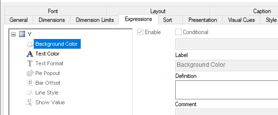
PFA with Pop up message while keep cursor on block chart.
- Mark as New
- Bookmark
- Subscribe
- Mute
- Subscribe to RSS Feed
- Permalink
- Report Inappropriate Content
Is the colormix formula in the Background color definition?
- Mark as New
- Bookmark
- Subscribe
- Mute
- Subscribe to RSS Feed
- Permalink
- Report Inappropriate Content
Thanks Jerry..It's working and I am getting monochrome color.
In the screen shot showing Darken and light color only because there is not much difference in percentage (like 12 % and 5.6% also showing same light color).
If there is difference maximum differance in percentage then getting Dark and light color ( like Dark Grey color for 58% and light grey color for 12 %)
Is it possible to show color variation between minimum difference of percentage (like 12 % and 5.6% also showing same light color).
Thank you for solution.
- « Previous Replies
-
- 1
- 2
- Next Replies »