Unlock a world of possibilities! Login now and discover the exclusive benefits awaiting you.
- Qlik Community
- :
- All Forums
- :
- QlikView App Dev
- :
- Re: Sow Gaps on Time Field
- Subscribe to RSS Feed
- Mark Topic as New
- Mark Topic as Read
- Float this Topic for Current User
- Bookmark
- Subscribe
- Mute
- Printer Friendly Page
- Mark as New
- Bookmark
- Subscribe
- Mute
- Subscribe to RSS Feed
- Permalink
- Report Inappropriate Content
Sow Gaps on Time Field
Hello Everyone,
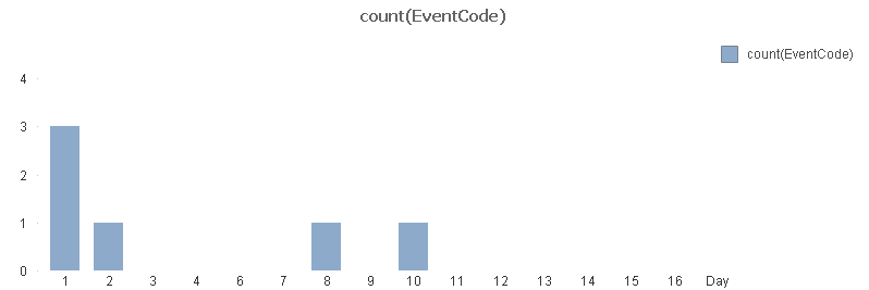
I have some data about events that happen in several days. In my chart, in order to show graphically if they are close to each order I want show the days with 0 as value. To do it, I need to have at least the register of the dais without events. The point is that if I select one EventCode that is not in all the days, those days disappear. For this i fond 2 solutions:
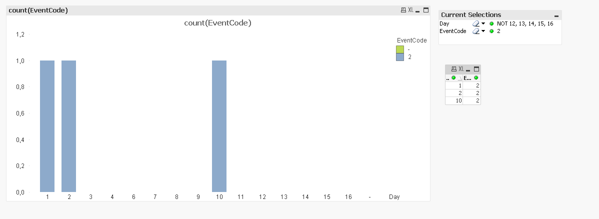
1 - Use the "show all values" on the Day dimension.
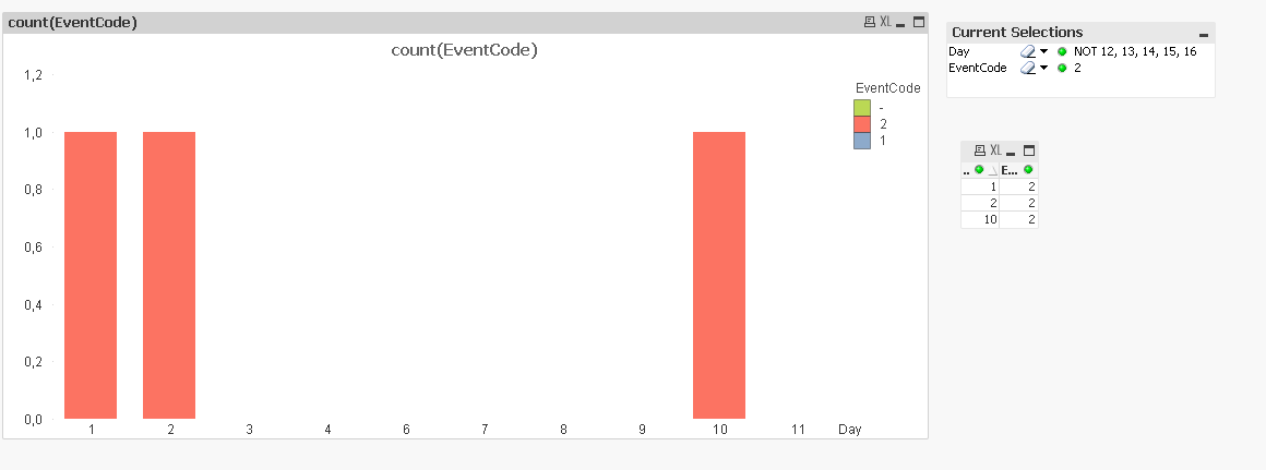
2 - Use a hidden expression with that omits the EventCode Field like, sum({<Event=>} 1)
But i can not use any of this two options for the following reasons:
1.1 - I have a whole Year of data, using this solution find the days with events starts to be complicated (obviously using the scroll bar)
2.2 - The hidden expression works fine but if you have EventCode as a secondary dimension (to know which of the selected events is happening) all the different events appear on the legend. Given that on my QV exists like 50 different events, the user needs to see only the selected ones.
Here is a QV and Dummy data to test my problem.
Data:
LOAD *
Inline [
Day,EventCode
1,1
1,1
1,2
2,2
8,1
10,2
];
Concatenate(Data)
LOAD *
Inline [ Day
3
4
6
7
9
11
12
13
14
15
16
];
Is there any other way that let me select the EventCode without having to see all the days and or having to see all the EventCodes on the legend?
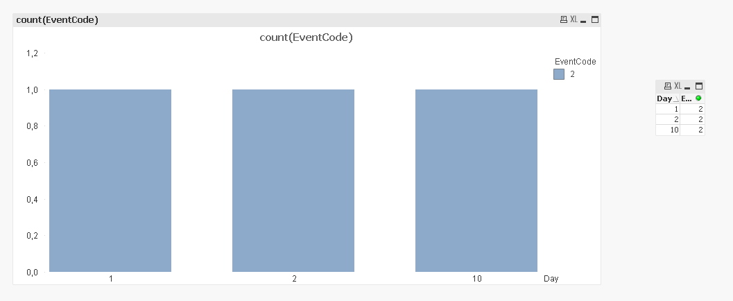
Pictures of What I see electing EventCode 2 and Days from 1 to 11:
0: If I don't do anything:
1: Solution1
2: Solution2
I also add a QV with this data.
- Tags:
- qlikview_scripting
- Mark as New
- Bookmark
- Subscribe
- Mute
- Subscribe to RSS Feed
- Permalink
- Report Inappropriate Content
Based on your input data, can you provide example if any event code is selected what representation do you want?
- Mark as New
- Bookmark
- Subscribe
- Mute
- Subscribe to RSS Feed
- Permalink
- Report Inappropriate Content
I have modified the starting post  I think this way will be more clear for anyone who reads the post.
- Mark as New
- Bookmark
- Subscribe
- Mute
- Subscribe to RSS Feed
- Permalink
- Report Inappropriate Content
Hi Eric,
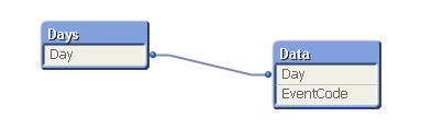
I changed your script so the two tables were not concatenated to get this data model that, to me, makes more sense.
I can make this chart:
There are two expressions in the chart. The second one is just 1, that's all. Check the Invisible checkbox and choose style Stacked.
Hope this helps.
Andrew
- Mark as New
- Bookmark
- Subscribe
- Mute
- Subscribe to RSS Feed
- Permalink
- Report Inappropriate Content
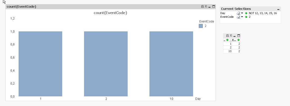
Maybe like attached?
- Mark as New
- Bookmark
- Subscribe
- Mute
- Subscribe to RSS Feed
- Permalink
- Report Inappropriate Content
I think it's good and with this dummy data no problem but when you have the days in format like "2017/10/04" the day is converted to "43005" (which is the numeric form of the Day). This also forbids you to use the scrollbar and if you want to go back in time with the same zoom you have to go by selecting and unselecting days which is not much comfortable to use when they are in number form :S.
- Mark as New
- Bookmark
- Subscribe
- Mute
- Subscribe to RSS Feed
- Permalink
- Report Inappropriate Content
I can not get to your solution. I am with the two tables and also with this number 1 without expression and set analysis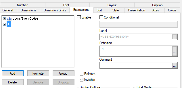
- Mark as New
- Bookmark
- Subscribe
- Mute
- Subscribe to RSS Feed
- Permalink
- Report Inappropriate Content
I have the same problem, please help!