Unlock a world of possibilities! Login now and discover the exclusive benefits awaiting you.
- Qlik Community
- :
- All Forums
- :
- QlikView App Dev
- :
- Re: Stacked graph with counted reference line
- Subscribe to RSS Feed
- Mark Topic as New
- Mark Topic as Read
- Float this Topic for Current User
- Bookmark
- Subscribe
- Mute
- Printer Friendly Page
- Mark as New
- Bookmark
- Subscribe
- Mute
- Subscribe to RSS Feed
- Permalink
- Report Inappropriate Content
Stacked graph with counted reference line
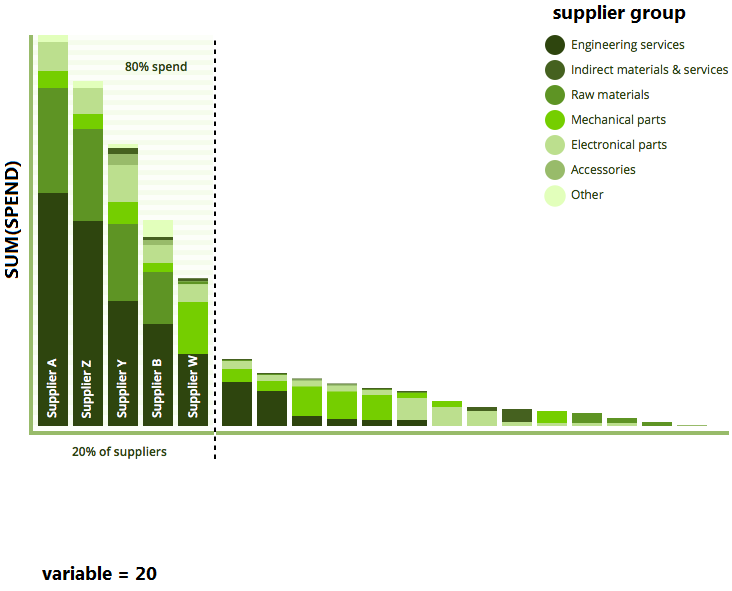
I am trying to re create this graph but cannot get the reference line to work.
I want spend up the y axis (expression: SUM(spend)), then across the x axis i want supplier name and it stacked by supplier group.
Now the difficult part, i want to have a variable which can be set from a slider between 1 to 100 (not difficult) which will be used in an x axis reference line that splits it by count([supplier name]) and the reference line text shows what percentage of the spend is in that percentage of suppliers.
For example the example below the variable is set to 20, so i want the reference line to be set on the x axis to 20% of the total suppliers used and then the reference line text is calculated that 20% of the suppliers = 80% of the spend.
- Mark as New
- Bookmark
- Subscribe
- Mute
- Subscribe to RSS Feed
- Permalink
- Report Inappropriate Content
Perhaps this blog post helps: Recipe for an ABC Analysis
talk is cheap, supply exceeds demand
- Mark as New
- Bookmark
- Subscribe
- Mute
- Subscribe to RSS Feed
- Permalink
- Report Inappropriate Content
tried these and cant get them to work in graph
- Mark as New
- Bookmark
- Subscribe
- Mute
- Subscribe to RSS Feed
- Permalink
- Report Inappropriate Content
anyone?
- Mark as New
- Bookmark
- Subscribe
- Mute
- Subscribe to RSS Feed
- Permalink
- Report Inappropriate Content