Unlock a world of possibilities! Login now and discover the exclusive benefits awaiting you.
- Qlik Community
- :
- All Forums
- :
- QlikView
- :
- Dates issue revisited
- Subscribe to RSS Feed
- Mark Topic as New
- Mark Topic as Read
- Float this Topic for Current User
- Bookmark
- Subscribe
- Mute
- Printer Friendly Page
- Mark as New
- Bookmark
- Subscribe
- Mute
- Subscribe to RSS Feed
- Permalink
- Report Inappropriate Content
Dates issue revisited
Hi all,
I wondered if anyone had come up with a better solution for the problem of visualising data with dates on a chart.
The situation I'm talking about is where you want to show data for a time period, e.g. a week, where you want Monday-Sunday displayed but you only have data for Mon, Wed, Thurs. Obviously, this problem is extended to days of the year, months etc...
Normally we create a calendar table that doesn't link, using this date as the dimension and then an expression like:
SUM ( IF(trans_date = calendar_date, SALES))
This works fine for smaller data sets. When the data set grows and the calculations become more complex, an IF statement here that essentially forces a join is VERY slow and renders some applications unusable.
This is something that I want to do all the time. In this example I would never want a chart that just showed Mon, Wed, Thurs, I would want to display every day of that week but only have bars (if it were a bar chart) on the days where there were sales.
If anyone has a slick, well performing solution I'd love to hear it!
Thanks
Gareth
ps - i realise this has been discussed a lot but to my mind no usable solution has been found for larger data sets.
- « Previous Replies
-
- 1
- 2
- Next Replies »
- Mark as New
- Bookmark
- Subscribe
- Mute
- Subscribe to RSS Feed
- Permalink
- Report Inappropriate Content
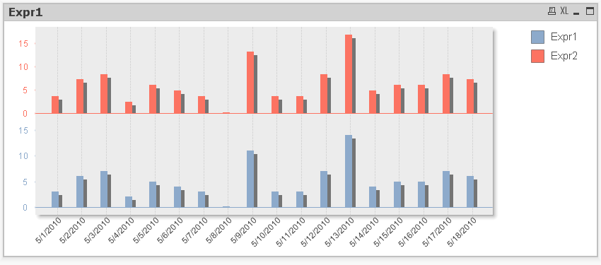
Actually this has created a second problem. In that same QV document, if you create a second expression (for example):
COUNT ( [Order Number]) *1.2
If the axis is set to continuous then the bars ovelap completely and one series is essentially hidden behind the other one. The 'Bar Settings' aren't available under properties, so how do I get it to look like a discrete axis again while remaining essentially continuous?
Any ideas?
Thanks
Gareth
- Mark as New
- Bookmark
- Subscribe
- Mute
- Subscribe to RSS Feed
- Permalink
- Report Inappropriate Content
You may have to go back to my original idea of adding a small number to the sum and forgetting the continuous checkbox.
Another idea would be to do something similar in the script ...
SampleRange:
LOAD min(CalendarDate) as rangeSt, max(CalendarDate)-min(CalendarDate) as rangeCount resident SampleData;
let x = peek('rangeSt',0);
TmpRangeData:
LOAD
Date($(x) + RowNo()-1) as tmpCalDate,
0.0001 as Details
autogenerate peek('rangeCount',0)+1;
right join (SampleData)
load tmpCalDate as CalendarDate, Details as OrderOverride resident TmpRangeData;
This just adds a new column to the data filling in the blanks between earliest and latest dates. All you have to do then is use this in an expression like this ...
=numMax(count([Order Number]),OrderOverride)
flipside
- Mark as New
- Bookmark
- Subscribe
- Mute
- Subscribe to RSS Feed
- Permalink
- Report Inappropriate Content
Thank you I can see that this workaround will work in practice, but it is less than ideal.
It's a shame that Qliktech didn't foresee that people would want to include dates in this way and make it a simple procedure.
If anyone else has a slick way of achieving this I'm really keen to hear about it.
Cheers
G
- Mark as New
- Bookmark
- Subscribe
- Mute
- Subscribe to RSS Feed
- Permalink
- Report Inappropriate Content
Ditto. I'm having the exact same issue. We're still on qv9 at the moment, but i wonder if v10 or v11 have fixed this issue?
- Mark as New
- Bookmark
- Subscribe
- Mute
- Subscribe to RSS Feed
- Permalink
- Report Inappropriate Content
Definitely the same in v10.
You can do something like this using Continuous and split axes ...
- « Previous Replies
-
- 1
- 2
- Next Replies »