Suggest an Idea

Vote for your favorite Qlik product ideas and add your own suggestions.

Qlik Sense - Line Chart areas transparency/opacity effects

francesco_menin
Partner - Creator III

Qlik Sense - Line Chart areas transparency/opacity effects

Hi all,
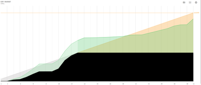
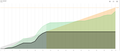
working on a customer project I've been asked many times if it is possible to force areas on overlapping measure lines to have the prevalence of the color of a specific on top of others that might render as current style (semi-transparent).
Or have the possibility to adjust the transparency / opacity of the area below the line.

This way it could be easier to highlight some data on top of other data and not have ambiguous colors on the charts.
MicrosoftTeams-image (19).pngmight look better like this:
MicrosoftTeams-image (19)_example.png


 Thanks

Tags (2)
10 Comments
Meghann_MacDonald

Hi @francesco_menin ,

Thank you for submitting this idea. The concern for setting transparency and opacity of lines in line charts has already been raised here: https://community.qlik.com/t5/Ideas/Ability-to-bring-the-reference-line-front-or-sent-it-to-back-the...

Please show your support for this idea by liking and/or commenting on tha post. 

Meghann

Status changed to: Closed - Duplicate
francesco_menin
Partner - Creator III

Hello @Meghann_MacDonald , my request does not concern reference lines but measures.

Meghann_MacDonald
 
Status changed to: Open - New
Patric_Nordstrom
Employee
Employee

Thank you for your feedback on ways to improve our product. While this is something we understand would be useful, it's not on the short-term roadmap. Please continue to show your support for this idea.

The transparency is there so the areas can distinguished but setting could be nice.

It is of course possible to mimic no transparency by using the stacked mode and "removing" the overlaps with calculations in the expressions.

Thanks,
Patric

Status changed to: Open - Collecting Feedback
fmarvnnt
Partner - Creator III

What about the WOW effect?

joao_soares_novartis
Contributor
Contributor

Independently of stacked mode, an option to control area transparency 0-100% it would be great.

Having that option in stacked mode, with transparency set to 0 %, the areas would be same color than line and this would be great because legend colors would be both line and area color. As of now, the legend shows the line color and areas are lighter that it.

francesco_menin
Partner - Creator III

thanks @joao_soares_novartis !

100% agree, it makes the whole chart more readable too

Yuki_Suzuki
Employee
Employee

My client has the same request.
They want the lines and areas to appear in the same color.

Meghann_MacDonald

From now on, please track this idea from the Ideation portal. 

Link to new idea

Meghann

NOTE: Upon clicking this link 2 tabs may open - please feel free to close the one with a login page. If you only see 1 tab with the login page, please try clicking this link first: Authenticate me! then try the link above again. Ensure pop-up blocker is off.

Ideation
Explorer II
Explorer II
 
Status changed to: Closed - Archived