Unlock a world of possibilities! Login now and discover the exclusive benefits awaiting you.
Suggest an Idea
Vote for your favorite Qlik product ideas and add your own suggestions.
- Qlik Community
- :
- Support
- :
- Ideation
- :
- Submit an Idea
- :
- Ideation
- :
- Ideas
- :
- Straight Table: Option to fill missing values with...
- Subscribe to RSS Feed
- Mark as New
- Mark as Read
- Bookmark
- Subscribe
- Printer Friendly Page
- Report Inappropriate Content
Straight Table: Option to fill missing values with zeros in mini line chart (trend minichart)
- Mark as New
- Bookmark
- Subscribe
- Mute
- Subscribe to RSS Feed
- Permalink
- Report Inappropriate Content
Straight Table: Option to fill missing values with zeros in mini line chart (trend minichart)
Imagine we have data sales of three products (A,B,C) aggregated by month.
For product A sales are for: January, February, March and April (4 months)
For Product B sales are for: all months (5 months)
For Product C sales are for: January, March, May (3 months)
Then we add mini line chart bar in the table and we will see data points for each product but only if we have corresponding sales value in month – 4 points for A, 5 points for B, 3 points for C. If there are no sales value in particular month, point isn’t displayed.
This situation is hard to analyze. We don’t really know what these points are for. For example, if we have only 3 points for product C, we can only guess the months: it can be January, February, March or January, February and May etc. Of course if we perform analysis deeply, we will investigate months with no sales of the product. For example, we can add new visualization, line chart, and select to display missing values as zeros or as connections.
But there is no way to do the same thing with mini line chart. We don’t have legend, we don’t know what points really are, or which month they are reffering, and points in each row are not aligned in the same manner. Finally we don’t have option to display missing values as zeros.
My idea is to add option to fill missing values with zeros in mini line chart. We will have points aligned and continuous and we will have ability to compare sales of products and check the trend.
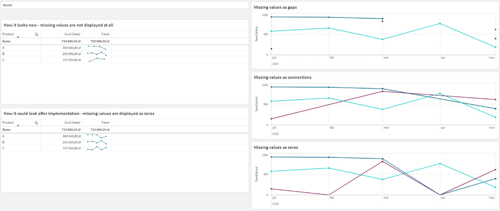
I’ve prepared a screenshot of my idea:
Top left table with mini line chart – it doesn’t display missing values at all – if I have 3 values (3 months of sales for product), it will display 3 points.
On the right side I have 3 line charts with 3 variants of displaying missing values: as gaps, as connections and as zeros. And the last option is the most interesting to implement in mini line chart.
Bottom left table is a visualized implementation of my idea. As you can see, each trend has 5 values, everything is aligned and comparable. You have clear view of sales in required timeline, there are no gaps or values without connection to another value.
I hope you can understand what I mean.
You must be a registered user to add a comment. If you've already registered, sign in. Otherwise, register and sign in.
