Unlock a world of possibilities! Login now and discover the exclusive benefits awaiting you.
- Qlik Community
- :
- Discover
- :
- Blogs
- :
- Product
- :
- Support Updates
- :
- SaaS editions of Qlik Sense – July 2020 Update
- Subscribe to RSS Feed
- Mark as New
- Mark as Read
- Bookmark
- Subscribe
- Printer Friendly Page
- Report Inappropriate Content
Hello Qlik Users!
The July 2020 update for SaaS has been out for a couple weeks now and included the following updates:
- The ability to add Monitoring Charts to the Hub
- Credit Card update capabilities in My Qlik
- Microsoft Dynamics CRM connector is now available via the Data Manager
- Read-only support for Microsoft OneDrive
- QlikView document consumers now have the ability to export data to Excel and create personal bookmarks (for more information on the QlikView functionality, check out this post from the Qlik Product Innovation Blog)
If you are a Qlik Sense Business user or Qlik Sense Enterprise SaaS, you should take a look at the Monitoring Charts. This new feature gives you the ability to add charts directly to the Hub so you can check the status of your company’s most pressing KPIs upon logging into the environment.
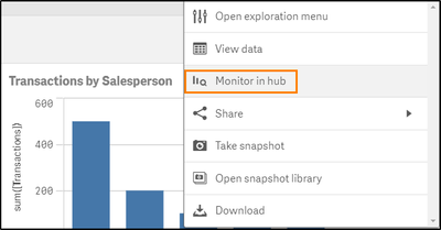
To add a chart to the Hub, make your selections to view the data as you would like. Then right click the chart and choose Monitor in Hub.
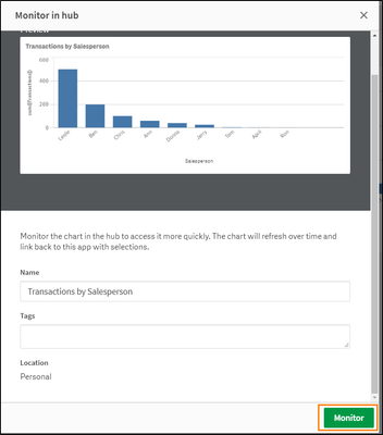
Adjust the name of the chart or add tags if desired. All monitoring charts you create will be saved to your Personal space. Click Monitor when finished.
The monitoring charts can be viewed on the Home page of the Hub under Your Charts or on the Explore page. Make sure you are viewing your Personal space and filter based on charts when using the Explore page.
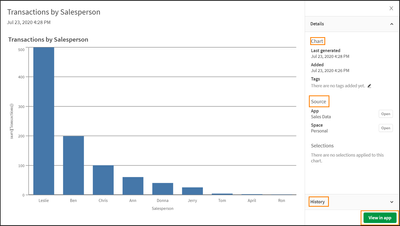
Hovering over the chart will allow you to expand the chart to a larger size when clicking View Chart. This view will also give you details about the chart including when the chart was created, the name of the source app, and what selections were used to create the chart, if any. The History option at the bottom of the window will retain the 10 previous snapshots of the chart and clicking View in app at the bottom, will open the app to the sheet the chart resides.
If you no longer wish to see the chart in your Hub, simply click the ellipsis (…) at the bottom of chart and choose Delete.
I think this is a great way to get quick access to important data. What do you all think?
For more information on this feature, please see Monitoring visualizations in cloud hubs.
Please give this post a like if you found it helpful! Subscribe to the Qlik Support Updates Blog by clicking the green Subscribe button if you haven’t already. Also, please let us know if you have any questions or leave your feedback in the comments.
Thank you for choosing Qlik!
Kind Regards,
Qlik Global Support
You must be a registered user to add a comment. If you've already registered, sign in. Otherwise, register and sign in.


