Unlock a world of possibilities! Login now and discover the exclusive benefits awaiting you.
- Qlik Community
- :
- Forums
- :
- Analytics & AI
- :
- Products & Topics
- :
- Visualization and Usability
- :
- Change color in charts with conditional dimensions...
- Subscribe to RSS Feed
- Mark Topic as New
- Mark Topic as Read
- Float this Topic for Current User
- Bookmark
- Subscribe
- Mute
- Printer Friendly Page
- Mark as New
- Bookmark
- Subscribe
- Mute
- Subscribe to RSS Feed
- Permalink
- Report Inappropriate Content
Change color in charts with conditional dimensions and aggregations
I am trying with no success to create: 1) A line chart with personalized colors based in a condition, and 2) A combo chart whit conditional dimensions and colors. I am attaching a reproducible Qlik Sense example with my approaches that were not correct.
1) A line chart with personalized colors based in a condition
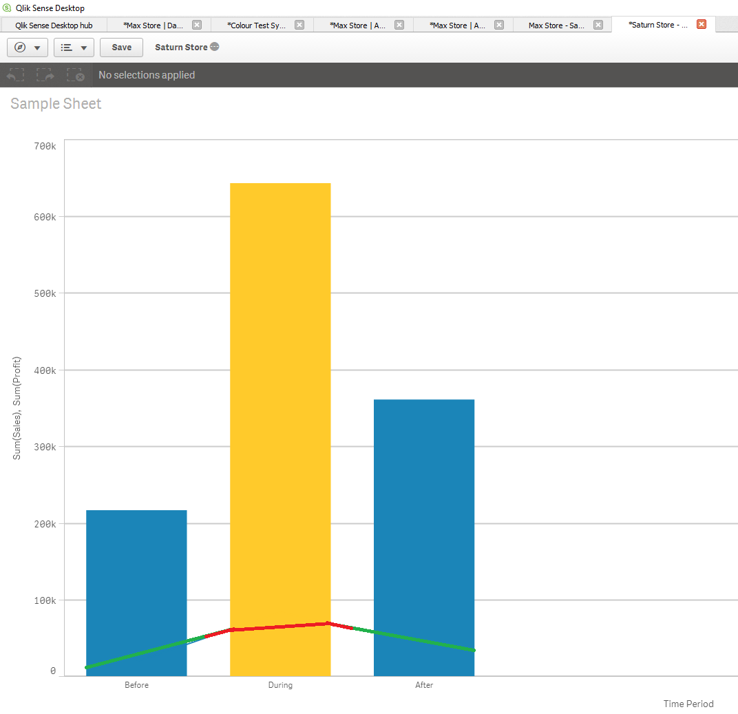
It is perfectly explained by Andrea Gigliotti in this thread:Change barplot color in generic dates dashboard how to create a barplot with conditional dimensions. I have used his know-how to create the following chart:

It is a simple barplot where the dimension "Date" is converted in the new dimension "Time Period" that has 3 categories: "Before", "During", and "After", based in 6 values that act as limits for "Date" and are entered by the user via "Variable Extension" in Qlik Sense. After creating the new variable, the chart is colored so that the measure "Sales" in the category "During" is highlighted in color yellow.
My question here is: How can I create an expression that does not affect the other measure in the combo chart, which is "Profits"? I would like a result as the one in the next image:
The measure "Profits" has green color. Nevertheless, when it intersects the "During" period it has color red. This way the visualization would be more readable for the user:
2) A combo chart whit conditional dimensions and colors.
It is also well explained by Steve Street in this thread:color by expression - QlikSense how to create a line chart with conditional dimensions using the ValueList function. I have used his response to create the following chart:
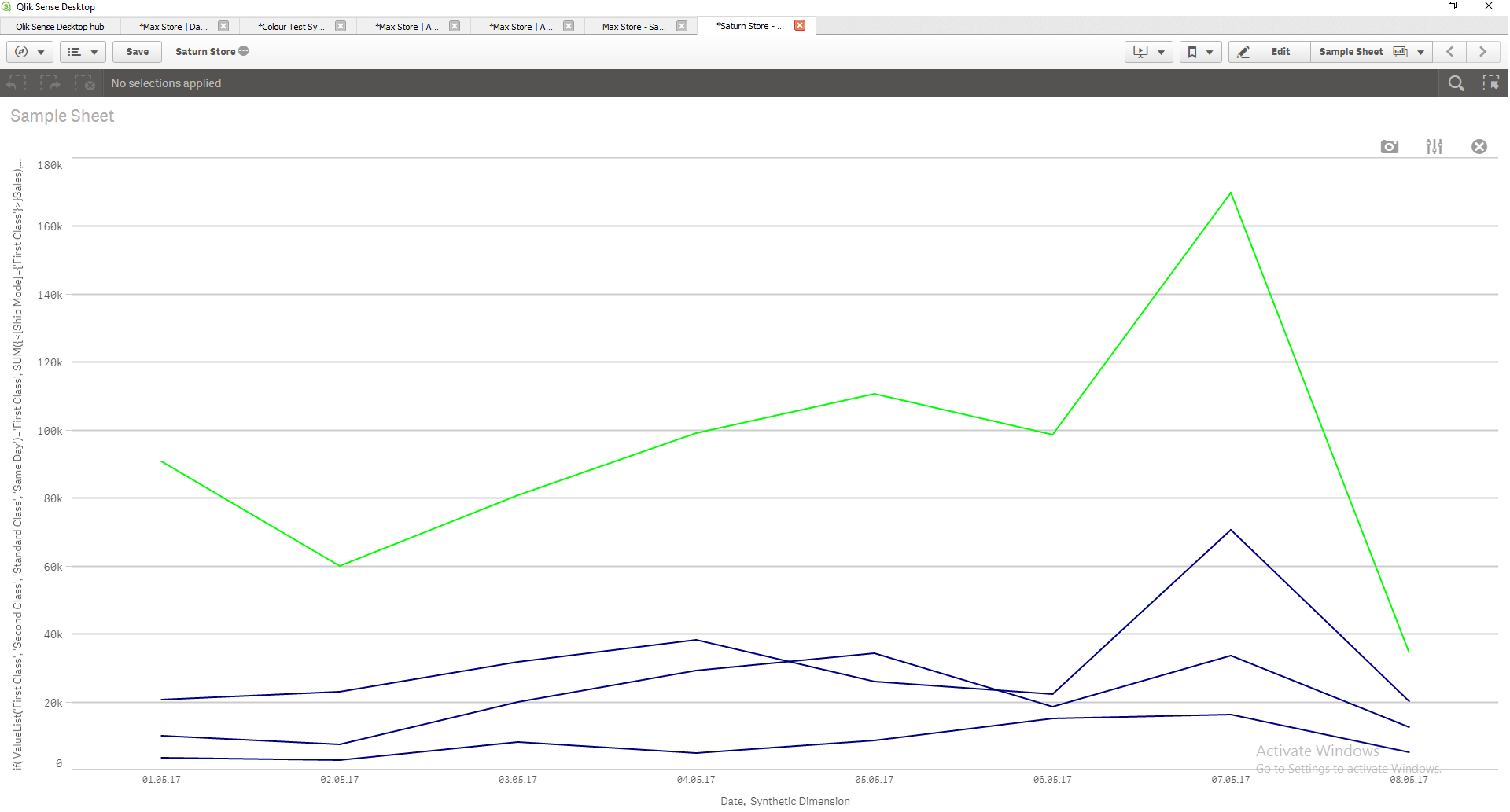
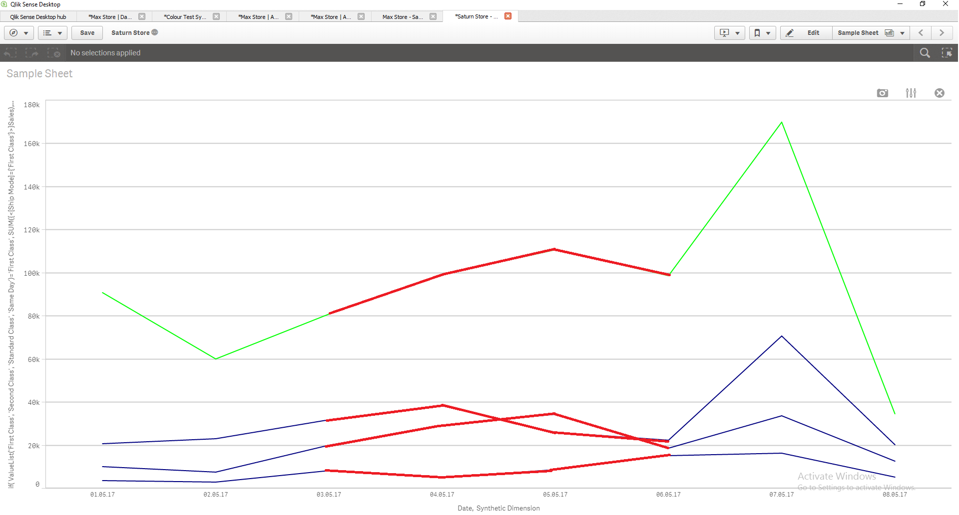
This chart illustrates Sum(Sales) using Value List. In pseudo-code, the conditional expression would be: IF [Ship Mode] = 'Standard Class' THEN Green(), ELSE Blue(). My question here is: How can I create an expression that adds a different independent color for the 'During' Time Period? The expected result would be something like I illustrate in the following image:
I would really appreciate some help as this charts are a little bit more difficult, given that they combine conditional dimensions, and conditional independent colors in chart lists and combo charts. Thanks in advance to the community.
P.D. To reproduce 100% my example please introduce the following values in the Variable Extension boxes of my app:
"BeforeMin" = 01.05.17
"BeforeMax" = 02.05.17
"DuringMin" = 03.05.17
"DuringMax" = 06.05.17
"AfterMin" = 07.05.17
"AfterMax" = 08.05.17
Accepted Solutions
- Mark as New
- Bookmark
- Subscribe
- Mute
- Subscribe to RSS Feed
- Permalink
- Report Inappropriate Content
Hi Anibal,
1) How can I create an expression that does not affect the other measure in the combo chart, which is "Profits"?
You can not do that with standart qlik sense combo chart yet. Maybe you can find an extension on branch that serve your goal.
Or you can change the measure to marker. It will be more readable than line.
2) How can I create an expression that adds a different independent color for the 'During' Time Period?
if((Date>=date(date#('$(vBDA_3)','DD.MM.YY'),'DD.MM.YY')) and (Date<=date(date#('$(vBDA_4)','DD.MM.YY'),'DD.MM.YY')),LightRed(),
IF(MATCH(ValueList('First Class', 'Second Class', 'Standard Class', 'Same Day'),'First Class','Same Day','Second Class'),Blue(),LightGreen()))
- Mark as New
- Bookmark
- Subscribe
- Mute
- Subscribe to RSS Feed
- Permalink
- Report Inappropriate Content
Hi Kaan,
Thank you very much for your answer. It is correct and works perfectly.
Regarding question number 1: Do you know any branch I can research on my own to try to achieve this type of visualization with combo charts? Maybe you were referring to Sense UI Combo Chart (Qlik Branch)? Please advice. Thanks a lot for your answer. Anibal.