Unlock a world of possibilities! Login now and discover the exclusive benefits awaiting you.
- Qlik Community
- :
- Forums
- :
- Analytics & AI
- :
- Products & Topics
- :
- Visualization and Usability
- :
- How to use Comparative Analysis to create line cha...
- Subscribe to RSS Feed
- Mark Topic as New
- Mark Topic as Read
- Float this Topic for Current User
- Bookmark
- Subscribe
- Mute
- Printer Friendly Page
- Mark as New
- Bookmark
- Subscribe
- Mute
- Subscribe to RSS Feed
- Permalink
- Report Inappropriate Content
How to use Comparative Analysis to create line chart with Qlik Sense?
I would like to create a line chart to compare value of different fruit types at the same month.
The data is as the following:
myMonth myType myValue
January 2015 apple 0
January 2015 banana 1
January 2015 orange 0
April 2015 apple 1
April 2015 banana 0
April 2015 orange 1
July 2015 apple 0
July 2015 banana 1
July 2015 orange 0
October 2015 apple 0
October 2015 banana 1
October 2015 orange 1
January 2016 apple 1
January 2016 banana 1
January 2016 orange 2
April 2016 apple 1
April 2016 banana 0
April 2016 orange 0
In Tableau, I can use myMonth as Columns, Sum(myValue) as Rows, and myType as Color to create a comparison line chart as the following.
How could I create the same comparison line chart with Qlik sense?
Thanks for your help!
Accepted Solutions
- Mark as New
- Bookmark
- Subscribe
- Mute
- Subscribe to RSS Feed
- Permalink
- Report Inappropriate Content
Get the solution.
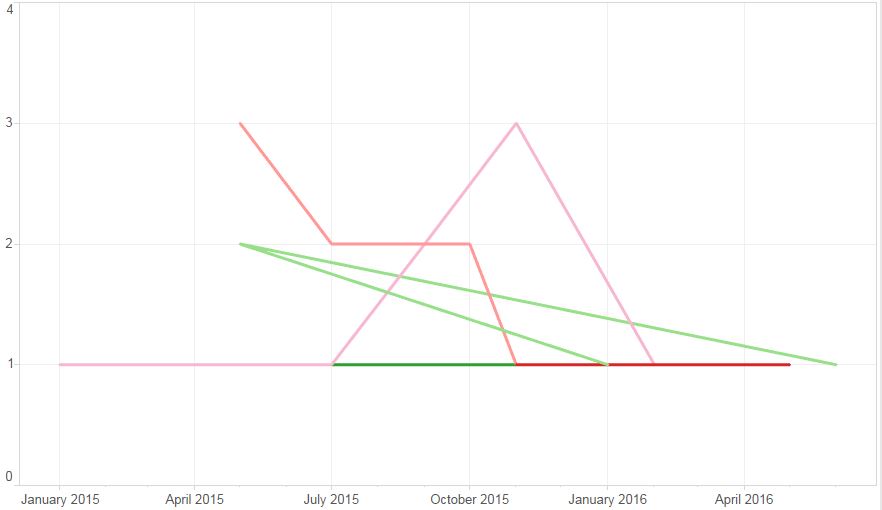
We can create a line chart with myMonth and myType as dimension and Sum(myValue) as measure.
Thanks!
- Mark as New
- Bookmark
- Subscribe
- Mute
- Subscribe to RSS Feed
- Permalink
- Report Inappropriate Content
Get the solution.
We can create a line chart with myMonth and myType as dimension and Sum(myValue) as measure.
Thanks!