Unlock a world of possibilities! Login now and discover the exclusive benefits awaiting you.
- Qlik Community
- :
- Forums
- :
- Analytics & AI
- :
- Products & Topics
- :
- Visualization and Usability
- :
- cumulative sum line chart with calculated dimensio...
- Subscribe to RSS Feed
- Mark Topic as New
- Mark Topic as Read
- Float this Topic for Current User
- Bookmark
- Subscribe
- Mute
- Printer Friendly Page
- Mark as New
- Bookmark
- Subscribe
- Mute
- Subscribe to RSS Feed
- Permalink
- Report Inappropriate Content
cumulative sum line chart with calculated dimension, problem with series
Hi, I have a problem with cumulative sum line chart, the problem is I think I need to aggr by dimension, but im usin calculated one, and puting it in the formula gives rubbish chart result.
So I'm playin with covid19 data. Columns of interest: date, cases, deaths, country.
Ive calculated on visualisation purposes dimension like:
day_0: =Aggr(nodistinct min({<cases=-{'0'}>}date),countriesAndTerritories)
//marks day with first case confirmed
day_count:=if(
date-Aggr(NODISTINCT min({<cases=-{'0'}>}date),countriesAndTerritories)<0,
0,
date-Aggr(NODISTINCT min({<cases=-{'0'}>}date),countriesAndTerritories)
)
//counts following days from day_0
Then I have a cumulative sum of Cases cinfirmed:
RangeSum(Above(total sum(cases),1,RowNo(total)))
I want to show it as a line chart, with day_count and country as dimensions. When i filter one country its, ok, problem is when i want to show more countries as a series. Then instead of something like that (example from power bi):
I get this:
thx for any help 🙂
edit: link to source table:
https://opendata.ecdc.europa.eu/covid19/casedistribution/csv
edit2:
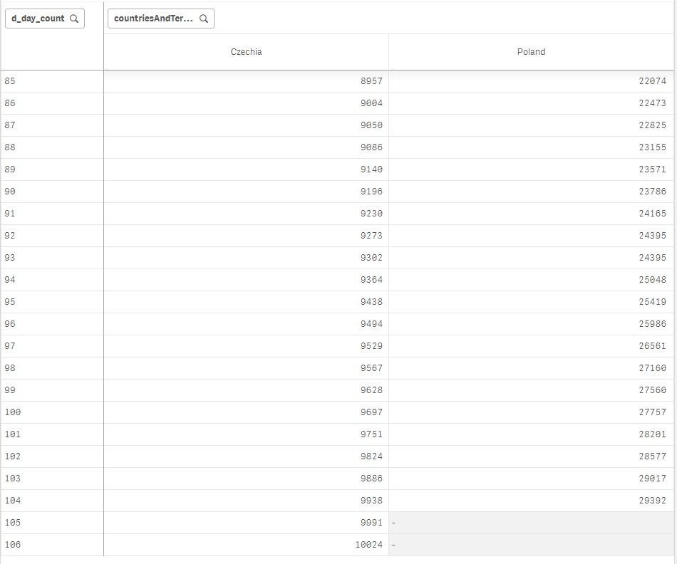
dont know why, but when i convert this chart to pivot table, it works correctly:


