Unlock a world of possibilities! Login now and discover the exclusive benefits awaiting you.
- Qlik Community
- :
- All Forums
- :
- QlikView App Dev
- :
- Mouse over effect on objects?
- Subscribe to RSS Feed
- Mark Topic as New
- Mark Topic as Read
- Float this Topic for Current User
- Bookmark
- Subscribe
- Mute
- Printer Friendly Page
- Mark as New
- Bookmark
- Subscribe
- Mute
- Subscribe to RSS Feed
- Permalink
- Report Inappropriate Content
Mouse over effect on objects?
Hi
I want to know if it is possible to make a kind of mouse over effect so when a user place the mouse on a chart for instance (without clicking on the chart/object), if there can be created some kind of pop up help text which describes definitions behind the chart?
I have tried to activate "pop-up labels" in the presentations tab. But this is not the information i want:
I want to be able to write something like: "This data is calculated in this way and the calculations are done on the basis of that way...".
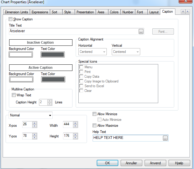
I have also tried to write some text in the Help text field in the Caption tab:
But it doen't give the output I wanted - the pop-up text is still the same as in the first picture.
Kind Regards
Maria
Accepted Solutions
- Mark as New
- Bookmark
- Subscribe
- Mute
- Subscribe to RSS Feed
- Permalink
- Report Inappropriate Content
If you tick the Show Caption box, the Help Text will be visible when you hover over or click on the ? on the caption.
- Mark as New
- Bookmark
- Subscribe
- Mute
- Subscribe to RSS Feed
- Permalink
- Report Inappropriate Content
If you tick the Show Caption box, the Help Text will be visible when you hover over or click on the ? on the caption.
- Mark as New
- Bookmark
- Subscribe
- Mute
- Subscribe to RSS Feed
- Permalink
- Report Inappropriate Content
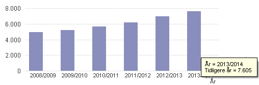
Ok, I tried that. It seems to work (see the yellow help text) 
But my output changes when I tick this box:
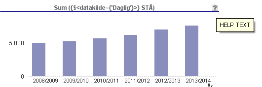
I don't wish the intervals to change and I don't like want the blue line to appear? Also suddenly he user can see the definition from the expressions tab. That I also want to avoid.
Can't I avoid that this new look just because I want a help text?
- Mark as New
- Bookmark
- Subscribe
- Mute
- Subscribe to RSS Feed
- Permalink
- Report Inappropriate Content
do you still have text in the "Title Text" below the checkbox to show caption? if there is no text, in this field, the first expression label becomes the title. to overwrite that, at least a space is needed in this field.
another thing, in general tab of chart properties, uncheck Show Title in Chart.
i think the blue line below the caption comes from the theme you are using. you may have to modify the theme to get rid of that.
re the y axis intervals, if you are not using static values in axes tab, it regenerates depending on the chart area. adding the caption decreased your chart area and hence the change in y axis labels. you may want to increase the chart size or consider adding values in the Axes tab in Scale section at least for Static Step.
- Mark as New
- Bookmark
- Subscribe
- Mute
- Subscribe to RSS Feed
- Permalink
- Report Inappropriate Content
sorry not possible. as a workaround you can create a button or a nice icon next to your chart (Help) and then users click on it, you can show pop up (another text box).
You can check "Whats new in QlikView 11" demo that came with QV client to see how they did it.