Unlock a world of possibilities! Login now and discover the exclusive benefits awaiting you.
- Qlik Community
- :
- All Forums
- :
- QlikView App Dev
- :
- Relative Change with additional dimension in bar c...
- Subscribe to RSS Feed
- Mark Topic as New
- Mark Topic as Read
- Float this Topic for Current User
- Bookmark
- Subscribe
- Mute
- Printer Friendly Page
- Mark as New
- Bookmark
- Subscribe
- Mute
- Subscribe to RSS Feed
- Permalink
- Report Inappropriate Content
Relative Change with additional dimension in bar chart
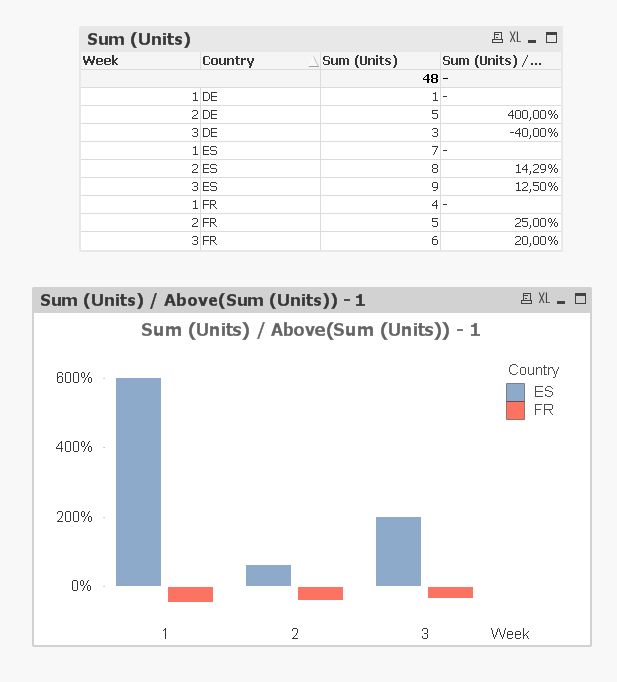
I would like to show the relative change in sales units relative to the preceding time period for several countries in a simple chart.
In a straight table this works fine (see top picture), because I am able to adjust the sort order as intended. In a bar chart, however, the dimensions are mixed up in the wrong way and the above() function does not work as intended (see bottom picture). In contrary to the table there is no option to adjust the sort order (without changing the x-axis).
The bar chart should show week 2 and 3, all three countries (in different colors) with the figures of the last column of the table. Any hints how to achieve this?