Unlock a world of possibilities! Login now and discover the exclusive benefits awaiting you.
- Qlik Community
- :
- All Forums
- :
- QlikView App Dev
- :
- Display legend on x axis of a graph
- Subscribe to RSS Feed
- Mark Topic as New
- Mark Topic as Read
- Float this Topic for Current User
- Bookmark
- Subscribe
- Mute
- Printer Friendly Page
- Mark as New
- Bookmark
- Subscribe
- Mute
- Subscribe to RSS Feed
- Permalink
- Report Inappropriate Content
Display legend on x axis of a graph
Hi,
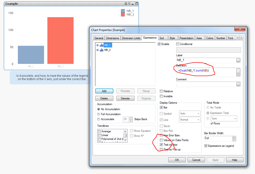
I have to create a graph with a large amount of expression (48) and no dimension.
I would like de name of each expression to be displayed under the each corresponding bar of the graph.
Not so simple to explain, so that I have created an example.
Thanks for your help !
Accepted Solutions
- Mark as New
- Bookmark
- Subscribe
- Mute
- Subscribe to RSS Feed
- Permalink
- Report Inappropriate Content
Hi Frank,
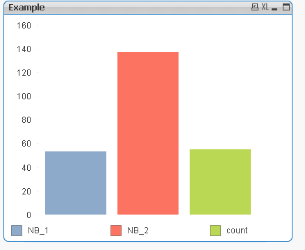
Chart Properties>Expression> Expressions as Legend - Ticked
Chart Properties>Presentation> Show Legend -Unticked
The Expression Labels will move to below the columns
Andy
- Mark as New
- Bookmark
- Subscribe
- Mute
- Subscribe to RSS Feed
- Permalink
- Report Inappropriate Content
Yes you can, change the two expressions using the dual function and check the display text on axis for each expression.
In your example
=Dual('NB_1',sum(NB))
=Dual('NB_2',sum(NB_ENG_AGENTS))
- Mark as New
- Bookmark
- Subscribe
- Mute
- Subscribe to RSS Feed
- Permalink
- Report Inappropriate Content
Hi Frank,
Chart Properties>Expression> Expressions as Legend - Ticked
Chart Properties>Presentation> Show Legend -Unticked
The Expression Labels will move to below the columns
Andy
- Mark as New
- Bookmark
- Subscribe
- Mute
- Subscribe to RSS Feed
- Permalink
- Report Inappropriate Content
- Mark as New
- Bookmark
- Subscribe
- Mute
- Subscribe to RSS Feed
- Permalink
- Report Inappropriate Content
By holding CTRL+SHIFT you can move the legend around
The with some movements of the chart you can get closer to this
(I have created additional expression)
- Mark as New
- Bookmark
- Subscribe
- Mute
- Subscribe to RSS Feed
- Permalink
- Report Inappropriate Content
Thanks a lot Andrew, that's exactly the way I intended to do it !
(I didnt want to move the legend)
Thank evrybody for your help !