Unlock a world of possibilities! Login now and discover the exclusive benefits awaiting you.
- Qlik Community
- :
- All Forums
- :
- QlikView App Dev
- :
- Visualizing Overlaps between Customer Groups
- Subscribe to RSS Feed
- Mark Topic as New
- Mark Topic as Read
- Float this Topic for Current User
- Bookmark
- Subscribe
- Mute
- Printer Friendly Page
- Mark as New
- Bookmark
- Subscribe
- Mute
- Subscribe to RSS Feed
- Permalink
- Report Inappropriate Content
Visualizing Overlaps between Customer Groups
Hi,
does anyone have a good idea how to automatically visualize overlaps between customer groups?
Example: Customers purchasing fruits
| 14 (all three) | Banana | Orange | Apple |
| Banana | 10 (only banana) | 20 (banana and orange) | 12 (banana and apple) |
| Orange | 20 (banana and orange) | 16 (only Orange) | 104 (apple and orange) |
| Apple | 12 (banana and apple) | 104 (apple and orange) | 5 (only apple) |
I would like to show the overlaps visually comprehensive. On a whiteboard I would do something like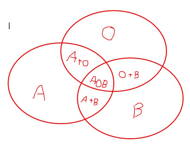
But this does have the issue that if the overlaps (e.g. A+O) are bigger then A, this is not presented visually appropriate.
I can of course hardcode it into the page, and make the size of the Font dependent on the amount, but this seems so futile...
Anyone who did something like this in a more automated fashion?
Especially interesting would be to learn how to accommodate 5 Groups visually.
Thanks!
Bernd
Accepted Solutions
- Mark as New
- Bookmark
- Subscribe
- Mute
- Subscribe to RSS Feed
- Permalink
- Report Inappropriate Content
Perhaps this helps: How to get dynamic Venn Diagram in Qlikview
talk is cheap, supply exceeds demand
- Mark as New
- Bookmark
- Subscribe
- Mute
- Subscribe to RSS Feed
- Permalink
- Report Inappropriate Content
Perhaps this helps: How to get dynamic Venn Diagram in Qlikview
talk is cheap, supply exceeds demand