Unlock a world of possibilities! Login now and discover the exclusive benefits awaiting you.
- Qlik Community
- :
- Forums
- :
- Analytics
- :
- App Development
- :
- Can Qlik Sense display charts for monthly/daily sa...
- Subscribe to RSS Feed
- Mark Topic as New
- Mark Topic as Read
- Float this Topic for Current User
- Bookmark
- Subscribe
- Mute
- Printer Friendly Page
- Mark as New
- Bookmark
- Subscribe
- Mute
- Subscribe to RSS Feed
- Permalink
- Report Inappropriate Content
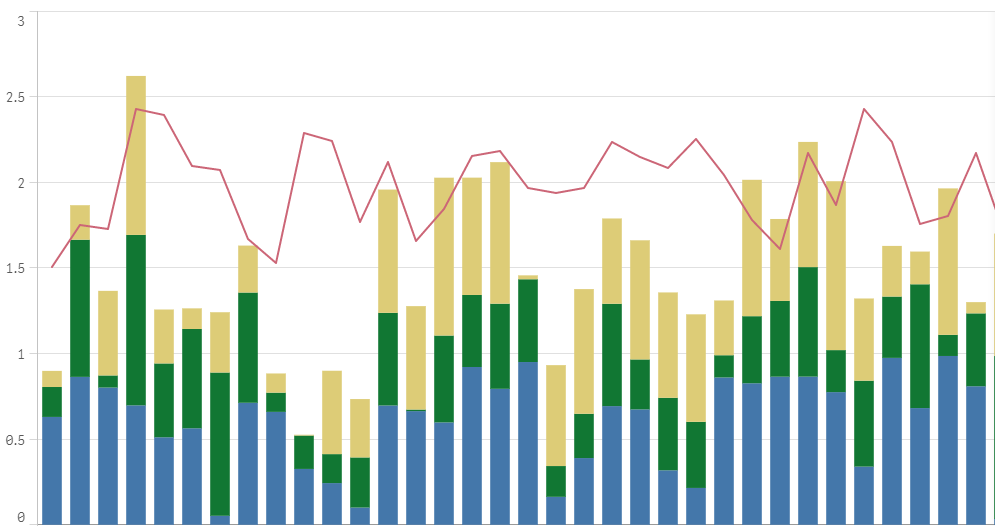
Can Qlik Sense display charts for monthly/daily sales revenues like the following?
The light blue line and bars are the budgeted revenue.
For the actual revenue, we would like to show the expected revenue by different colors according to levels of certainty.
Say, the dark blue portion is which realized with no doubt, deep orange for what we expect almost certainly, and the light orange one may occur with some chance.

- Mark as New
- Bookmark
- Subscribe
- Mute
- Subscribe to RSS Feed
- Permalink
- Report Inappropriate Content
Hi 王 威,
You cannot do this in a bar chart the way you show, it would require stacking multiple measures at the same time as using multiple dimensions, which we currently do not support.
My suggestion is that you instead use a combo chart, which also might be more suited for this task (depending a bit on what data you are looking at of course).
In this example I have created a combo chart with four measures (your four colors), used three of them as bars and stacked them, with the last measure as a line.. This gives you a nice way of comparing the actual value to the budget.