Unlock a world of possibilities! Login now and discover the exclusive benefits awaiting you.
- Qlik Community
- :
- All Forums
- :
- QlikView App Dev
- :
- Remove Y axis label Combo chart
- Subscribe to RSS Feed
- Mark Topic as New
- Mark Topic as Read
- Float this Topic for Current User
- Bookmark
- Subscribe
- Mute
- Printer Friendly Page
- Mark as New
- Bookmark
- Subscribe
- Mute
- Subscribe to RSS Feed
- Permalink
- Report Inappropriate Content
Remove Y axis label Combo chart
Hi All,
I am very new to the qlikview and I need to fix some design issues. Apologize me for the very basic question.
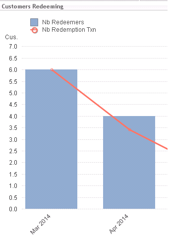
I have a compo chart as shown in the attached image. I need to remove the Y asix label('Cus'). I am not sure where it is coming from. I cannot find it in the properties options.
Also Is it possible to move the legends separately (Display 'Nb Redeemers' on top of left Y axis and 'Nb Redemption txn' on right Y axis)
Thanks a lot for your help.
Regards,
K.Mugunthan
- Mark as New
- Bookmark
- Subscribe
- Mute
- Subscribe to RSS Feed
- Permalink
- Report Inappropriate Content
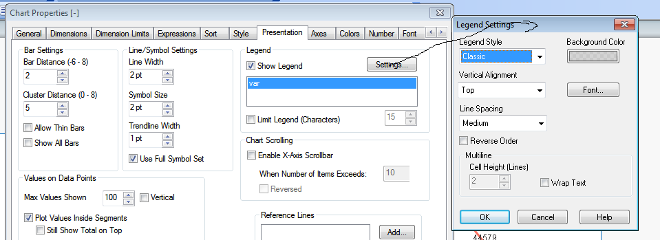
go to properties and in dimension tab right side down u will find checkbox as label..where u can enable or disable
- Mark as New
- Bookmark
- Subscribe
- Mute
- Subscribe to RSS Feed
- Permalink
- Report Inappropriate Content
Click on chart, press Ctrl+Shift,
you will see Red line plots in your chart, then you can move any legend anywhere...
- Mark as New
- Bookmark
- Subscribe
- Mute
- Subscribe to RSS Feed
- Permalink
- Report Inappropriate Content
This Cus. seems tille in chart...
Under General Tab -> uncheck Show Tiltle in chart
Hope this will help!!
- Mark as New
- Bookmark
- Subscribe
- Mute
- Subscribe to RSS Feed
- Permalink
- Report Inappropriate Content
Hi..
Go to properties -->Presentation tab u will find checkbox as Show legend..where u can enable or disable the legend...if u want to disable jst unchecked it
Hope this will helps u..!!
Regards,
Mohammad
- Mark as New
- Bookmark
- Subscribe
- Mute
- Subscribe to RSS Feed
- Permalink
- Report Inappropriate Content
that is for dimension which is Mar 2014, Apr 2014 etc along X axis..
not for Y axis
- Mark as New
- Bookmark
- Subscribe
- Mute
- Subscribe to RSS Feed
- Permalink
- Report Inappropriate Content
FIrst Balraj comment is correct,
next
you don't want to show the labels uncheck the SHOW LEGENDS
if you want to apply the settings click the settings
- Mark as New
- Bookmark
- Subscribe
- Mute
- Subscribe to RSS Feed
- Permalink
- Report Inappropriate Content
@sureshqv Thanks. But that check box works only for X axis label. Not for Y axis. Any idea ?
- Mark as New
- Bookmark
- Subscribe
- Mute
- Subscribe to RSS Feed
- Permalink
- Report Inappropriate Content
Yes. But I need to have it in two separate boxes. Is it possible ?