Unlock a world of possibilities! Login now and discover the exclusive benefits awaiting you.
- Qlik Community
- :
- All Forums
- :
- QlikView Integrations
- :
- SVG Reader: Can't get color gradients to display
- Subscribe to RSS Feed
- Mark Topic as New
- Mark Topic as Read
- Float this Topic for Current User
- Bookmark
- Subscribe
- Mute
- Printer Friendly Page
- Mark as New
- Bookmark
- Subscribe
- Mute
- Subscribe to RSS Feed
- Permalink
- Report Inappropriate Content
SVG Reader: Can't get color gradients to display
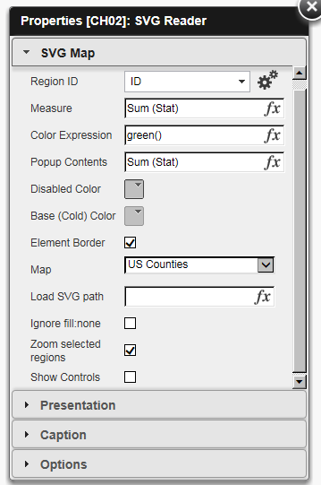
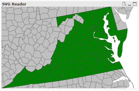
I'm trying to use the SVG reader extension to create a heat map. Here are my settings:
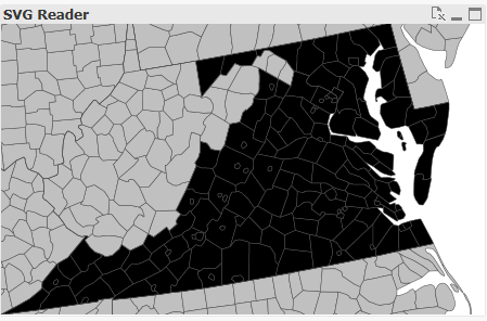
I believe I have successfully linked my US county data to the preloaded "US Counties" SVG file. I only have a subset of counties in my dataset, and only these counties are being displayed in the map.
In addition, the pop-up contents are working exactly as they should.
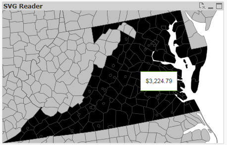
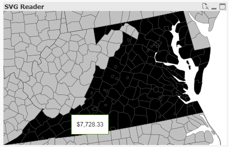
However, despite there being significant variation within the "Stat" variable (which is my measure), all the colors are exactly the same. I would instead like a gradient which distinguishes high values from low values.
In addition, the map is shaded black, even though I am specifying the color green. Strangely, if I change the measure to a constant, the map turns green.
Anybody know what's going on?