Unlock a world of possibilities! Login now and discover the exclusive benefits awaiting you.
- Qlik Community
- :
- All Forums
- :
- QlikView Administration
- :
- Grid chart
- Subscribe to RSS Feed
- Mark Topic as New
- Mark Topic as Read
- Float this Topic for Current User
- Bookmark
- Subscribe
- Mute
- Printer Friendly Page
- Mark as New
- Bookmark
- Subscribe
- Mute
- Subscribe to RSS Feed
- Permalink
- Report Inappropriate Content
Grid chart
Hi all,
my aim is to create a chart showing the Avg(km) and Avg(seniority) of some vehicles according to some proprieties:
- the level of reimbursement achieved (total, partial, no reimbursement)
- the level of satisfaction of the vehicle owner: Overall 1-4; 5-6; 7-8; and Overall 9-10;
The chart should be as follows (each point show the average seniority/km for the i-group, defined as combination of the two variables presented above (satisfaction and reimbursement).
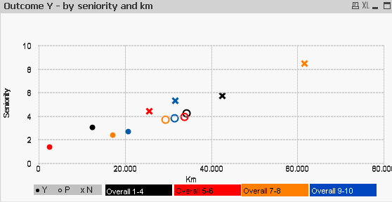
The problem is that the chart has been created by overlapping three charts (enclosed a qvw example).
Furthermore I have trouble in defining the colors rule, because the rules I specified in the "dimension"/"expression" properties are ignored. Only the rules in the "colors tab" seem to be considered, but it is not good for me.
Thanks in advance for your help.
All the best,
Sabrina