Unlock a world of possibilities! Login now and discover the exclusive benefits awaiting you.
- Qlik Community
- :
- All Forums
- :
- QlikView App Dev
- :
- Can someone please check my maths of sophisticated...
- Subscribe to RSS Feed
- Mark Topic as New
- Mark Topic as Read
- Float this Topic for Current User
- Bookmark
- Subscribe
- Mute
- Printer Friendly Page
- Mark as New
- Bookmark
- Subscribe
- Mute
- Subscribe to RSS Feed
- Permalink
- Report Inappropriate Content
Can someone please check my maths of sophisticated analysis
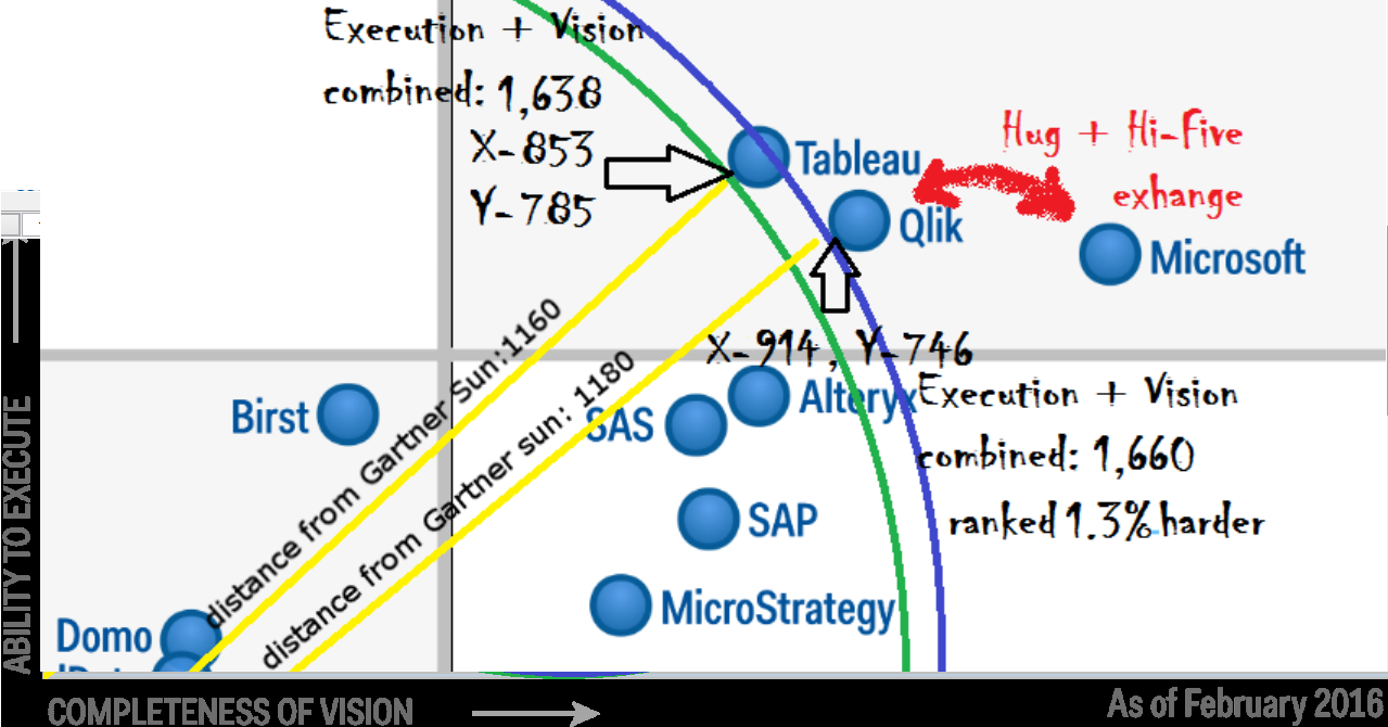
I am hoping I did not botch any of this highly-highly sophisticated analysis of the Gartner 2016 BI leadership quadrant, but I have probably forgotten to carry a zero at least somewhere.
Accepted Solutions
- Mark as New
- Bookmark
- Subscribe
- Mute
- Subscribe to RSS Feed
- Permalink
- Report Inappropriate Content
Hi Evan
Yes you could do that.There's a couple of information available how to do that (you probably already know about those sources, such as https://www.youtube.com/watch?v=hVimVzgtD6w#t=351 ).
The setup would be
1) Create a scatter plot with
Dimensions
a) the time => go to animed dimension to set
b) the bubble your entities you want to compare
c) the color of the bubble (example : the tool/software)
Expressions would be the exact coordinates within the "Gartner Universe"
1) X
2) Y
3) Size of the bubble
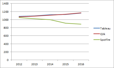
However, I'm wondering if not a line chart would better transport the message. Animated chart may look spectacular (in the end humans are mainly visual centered beasts) but the animation might cover the message you want to bring forward. Thus you might set this up using the absolut values of distance to the "Gartner Sun", such as
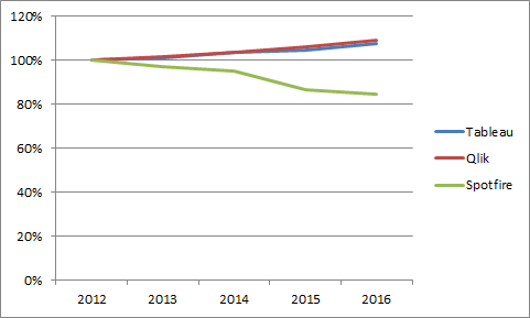
or you could point out the change over time. For every Tool/Software you would define the original starting point (using again the absolut value of distance to the "Gartner Sun") as 100% and then show as a percentage to this starting point the following positions. The graph would look like
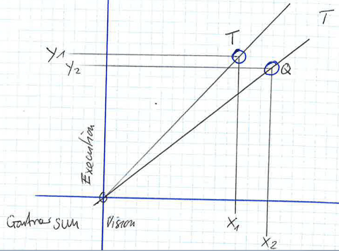
One interesting avenue to explore would be the question, if you should use just the distance to the "Gartner Sun" or if you should use the area that is spanned by the position of the "Gartner Sun" and the position of the Tool/Software (calculated by the formula: area = X * Y). Then there's also the question, where to set the position of the "Gartner Sun". Currently you have set this in far left and below corner of the Quadrants, but you might consider changing this to the middle of the Quadrant map. Using X*Y and keeping the +/- signs of the X and Y might show quite good differenziation of the data.
Best regards
- Mark as New
- Bookmark
- Subscribe
- Mute
- Subscribe to RSS Feed
- Permalink
- Report Inappropriate Content
Hi Evan
No, your math is correct 🙂 : The only argument I see, is that the measurements you've done not precise enough, as it's hard to draw exact tangents for measuring the distances to the "Gartner sun". But that might be solved by using a scaled up image of the "Gartner Universe". Of course, the challenge remains to translate the significance of 1.3 (1.7)% difference of distance into meaning.
| T | 853 | x^2 | 727609 |
| 785 | y^2 | 616225 | |
| 1638 | 1343834 | ||
| SQRT | 1159.23854 | ||
| Q | 914 | x^2 | 835396 |
| 746 | y^2 | 556516 | |
| 1660 | 1391912 | ||
| SQRT | 1179.7932 | ||
| T / Q | -1.7% |
Best regards
- Mark as New
- Bookmark
- Subscribe
- Mute
- Subscribe to RSS Feed
- Permalink
- Report Inappropriate Content
You're absolutely right QlikCsgg! I tried to adjust that in my next phase of analysis. Here's a measurement of Yr over Yr 2016 - 2015. Maybe we could animate the charge in a scatter chart and watch it on loop!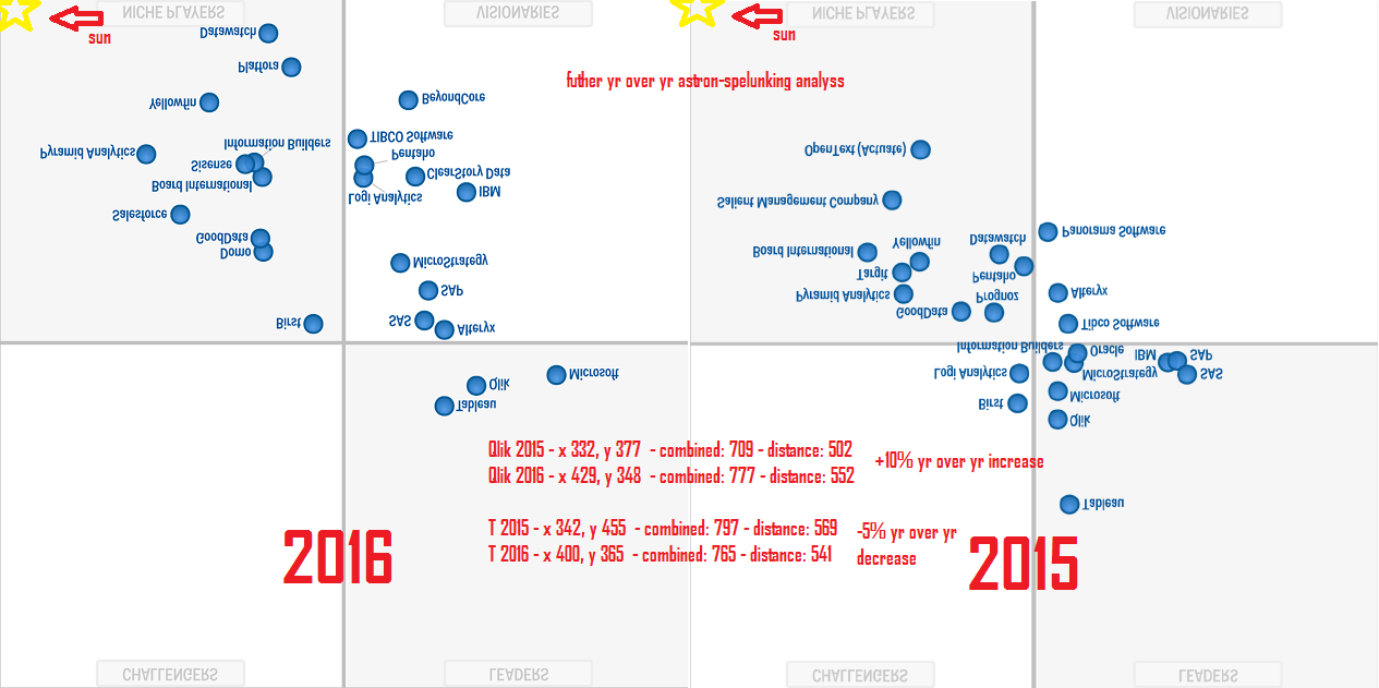
- Mark as New
- Bookmark
- Subscribe
- Mute
- Subscribe to RSS Feed
- Permalink
- Report Inappropriate Content
Hi Evan
Yes you could do that.There's a couple of information available how to do that (you probably already know about those sources, such as https://www.youtube.com/watch?v=hVimVzgtD6w#t=351 ).
The setup would be
1) Create a scatter plot with
Dimensions
a) the time => go to animed dimension to set
b) the bubble your entities you want to compare
c) the color of the bubble (example : the tool/software)
Expressions would be the exact coordinates within the "Gartner Universe"
1) X
2) Y
3) Size of the bubble
However, I'm wondering if not a line chart would better transport the message. Animated chart may look spectacular (in the end humans are mainly visual centered beasts) but the animation might cover the message you want to bring forward. Thus you might set this up using the absolut values of distance to the "Gartner Sun", such as
or you could point out the change over time. For every Tool/Software you would define the original starting point (using again the absolut value of distance to the "Gartner Sun") as 100% and then show as a percentage to this starting point the following positions. The graph would look like
One interesting avenue to explore would be the question, if you should use just the distance to the "Gartner Sun" or if you should use the area that is spanned by the position of the "Gartner Sun" and the position of the Tool/Software (calculated by the formula: area = X * Y). Then there's also the question, where to set the position of the "Gartner Sun". Currently you have set this in far left and below corner of the Quadrants, but you might consider changing this to the middle of the Quadrant map. Using X*Y and keeping the +/- signs of the X and Y might show quite good differenziation of the data.
Best regards
- Mark as New
- Bookmark
- Subscribe
- Mute
- Subscribe to RSS Feed
- Permalink
- Report Inappropriate Content
Great ideas QlikCsgg, will look into these! For your line chart, I'd like to see unchecked 'Forced 0' so we can zoom in on the differences between those bars in the 80 - 100% band.
- Mark as New
- Bookmark
- Subscribe
- Mute
- Subscribe to RSS Feed
- Permalink
- Report Inappropriate Content
Hi Evan
Yes, to zoom in, of course, you probabely would uncheck the axis to start with 0%. However, following the advice of Hichert on chart design, showing only a band of 80%-110% on the axis might show a "wrong" picture :-).
Best regards