Unlock a world of possibilities! Login now and discover the exclusive benefits awaiting you.
- Qlik Community
- :
- All Forums
- :
- QlikView App Dev
- :
- Possible to bind 2 overlaid charts?
- Subscribe to RSS Feed
- Mark Topic as New
- Mark Topic as Read
- Float this Topic for Current User
- Bookmark
- Subscribe
- Mute
- Printer Friendly Page
- Mark as New
- Bookmark
- Subscribe
- Mute
- Subscribe to RSS Feed
- Permalink
- Report Inappropriate Content
Possible to bind 2 overlaid charts?
Hi All
I have one bar chart "stacked" and another chard which is a line graph. They share the same dimensions of the x axis. Users want to see the the make up of the stacked graph with the colours and then they want to see that stack in relation to the line graph. I have made this chart which is one chart on top of the other but ... is there any way of keeping them together so that they do not move apart when users accidentally drag on one chart?
Jo
- Mark as New
- Bookmark
- Subscribe
- Mute
- Subscribe to RSS Feed
- Permalink
- Report Inappropriate Content
I don't think you can bind chart objects like you requested. Would be nice if one could.
But you can prevent the user from accidently moving / resizing the objects by disabling the option on layout tab in chart properties, Security tab, document properties:
- Mark as New
- Bookmark
- Subscribe
- Mute
- Subscribe to RSS Feed
- Permalink
- Report Inappropriate Content
Thank you that works and users cannot move the charts ... any hints on how to line up the 0 axis perfectly between the charts? Depending on the blocks of time chosen the graphs can 'move' in relation to one another.
- Mark as New
- Bookmark
- Subscribe
- Mute
- Subscribe to RSS Feed
- Permalink
- Report Inappropriate Content
Not sure how one can do thi perfectly.
BTW, why do you need to use an overlay of two charts here? Won't a combo chart do the same job?
- Mark as New
- Bookmark
- Subscribe
- Mute
- Subscribe to RSS Feed
- Permalink
- Report Inappropriate Content
Hi Swuehl
I don't think so because of the number of dimensions?
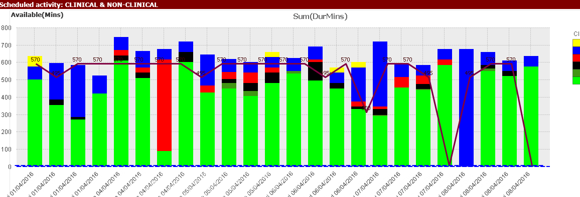
First lot of figures gives the total MinsUsed for the day and the Activitytype
the second lot of figures gives the total minutes available on any one machine on any particular day
The chart then shows the fact that on date 1/1/2016 then machine m1 has used 30 mins - so reached target/capacity (they only had 30 mins available), but machine m2 only used 10 mins but had 20 minutes available. Colour coding the Activitytype means that you can "see" what activities are taking place and make decisions about getting rid of particular activities on a particular day.
Hope I have explained the scenario and why it is important to have the stacked chart showing all the activity types and then the chart which shows if the target has been reached.
Jo
| date | machine | Activitytype | MinsUsed |
| 1/01/2016 | m1 | A | 10 |
| 1/01/2016 | m1 | B | 10 |
| 1/01/2016 | m2 | B | 10 |
| 1/01/2016 | m1 | A | 10 |
| date | machine | availMins | |
| 1/01/2016 | m1 | 30 | |
| 1/01/2016 | m2 | 20 |