Unlock a world of possibilities! Login now and discover the exclusive benefits awaiting you.
- Qlik Community
- :
- All Forums
- :
- QlikView App Dev
- :
- Problems of showing missing values in a bar chart
- Subscribe to RSS Feed
- Mark Topic as New
- Mark Topic as Read
- Float this Topic for Current User
- Bookmark
- Subscribe
- Mute
- Printer Friendly Page
- Mark as New
- Bookmark
- Subscribe
- Mute
- Subscribe to RSS Feed
- Permalink
- Report Inappropriate Content
Problems of showing missing values in a bar chart
Hi Community,
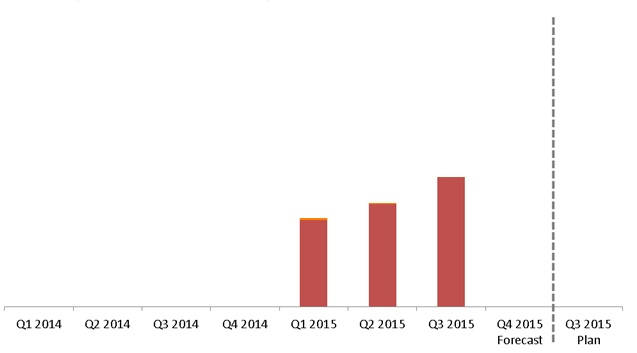
I would like to develop a bar chart with Qlikview to show the actual,forecast and plan data. When user choose Q3 of current year, the chart will present the figures of last year actual, current year actual till the quarter being choosen, Current year Forecast after the quarter being chosen and selected current year quarter Plan (Q3), altogether 9 bars in the entire chart. All data needed to be extracted with multi dimensions, such as date, Business Unit, Entity, Account and so forth. The problem I am facing is that sometimes there will be no records for some quarters and I am not able to show the quarters with no data in the bar chart, quarters with missing values will be skipped. I have tried some of the methods from this community, but the result is not what I expect, it just shows 3(Scenario:Actual, Forecast, Plan)*8(Quarters for 2 Years) = 24 bars in the chart. Is there any workaround for me to present the graph as shown in the pictures below which I did it in Excel before?
Regards,
Maverick
- Mark as New
- Bookmark
- Subscribe
- Mute
- Subscribe to RSS Feed
- Permalink
- Report Inappropriate Content
There are several methods, depends on the data and the requirements. Usually, you need to model the data, even create dummy rows to get the expected result.
Other method is to use a disconected timeline in your chart, works but it takes a lot of CPU.
- Mark as New
- Bookmark
- Subscribe
- Mute
- Subscribe to RSS Feed
- Permalink
- Report Inappropriate Content
I have tried to use the method of isolated calendar but I don't know how to show the forecast and plan data for particular quarters instead of showing 2 years figures for forecast and plan data.
- Mark as New
- Bookmark
- Subscribe
- Mute
- Subscribe to RSS Feed
- Permalink
- Report Inappropriate Content
If your bars are not coming for the quarters which are not selected or which doesn't have values then use the following option
Presentation tab -> uncheck the "Suppress zero values" option
- Mark as New
- Bookmark
- Subscribe
- Mute
- Subscribe to RSS Feed
- Permalink
- Report Inappropriate Content
Like I said, the actual logic depends on your data model.
Basically, you have some amounts to show on a barchart. Those amounts are of various types (Actual, Forecast and Plan) and on a timelime (Quarter). Therefore, you have 2 dimensions (Time and Amount Type). So, you need to use Stacked Barchart.
You need to sort by a calculated expression to get the expected sorting (Plan value at the end),
The final result would look like:
Quarter, Type, Amount
Q1-2014, Actual, 0
Q2-2014, Actual, 0
Q3-2014, Actual, 0
Q4-2014, Actual, 0
Q1-2015, Actual, 200
Q2-2015, Actual, 300
Q3-2015, Actual, 500
Q4-2015, Forecast, 0
Q3-2015, Plan, 0
Personally, I would use a Combo chart and show the Plan value for all previous quarters as symbols on the same bar.
- Mark as New
- Bookmark
- Subscribe
- Mute
- Subscribe to RSS Feed
- Permalink
- Report Inappropriate Content
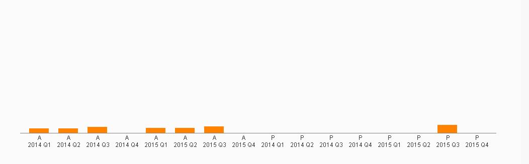
I uncheck both the "Suppress Missing Values" and "Suppress zero values" options, and the result become like this:
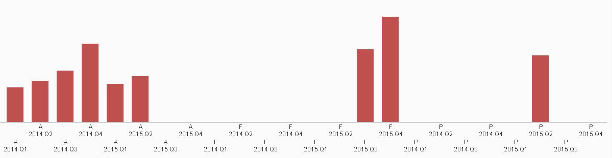
I have selected Q2 2015 from the list box. What I expect to see is the figures of A 2014 Q1 - A 2015 Q2, F 2015 Q3 - F 2015 Q4 and P 2015 Q2. There are two problems I am facing, the first one is i have tried to use set analysis to limit the quarter being shown for F and Q, but 2 years data are still being shown in the graph. The second problem is that when there is no data at all for a scenario (e.g. F), the dimension label will not be appeared in the graph, as shown at the picture below.