Unlock a world of possibilities! Login now and discover the exclusive benefits awaiting you.
- Qlik Community
- :
- All Forums
- :
- QlikView App Dev
- :
- Percentile presentation in Bar chart
Options
- Subscribe to RSS Feed
- Mark Topic as New
- Mark Topic as Read
- Float this Topic for Current User
- Bookmark
- Subscribe
- Mute
- Printer Friendly Page
Turn on suggestions
Auto-suggest helps you quickly narrow down your search results by suggesting possible matches as you type.
Showing results for
Not applicable
2016-05-11
01:39 PM
- Mark as New
- Bookmark
- Subscribe
- Mute
- Subscribe to RSS Feed
- Permalink
- Report Inappropriate Content
Percentile presentation in Bar chart
In Excel it is possible to make this kind of bar chart :
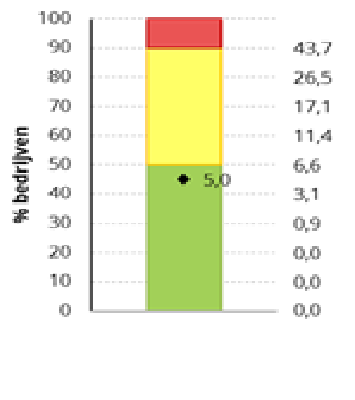
On the right you see the percentile calculations respectively with factor 10, 20, 30, 40,... of a whole bunch of companies. You see that the distribution of the values is not even. On the left you see the percentile factor values. Everything which is below factor 50 is green. Between 50 and 90 is Yellow. Above 90 is red. The diamond gives the value of one selected company. It is clear that this company is in the green zone.
Does anybody if it is possible to make such a graph in QlikView. In a bar chart it is not possible to plot an Y-axes with variable steps.
989 Views
0 Replies