Unlock a world of possibilities! Login now and discover the exclusive benefits awaiting you.
- Qlik Community
- :
- Forums
- :
- Analytics
- :
- New to Qlik Analytics
- :
- A line chart better for the color blind
- Subscribe to RSS Feed
- Mark Topic as New
- Mark Topic as Read
- Float this Topic for Current User
- Bookmark
- Subscribe
- Mute
- Printer Friendly Page
- Mark as New
- Bookmark
- Subscribe
- Mute
- Subscribe to RSS Feed
- Permalink
- Report Inappropriate Content
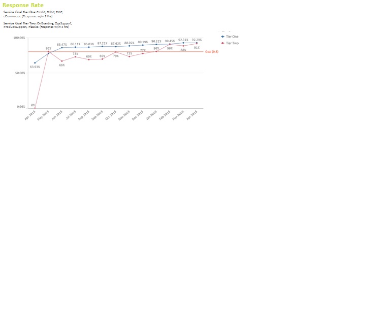
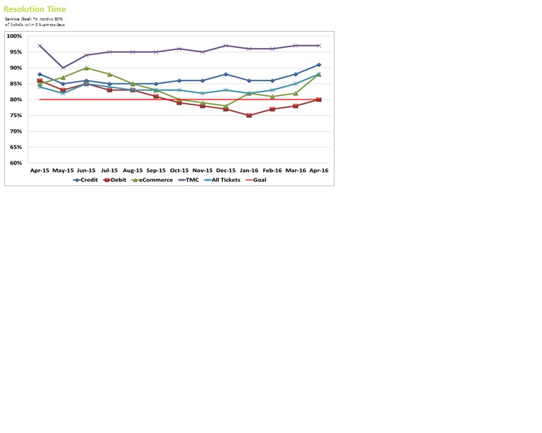
A line chart better for the color blind
I check Qlik Branch regularly for new visualizations, but have not run across one to assist me. So, I wanted to reach out and see if anyone had any ideas.
I have a senior leader who is a big support and user of Qlik Sense Dashboards I have designed for him. However, he is color blind so he rely's more on things being bold, underlined, or differing shapes. I have a Line Chart for him showing a trend that he presents every Friday on a large projected screen for his peers and he has trouble seeing differentiation between his datasets. He now has someone rebuild the charts in Excel so he can bold the X & Y columns, as well as have each datapoint be a different shape. Any ideas of how I can help him within Qlik Sense.
See examples:
- Mark as New
- Bookmark
- Subscribe
- Mute
- Subscribe to RSS Feed
- Permalink
- Report Inappropriate Content
You can try a combichart. But that only allows one dimension. So you'd need to add two expressions for each 'line'. One shown as Line and one shown as Symbol. You can choose between symbols so your boss can distinguish better between them.
talk is cheap, supply exceeds demand