Unlock a world of possibilities! Login now and discover the exclusive benefits awaiting you.
- Qlik Community
- :
- All Forums
- :
- QlikView App Dev
- :
- gauge chart
- Subscribe to RSS Feed
- Mark Topic as New
- Mark Topic as Read
- Float this Topic for Current User
- Bookmark
- Subscribe
- Mute
- Printer Friendly Page
- Mark as New
- Bookmark
- Subscribe
- Mute
- Subscribe to RSS Feed
- Permalink
- Report Inappropriate Content
gauge chart
Hi,
How to create gauge chart like attached in qlikview
Edit:
attached now is the expected chart
- Mark as New
- Bookmark
- Subscribe
- Mute
- Subscribe to RSS Feed
- Permalink
- Report Inappropriate Content
you want something like the attached one?
- Mark as New
- Bookmark
- Subscribe
- Mute
- Subscribe to RSS Feed
- Permalink
- Report Inappropriate Content
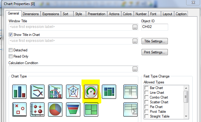
To get started you would choose the Gauge option when creating a new chart object as seen below:
Next, enter your expression on the Expressions tab.
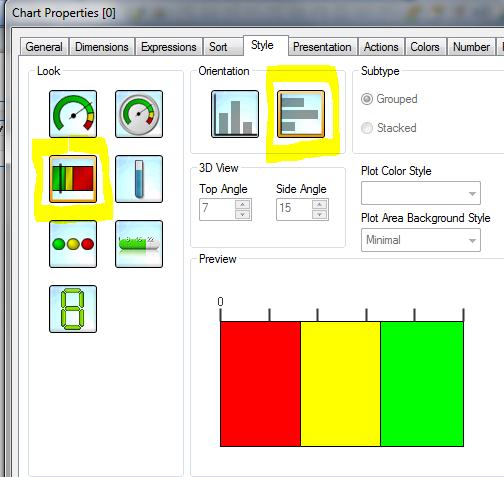
Then you would choose the two options as seen below on the Style tab:
On the Presentation tab you can tweak the settings to get the gauge fine tuned to meet your needs.
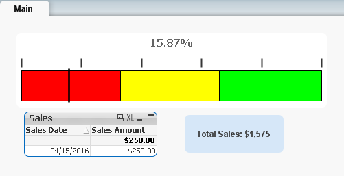
Once completing the above steps you should be able to create something similar to the following:
- Mark as New
- Bookmark
- Subscribe
- Mute
- Subscribe to RSS Feed
- Permalink
- Report Inappropriate Content
Hi Vibhu,
You have to read below interesting blog posts. You might get good idea on how to do this.
Simple Infographics | Qlik Freak
- Mark as New
- Bookmark
- Subscribe
- Mute
- Subscribe to RSS Feed
- Permalink
- Report Inappropriate Content
This is just a colorful bar , you'll just have to create that many segments
Is this bar showing a 100%? I would suggest showing the needle as this could be very confusing
If a post helps to resolve your issue, please accept it as a Solution.