Unlock a world of possibilities! Login now and discover the exclusive benefits awaiting you.
- Qlik Community
- :
- All Forums
- :
- QlikView App Dev
- :
- Can this line chart be done in QlikView?
- Subscribe to RSS Feed
- Mark Topic as New
- Mark Topic as Read
- Float this Topic for Current User
- Bookmark
- Subscribe
- Mute
- Printer Friendly Page
- Mark as New
- Bookmark
- Subscribe
- Mute
- Subscribe to RSS Feed
- Permalink
- Report Inappropriate Content
Can this line chart be done in QlikView?
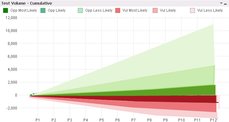
Hi, I would like to show to users this type of the visualization, but cannot get it right now. I am getting a mix of colors. I put what I want to get as a paint on top of existing spread. I've attached a demo data and the QVapp. Thanks
Accepted Solutions
- Mark as New
- Bookmark
- Subscribe
- Mute
- Subscribe to RSS Feed
- Permalink
- Report Inappropriate Content
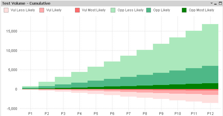
Too bad that it start from the bottom of the chart area. I found that stacked bar chart can show all. Not so smooth, but it can fit the purpose. If anyone would have a better idea please let me know. Thanks
- Mark as New
- Bookmark
- Subscribe
- Mute
- Subscribe to RSS Feed
- Permalink
- Report Inappropriate Content
I guess so. But the best technqiue I can come up with is to invert the areas for the negative lines and create an additional line+area that whites out the bottom area up to the most negative line.
The problem with the standard chart type in QlikView is that areas are always filled starting from the bottom of the chart area, and not from the zero line...
Peter
- Mark as New
- Bookmark
- Subscribe
- Mute
- Subscribe to RSS Feed
- Permalink
- Report Inappropriate Content
As peter said, I agree
But, Qlikview line chart Style - Default, it consumes the whole Width and Height. So, i don't think is that is possible.
- Mark as New
- Bookmark
- Subscribe
- Mute
- Subscribe to RSS Feed
- Permalink
- Report Inappropriate Content
Too bad that it start from the bottom of the chart area. I found that stacked bar chart can show all. Not so smooth, but it can fit the purpose. If anyone would have a better idea please let me know. Thanks