Unlock a world of possibilities! Login now and discover the exclusive benefits awaiting you.
- Qlik Community
- :
- Forums
- :
- Analytics
- :
- New to Qlik Analytics
- :
- Scatter Chart - QlikSense
- Subscribe to RSS Feed
- Mark Topic as New
- Mark Topic as Read
- Float this Topic for Current User
- Bookmark
- Subscribe
- Mute
- Printer Friendly Page
- Mark as New
- Bookmark
- Subscribe
- Mute
- Subscribe to RSS Feed
- Permalink
- Report Inappropriate Content
Scatter Chart - QlikSense
hi all,
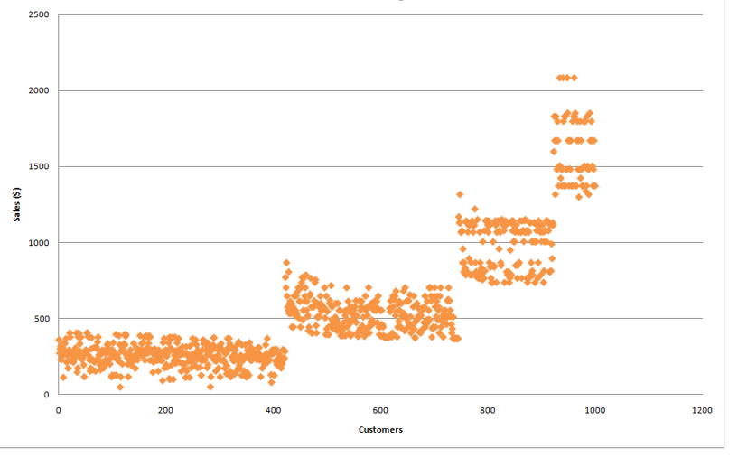
I am trying to use the attached set of data to build a scatter chart similar to the one in the attached screnshot.
the chart represent all sales amounts transactions in points grouped by the column [K Mean]..
- Mark as New
- Bookmark
- Subscribe
- Mute
- Subscribe to RSS Feed
- Permalink
- Report Inappropriate Content
What error are you getting? With my limited use of the sense scatter chart the only limit to watch for was on the number of data points it could display which I believe was around 2000.
- Mark as New
- Bookmark
- Subscribe
- Mute
- Subscribe to RSS Feed
- Permalink
- Report Inappropriate Content
Hi alec,
If i am right your name is Alice.
I have created an application on your data and tried to create what you want,If still you don't find it suitable then please tell me what are the definition of the X axis and Y axis measure as in your pic , on X axis only customer is written now what is the logic behind it ,if you tell me so I can reflect it.
Please mark the appropriate replies as CORRECT / HELPFUL so our team and other members know that your question(s) has been answered to your satisfaction.
Rohit Kumar
- Mark as New
- Bookmark
- Subscribe
- Mute
- Subscribe to RSS Feed
- Permalink
- Report Inappropriate Content
it is very close but not what I want. I want to show all the data point as in your graph but want the x axis to show K means.. the problem is when I make the changes on your sample, i only get 4 points on the chart.
- Mark as New
- Bookmark
- Subscribe
- Mute
- Subscribe to RSS Feed
- Permalink
- Report Inappropriate Content
Hi Alec,
Please check now , Hope you got what you want.
Please mark the appropriate replies as CORRECT / HELPFUL so our team and other members know that your question(s) has been answered to your satisfaction.
Rohit Kumar
- Mark as New
- Bookmark
- Subscribe
- Mute
- Subscribe to RSS Feed
- Permalink
- Report Inappropriate Content
thanks so much for all the help but it still doesn't represent what I want.
For example, if I take "Asetate Aviator" as a description it shows me one dot with K Means=166 and amount = 21,418..
while I need to have all the sales points meaning all transactions each on its own dot and it will show many points with amounts from 228.2 to 293.4 and the k means will show values from 2 to 4..
Best,
Alec
- Mark as New
- Bookmark
- Subscribe
- Mute
- Subscribe to RSS Feed
- Permalink
- Report Inappropriate Content
Hi badr,
See What you are trying to achive is not possible with the data you have .How can you have many dots when you have selected one value from Amount Desc. If you select one value of course it will show you one dot. See you have an image but it doesn't mean you can reflect any data with the image. Please consider it once again and try it on excel what you are trying , Is it possible with excel if it is We can reflect it to Qlik or any BI tool.
- Mark as New
- Bookmark
- Subscribe
- Mute
- Subscribe to RSS Feed
- Permalink
- Report Inappropriate Content
hi Rohit, I am not selecting one value from the amount desc. I am selecting one value of the description column which has the product name.. when I do i see many lines of data and each with different amount.. I want to show these amounts if each dot.
- Mark as New
- Bookmark
- Subscribe
- Mute
- Subscribe to RSS Feed
- Permalink
- Report Inappropriate Content
Hi,
There is only one column there , In your attached data Amount Desc I am talking about this column , when you select on value from this column so it is the property of scatter chart that it will show you one value only same for more values.
Is there any other column in your attached data ?