Unlock a world of possibilities! Login now and discover the exclusive benefits awaiting you.
- Qlik Community
- :
- All Forums
- :
- Qlik NPrinting
- :
- Need to print two wrap-up gauge charts using NPrin...
- Subscribe to RSS Feed
- Mark Topic as New
- Mark Topic as Read
- Float this Topic for Current User
- Bookmark
- Subscribe
- Mute
- Printer Friendly Page
- Mark as New
- Bookmark
- Subscribe
- Mute
- Subscribe to RSS Feed
- Permalink
- Report Inappropriate Content
Need to print two wrap-up gauge charts using NPrinting with Qlikview
Hi All,
I am very new to NPrinting & need urgent help.
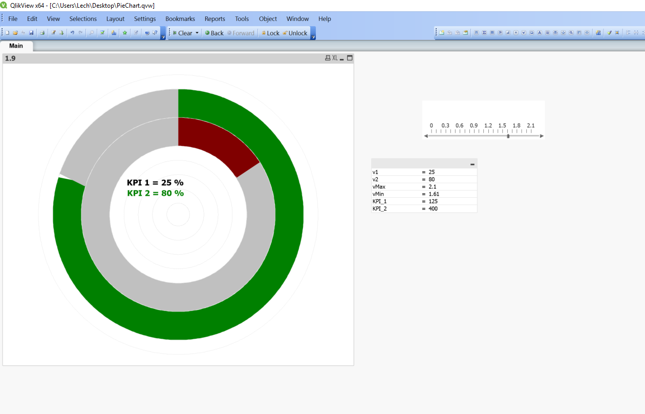
In my qlikview dashboard, I have two gauge chart which are wrapped up together as shown in image.
Can we create a same report in NPrinting so they will look like same as qlikview.
- Mark as New
- Bookmark
- Subscribe
- Mute
- Subscribe to RSS Feed
- Permalink
- Report Inappropriate Content
Hi Neetu,
If you are overlaying one gauge chart with another and using background transparency to make the bottom one visible, note that background transparency is not retained when charts are exported as images from QlikView. You can test this without involving NPrinting (RMB on the object and choose Export). So I would say this is not possible.
HTH - Daniel.
- Mark as New
- Bookmark
- Subscribe
- Mute
- Subscribe to RSS Feed
- Permalink
- Report Inappropriate Content
Hi Neetu,
As Daniel said transparency is not supported. What i did in my development was:
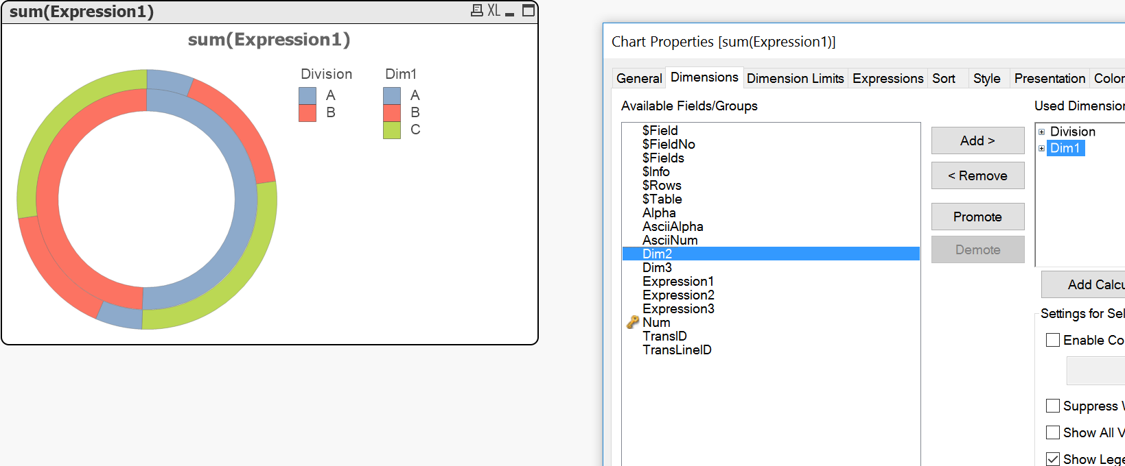
I have created a Pie/Donut Chart with 2 Dimensions and fidly expressions. Two dimensions wereartifitial Calculated dimensions so i could write conditional statements and link them with very fidly expressions. The trick was to make expressions independent and ignore dimension levels. This was not an easy part and i remember spending whole day playing with it and trying get it working, but eventualy i did
Attached chart is obviously not end result but it can give you an idea what you can do and how you can achieve similar thing using PieChart as a single object If you really need to have wrapped together gauges.
regards
Lech
- Mark as New
- Bookmark
- Subscribe
- Mute
- Subscribe to RSS Feed
- Permalink
- Report Inappropriate Content
Thanks Lech,
Can you please share the sample file & let me know that how we can achieve for the above mention example, may be it will work for my scenario as well.
Your help is really appreciated.
- Mark as New
- Bookmark
- Subscribe
- Mute
- Subscribe to RSS Feed
- Permalink
- Report Inappropriate Content
Hi Neetu,
Apologies for such a late reply - i had to think twice or even more times to actualy get to where i was.
So first thing first. The solution i have implemented was not based on Pie Chart but on Radar chart.
Here are the steps to do:
- create grid used as a main dimension in your radar chart (usually 100 unique values is enough, in my example i have 500
- create 2 measures (to create 2 lines)
- play with the colors
My example is based fully on variables and x field with values from 1-500.
See attached solution - it is basic but does the job.