Unlock a world of possibilities! Login now and discover the exclusive benefits awaiting you.
Announcements
Live today at 11 AM ET. Get your questions about Qlik Connect answered, or just listen in.
SIGN UP NOW
- Qlik Community
- :
- All Forums
- :
- GeoAnalytics
- :
- How to create a pie chart for my case?
Options
- Subscribe to RSS Feed
- Mark Topic as New
- Mark Topic as Read
- Float this Topic for Current User
- Bookmark
- Subscribe
- Mute
- Printer Friendly Page
Turn on suggestions
Auto-suggest helps you quickly narrow down your search results by suggesting possible matches as you type.
Showing results for
Not applicable
2017-04-26
01:37 AM
- Mark as New
- Bookmark
- Subscribe
- Mute
- Subscribe to RSS Feed
- Permalink
- Report Inappropriate Content
How to create a pie chart for my case?
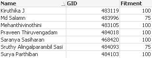
I am supposed to create a pie chart based on the percentage of fitment.If the percentage of fitment is 75 it should appear in yellow color in the pie chart,If fitment is 100 then it should appear in green,If fitment is 50 then red.This is the way I want. But the I loaded the fitment column using load inline like follows
LOAD * INLINE [
GID, Fitment
484018, 100
483996, 75
484093, 75
484103, 100
468420, 100
483119, 100
483105, 100
];
Now I have to create a pie chart.Please help to do this.
107 Views
0 Replies