Unlock a world of possibilities! Login now and discover the exclusive benefits awaiting you.
- Qlik Community
- :
- Forums
- :
- Analytics
- :
- New to Qlik Analytics
- :
- Where is "Include Null Values" on Line Chart?
- Subscribe to RSS Feed
- Mark Topic as New
- Mark Topic as Read
- Float this Topic for Current User
- Bookmark
- Subscribe
- Mute
- Printer Friendly Page
- Mark as New
- Bookmark
- Subscribe
- Mute
- Subscribe to RSS Feed
- Permalink
- Report Inappropriate Content
Where is "Include Null Values" on Line Chart?
On Qliksense 3.2 Desktop, the documentation for line chart says there is a "Include Null Values" button. However, there is not. This making the scale on my line chart all messed up due to the null values silently forcing the scale up (at least you can find the null bar on the bar chart). I have to convert to Bar Chart, untick the box, then convert to line chart. Is this a bug?
- Mark as New
- Bookmark
- Subscribe
- Mute
- Subscribe to RSS Feed
- Permalink
- Report Inappropriate Content
Hi,
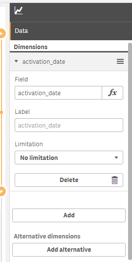
I'm using 3.2 SR1 and i can see that check box to include null value option. u can upgrade to below version/
also u have option to exclude dimension and measure null value via set analysis expression
try like
Sum({$<Client -= {""}>}OrderQty)
also
- Mark as New
- Bookmark
- Subscribe
- Mute
- Subscribe to RSS Feed
- Permalink
- Report Inappropriate Content
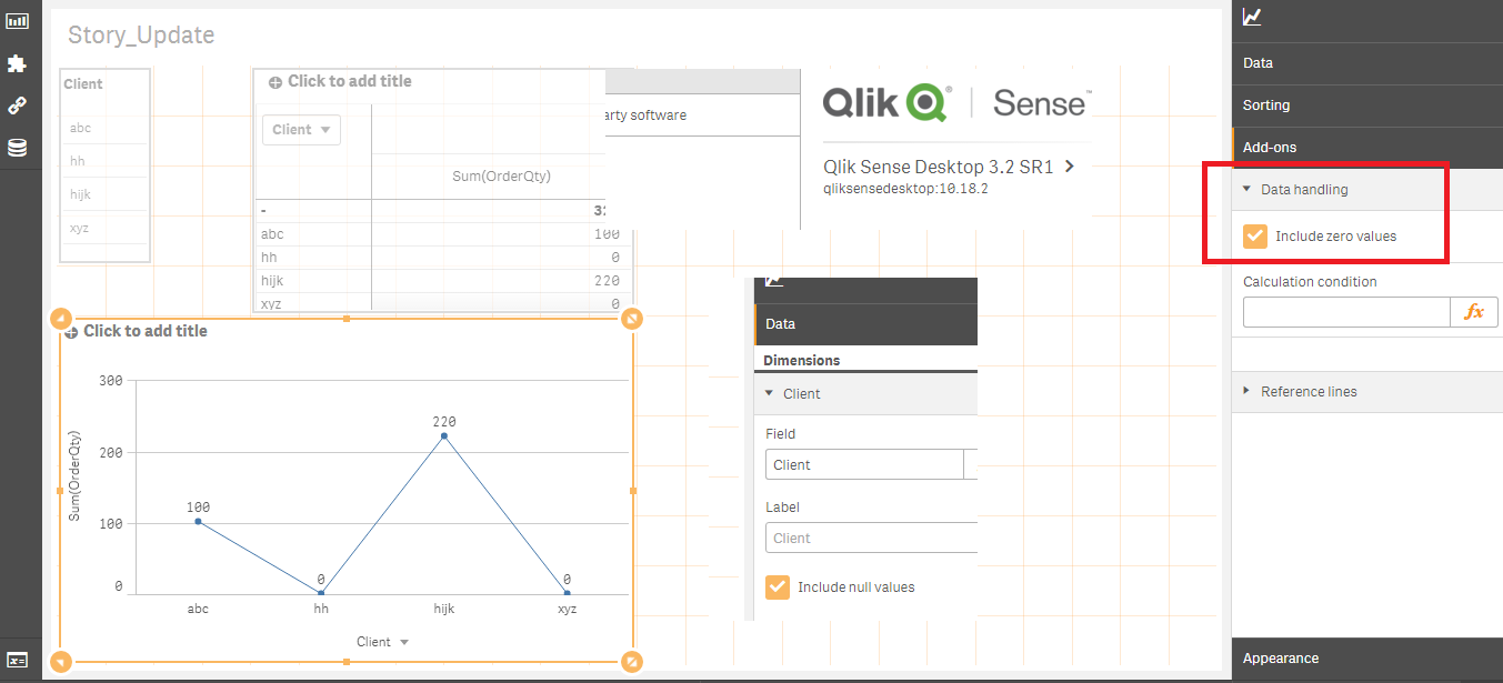
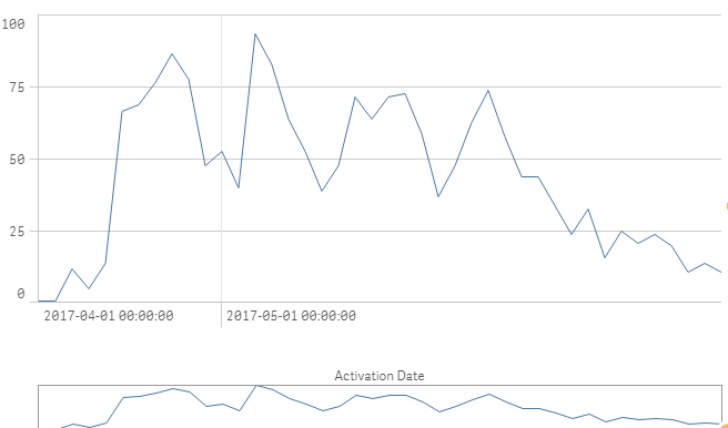
Hey, this doesn't make any difference - that is include zero values, not include null values. e.g. this is my graph with or without the "include null values" button ticked.
This is the chart when converted to a bar chart - you can see the huge null value column on the preview at the bottom which is messing up the scale, far right:
This is the bar chart when you untick the "include null value" option which is available under the dimension in the bar chart field, you get this:
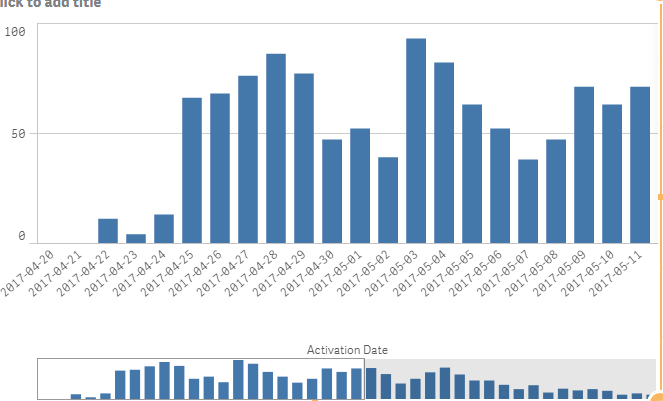
Which then you can convert to a line chart. Unticking the "include zero values" box just removes the first two days on this bar chart.
Final line chart:
I'm using 3.2 SR4, and the documentation for the line chart says it's supposed to be there under the dimension properties!
I could use a set expression, but in this case I am far more likely to just save it as a master visualisation. However, if this is supposed to be a self-service platform for business users, I really don't expect them to have to go through all these steps or write set expressions - it looks like a bug to me.
- Mark as New
- Bookmark
- Subscribe
- Mute
- Subscribe to RSS Feed
- Permalink
- Report Inappropriate Content
Looks like this is just a Desktop problem - Qliksense Server appears to have the button...!
- Mark as New
- Bookmark
- Subscribe
- Mute
- Subscribe to RSS Feed
- Permalink
- Report Inappropriate Content
I believe the missing "Include null values" chekbox is a long lasting bug with the Qlik Sense Line Chart. It's not only in desktop, but also in Server.

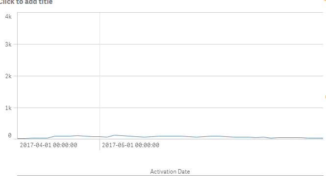
It's particularly confusing if you have many null values in the x axis dimension, because it may look like the auto setting for the y axis range doesn't work, like above.
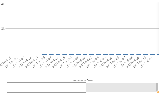
The simple workaround is to temporarily turn off the continuous x-axis. Voila, the Include null values box appears magically.

Uncheck it, and turn the continuous x-axis back on if you want that. The chart looks better now.
