Unlock a world of possibilities! Login now and discover the exclusive benefits awaiting you.
- Qlik Community
- :
- All Forums
- :
- QlikView App Dev
- :
- Linear gauge in straight table - changing segment ...
- Subscribe to RSS Feed
- Mark Topic as New
- Mark Topic as Read
- Float this Topic for Current User
- Bookmark
- Subscribe
- Mute
- Printer Friendly Page
- Mark as New
- Bookmark
- Subscribe
- Mute
- Subscribe to RSS Feed
- Permalink
- Report Inappropriate Content
Linear gauge in straight table - changing segment color for dimensions
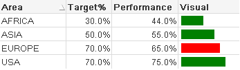
I have a straight table that shows a KPI for certain geographic areas. Each record has a numerator and denominator that I sum and divide to get the percentage performance. There is also a target percentage that is different for each area. I am displaying the percentage number in one field, but in the other, I want to show a linear gauge filling to 100%, but there should only be one segment, and the color should be different depending on whether the area num/den is higher or lower than the area's target.
For example, in my file I've uploaded, all the bars should be solid green, except for Europe, who is behind their target, which should be solid red. I've tried playing with the expressions for both color and segment definition, but it looks like when QV evaluates those expressions, it's for the user's selections, and not for each individual dimension that is in the chart.
Is there a way to achieve this without creating separate objects for each area?
- Mark as New
- Bookmark
- Subscribe
- Mute
- Subscribe to RSS Feed
- Permalink
- Report Inappropriate Content
Thought about trying to somehow use AGGR(), but that may be the wrong direction.
- Mark as New
- Bookmark
- Subscribe
- Mute
- Subscribe to RSS Feed
- Permalink
- Report Inappropriate Content
Hi,
The Linear Gauge segments are looking for a single value for colour.
If you really need a highlighted bar perhaps try using repeating symbols in the straight table cell to make your own in-cell graphic,
or use more than one linear gauge to show highlighted variance,
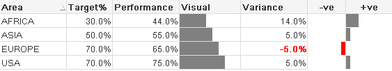
see attached qvw,
Regards,
HD
- Mark as New
- Bookmark
- Subscribe
- Mute
- Subscribe to RSS Feed
- Permalink
- Report Inappropriate Content
Hi
I tried to dig into the issue and found that the calculated color expression doesn't get affected by the dimensionality of the chart. The expression will be applied on the entire dataset. It will return same result as if it is inside a text box.
Although I don't think this should be the right way of implementation by Qliktech ,I guess the solution provided by Donald might help you this time.
- Mark as New
- Bookmark
- Subscribe
- Mute
- Subscribe to RSS Feed
- Permalink
- Report Inappropriate Content
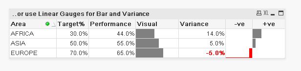
Hi
Used hdonald's app and made new chart... this what you want?
regards
Dave
- Mark as New
- Bookmark
- Subscribe
- Mute
- Subscribe to RSS Feed
- Permalink
- Report Inappropriate Content
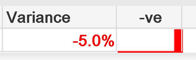
Digging up an old thread...
I was trying out this approach in v11.2 and I run into a annoying issue.
As long as there are several lines in the table it works fine but when there is only one line or the/a negative line is at the bottom it looks strange. It is as though the background extends outside the table box.
Several lines, negative last:
Only one line:
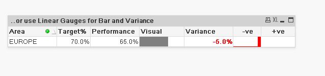
And here again with 400% zoom:
Does anybody know if there is a solutin for this? Or is there a better solution in later versions?