Unlock a world of possibilities! Login now and discover the exclusive benefits awaiting you.
- Qlik Community
- :
- All Forums
- :
- QlikView App Dev
- :
- View the X-Axis description in graph
- Subscribe to RSS Feed
- Mark Topic as New
- Mark Topic as Read
- Float this Topic for Current User
- Bookmark
- Subscribe
- Mute
- Printer Friendly Page
- Mark as New
- Bookmark
- Subscribe
- Mute
- Subscribe to RSS Feed
- Permalink
- Report Inappropriate Content
View the X-Axis description in graph
Hello,
I have a query trying to make a graph in QlikView.
The X-axis of a graph I want to use as the Months of Continuous Dimension
(which the division is for all months) but that only shows the name
of the month every 3 months.
Anyone know how I could do this?
I appreciate your help.
Thank you
- Mark as New
- Bookmark
- Subscribe
- Mute
- Subscribe to RSS Feed
- Permalink
- Report Inappropriate Content
Most likely there is simply no enough space. Try using diagonal or vertical lables.
Regards,
Michael
PS: in general, month as continuous is a strange idea...
- Mark as New
- Bookmark
- Subscribe
- Mute
- Subscribe to RSS Feed
- Permalink
- Report Inappropriate Content
Hi,
I attached a picture where you can see my goal.
In the picture above is the chart now, and in the bottom picture is how I want.
I could do?
Very thanks,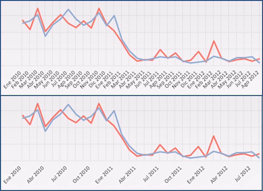
Guzmán
- Mark as New
- Bookmark
- Subscribe
- Mute
- Subscribe to RSS Feed
- Permalink
- Report Inappropriate Content
Just like Michael said , the issue is space.
here is what I do - change the axes label to vertical(Under chart properties , Dimension axis, click the radio button corresponds to vertical line) and streach the length. and change the font for axis label.
Hope this helps
Aji.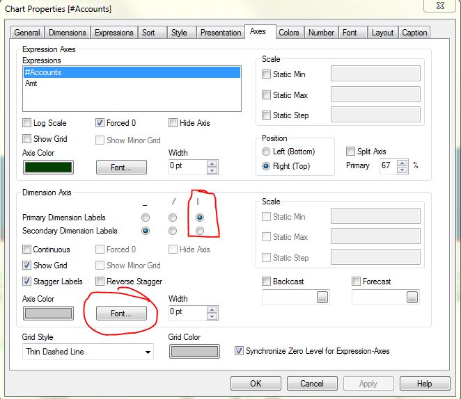
- Mark as New
- Bookmark
- Subscribe
- Mute
- Subscribe to RSS Feed
- Permalink
- Report Inappropriate Content
I think he wants to say that just wants to see the information by quarter. I mean, for the corresponding to january, february and march, appears accumulated in january. The same for the rest of the months.
- Mark as New
- Bookmark
- Subscribe
- Mute
- Subscribe to RSS Feed
- Permalink
- Report Inappropriate Content
From the image Guzmán uploaded , the graphs looks same(I mean no data aggregation ) . So I guess he wants the label to be displayed for every month
- Mark as New
- Bookmark
- Subscribe
- Mute
- Subscribe to RSS Feed
- Permalink
- Report Inappropriate Content
Aji,
As i can see now it is quite opposite. Current version shows all months, and the requirement is to show only hte 1st month of the quarter - but the data points must be for all months.
Guzmán,
See what I tried - and got some result.
First step is to create an artificial dimension that has "normal" value for the 1st months of the quarter, and value that contains blanks, and character chr(10) at the start and the end, for all other months. To make each "month" unique, I used different number of blanks. Here is the script of the data, see Month1 field:
// Date =====================================
LET Start = num(makedate(2010,1,1));
LET End = floor(yearend(today()));
Date:
LOAD
$(Start)-1+RecNo() as Date
AUTOGENERATE $(End) - $(Start) + 1;
JOIN (Date) LOAD
Date,
date(MonthStart(Date), 'MMM-YY') as Month,
year(Date) as Year
RESIDENT Date;
tmp:
LOAD DISTINCT
Month
RESIDENT Date;
JOIN (Date) LOAD DISTINCT
Month,
if(mod(month(Month),3)=1,date(MonthStart(Month), 'MMM-YY'), chr(10)& repeat(' ', RowNo()) & chr(10)) as Month1
RESIDENT tmp
ORDER BY Month;
DROP TABLE tmp:
// ==================================
Field Month1 is what we need for the chart as dimension. It looks more or less OK if use vertical labels, not continuous. And, in Presentations limit legend (characters) to 6.
Regards,
Michael
- Mark as New
- Bookmark
- Subscribe
- Mute
- Subscribe to RSS Feed
- Permalink
- Report Inappropriate Content
Michael, Now it make sense 🙂 My bad I didn't read it correctly
- Mark as New
- Bookmark
- Subscribe
- Mute
- Subscribe to RSS Feed
- Permalink
- Report Inappropriate Content
Hi
As Michael says, I want to show the division for all the months but only the description of the scale for the first month of the quarter
Michael,
Very thanks for your response.
I tried what you said but did not get the expected result, in the following image is the graph as it was then.
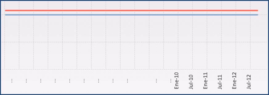
Regards.
Guzmán
- Mark as New
- Bookmark
- Subscribe
- Mute
- Subscribe to RSS Feed
- Permalink
- Report Inappropriate Content
Guzmán,
Looks like the chart expressions are not logicaly related to the Date table. Can't guess more than that from the picture.
Regards,
Michael